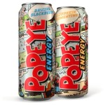
 US-based consultancy McLean Design has created packaging designs for new energy drink Popeye, based on a vintage comic-book style.
The Popeye energy drink is launching in the US market, and is produced in California. McLean Design, which is also based in the state, was tasked with developing its packaging.
The consultancy developed a comic-strip look for the cans, aiming to replicate the large-dot printing of early comics.
Popeye and other characters are used in the packaging, alongside the original Popeye logo, which is licensed by King Features Syndicate.
A comic-book typeface is also used on the cans, including on the dietary information panel.
The Popeye energy drink is launching in the US is two flavours, Bruiser Blackberry and Clobberin Clementine.

You must be logged in to post a comment Login