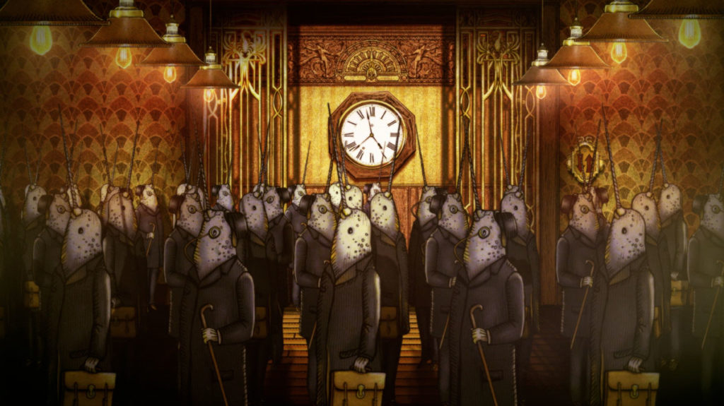
Hendrick’s Gin’s tagline is ‘Undeniably peculiar, utterly delicious’ – a phrase that could equally describe Tulips and Chimney’s acclaimed animations.
 “We have long been admirers of the Hendrick’s Gin aesthetic,” says director Ree Treweek. “Its Victoriana surrealism is so aligned with our style that you can imagine our delight when we were approached by the creative agency Quaker City Mercantile to create an animated spot for the Scottish brand.”
Escape, the result, is an invitation to ‘escape the conventional and embrace the delectable.’
 “No one likes commuting,” says executive producer Nina Pfeiffer. “It is a mundane necessity for so many, and that’s why we love this script so much. Taking something painfully ordinary and giving it that extraordinary Hendrick’s sense of wonder was an absolute joy.”
The heroes’ journeys home to delicious cocktails are truly weird and wonderful, a surreal mix of impossible juxtapositions and hybrid creatures dressed in Victorian fashion: think crowds of narwhals, a dapper gentleman in a tuxedo with the head of a cucumber, a sophisticated lady juggling knives between palm trees, and painted ceramic whales.
 Hendrick’s vintage paper cut aesthetic ties together the varied environments.
“We loved the idea that the architecture itself reflects the theme of the spot, and is alive and changing,” says Ree. “Our commuters’ office block works like an old-fashioned clock hand, while the homes of our lead characters resemble an alligator and a swordfish. We played with scale within the environments and built on the idea that things are constantly changing, from the lighting to the sky tones.”
 For the spot’s distinct look, Tulips and Chimneys created layered illustrated artwork in Photoshop, which was then animated and composited in After Effects. When compositing, they added a subtle grain to the film and made use of vignettes, dust, scratches, film burn, light leaks and other imperfections common in old film stock.
“Atmospherics, lighting and motion blur created ‘real world’ feeling to our shots and helped us to create a seemingly limitless Hendrick’s environment,” says Nina. “We’ve stayed fairly close to the look of the brand, but added depth, atmospherics and some subtle moments of surprise.”

Source: Tulips and Chimney

You must be logged in to post a comment Login