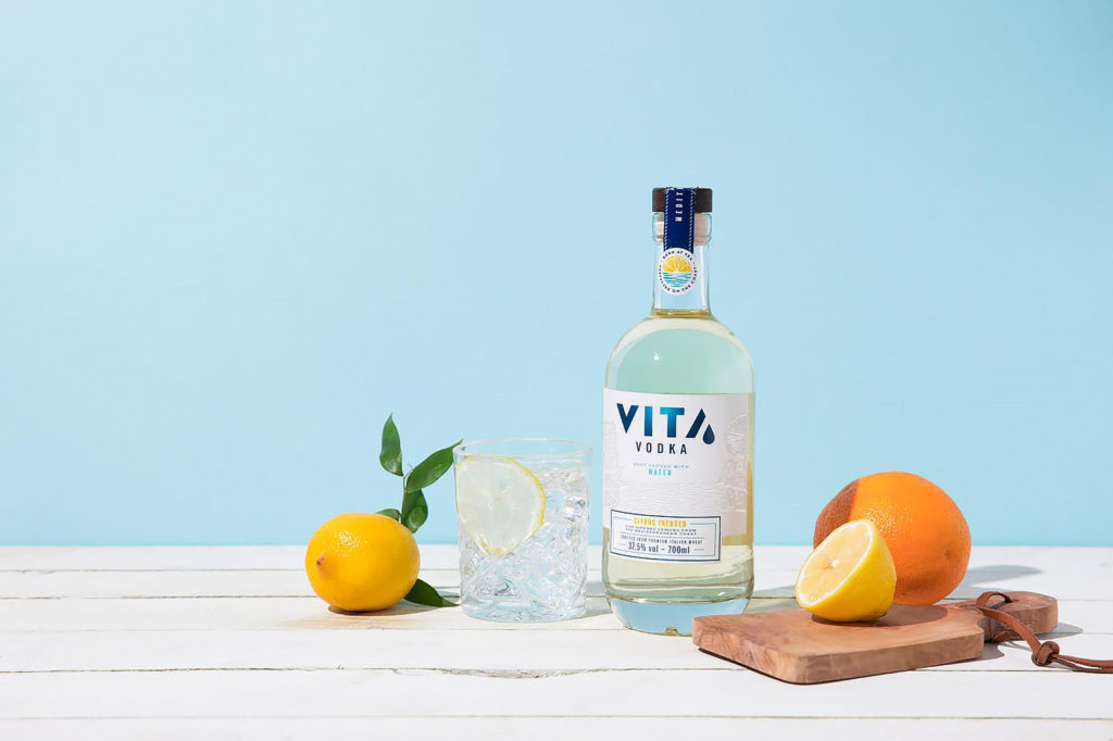
Vita Vodka has relaunched its core brand identity and packaging with a premiumised, refreshing, and distinctive identity created by global independent branding and innovation agency Dragon Rouge. The redesign is aimed at better reflecting Vita’s premium price point, quality ingredients and Mediterranean brand story, as it launched into the UK through a Rewards Crowdfunding Campaign.
A citrus vodka drink of 37.5% ABV, Vita was born Spain in 2017, as the first vodka designed to be mixed with water. The product was created by Spanish entrepreneur Victor Ruiz Lafita, who had spent time living in London and spotted an opportunity in the market for a sugar-free vodka offer with an appetising enough taste profile that doesn’t need to be mixed with sugary CSDs. The product offer is on-trend with no sugar and boasts a low calorie count, and the ingredients were researched for over a year before going into production.
Creating the new Vita identity was a great opportunity, as the product quality was widely recognised, yet the existing brand identity wasn’t doing justice to the product quality or the unique story behind the brand. The previous brand identity had taken the Swedish vodka brand Absolut as design inspiration, however the cold Nordic, minimalist style was not reflective of Vita’s warm, Mediterranean provenance and real equity.
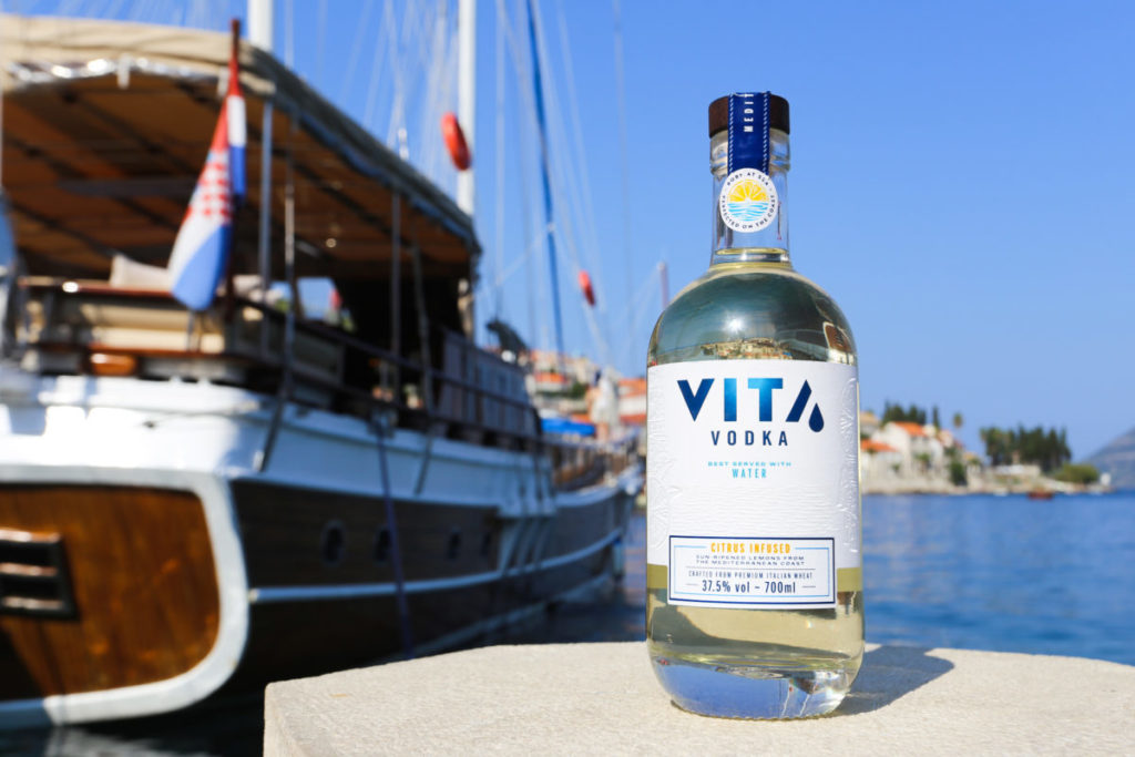
Dragon Rouge took on this challenge with the Vita team, with the aim of generating an evolved, refreshed brand identity. The revamped brand image focuses on the truly pan-Mediterranean nature of the brand, which uses Italian wheat and organic lemons from the Mediterranean coast, and is distilled in Barcelona.
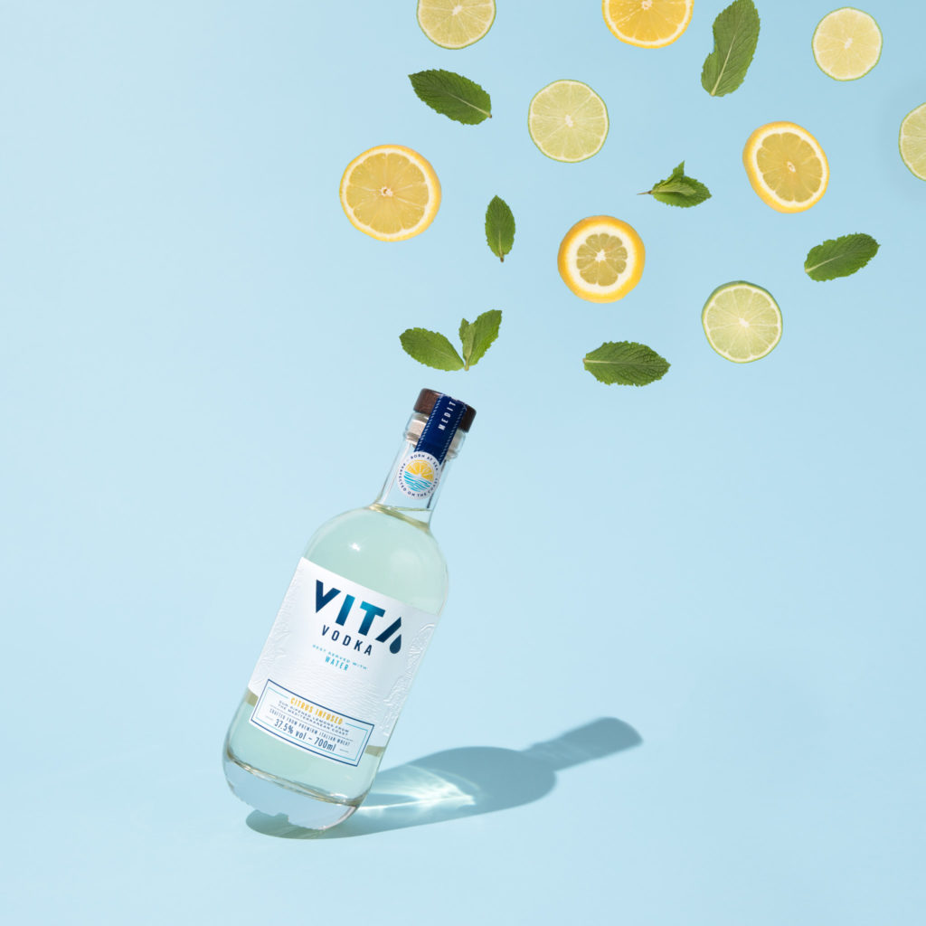
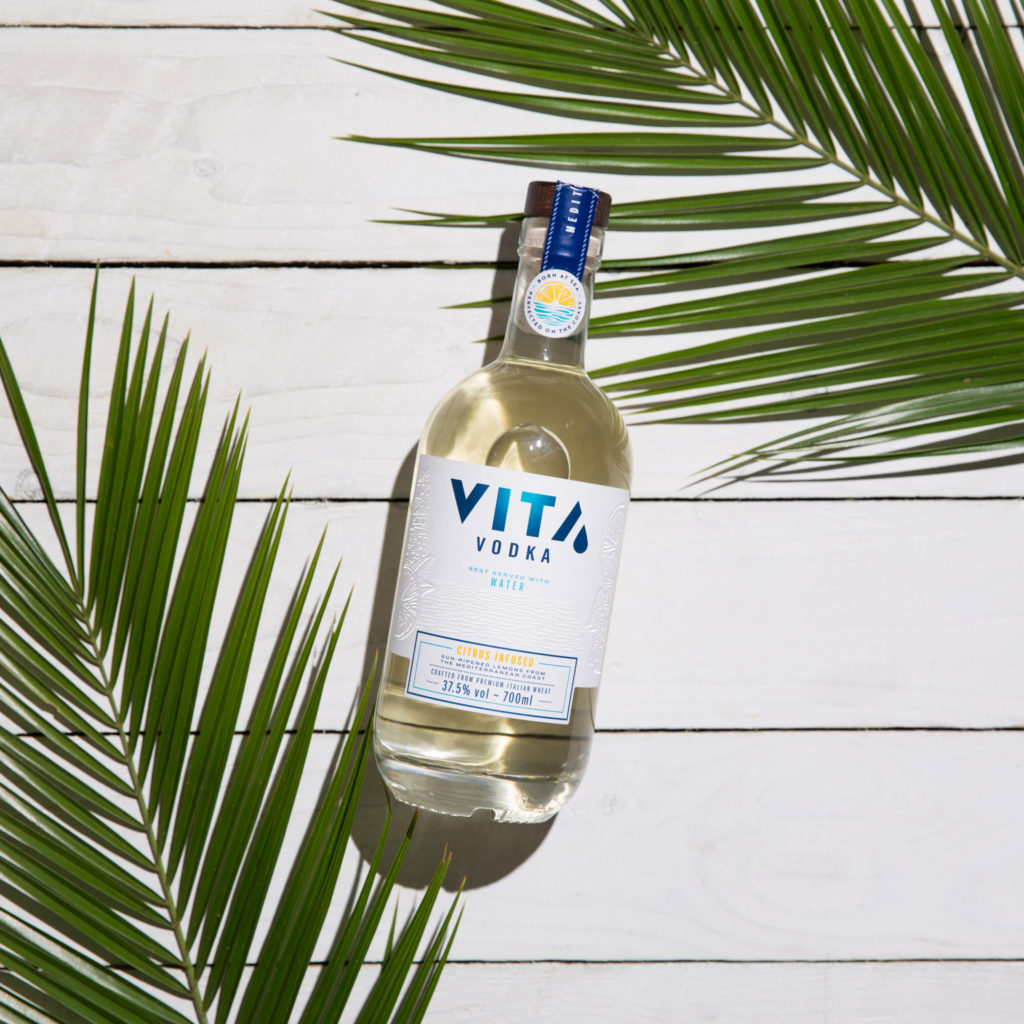
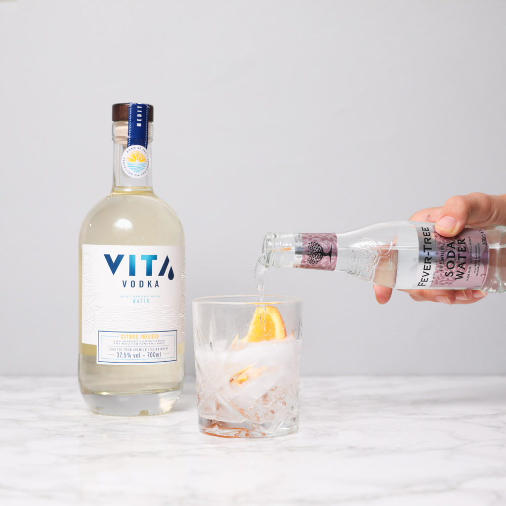
The visual elements further reflect the craft and provenance story. A new bottle structure was introduced, inspired by adjacent categories such as gin, and the substrate is transparent to celebrate the delicate colour of the liquid. The previously screened on label has been replaced by a high quality paper label, rich with embossing and varnishes to elevate the craft and authenticity story. A new neck label has been introduced that features Vita’s motto “Born at Sea, Perfected on the Coast.” Throughout the bottle there are discovery elements hidden within the illustration, neck label and back label. A fresh new blue has been used to provide a link back to the Mediterranean sea, breathing life into the reworked brand mark. These elements combined share the narrative of Vita Vodka’s inception and multi-ingredient make up, and truly reflect the spirit of the Mediterranean.
The end result is a considered evolution of the brand that allows Vita to tell its rich story and justifies its price point and unique space within the white spirits category.
Dragon Rouge London’s Creative Director, Dave Robinson said “As soon as I met Victor, I realised this was an amazing opportunity Dragon Rouge couldn’t let go of. A chance to bring Victor’s adventurous vision and rich product story to life. We shared an entrepreneurial attitude throughout the design collaboration. And so the ‘Spirit of the Mediterranean’ concept was born, encapsulated in every bottle. Pared back design, a nod to distant shores and ocean waves, hidden flavour and nautical details: all discretely there to discover for yourself. The new bottle shape has the charm of a message in a bottle, building on the brand story “born at sea, perfected on the coast”. Now the brand personality matches the uniqueness of the vodka itself, I look forward to Vita gaining even more momentum.”
Vita’s Founder Victor Ruiz Lafita said “I feel very lucky to have worked with Dragon Rouge’s team. Apart from their excellent design and creative skills, I have appreciated their personal and close approach. The Creative Director, Dave, is a very likable guy that has been fully involved and hands-on during the whole process, which has allowed to increase the flexibility in the creative process.”
Source: Dragon Rouge

You must be logged in to post a comment Login