
WMH&I has unveiled a new identity for premium vodka brand NEFT ahead of an ambitious drive to expand its customer base beyond the US and Nigeria, currently NEFT’s two biggest markets.

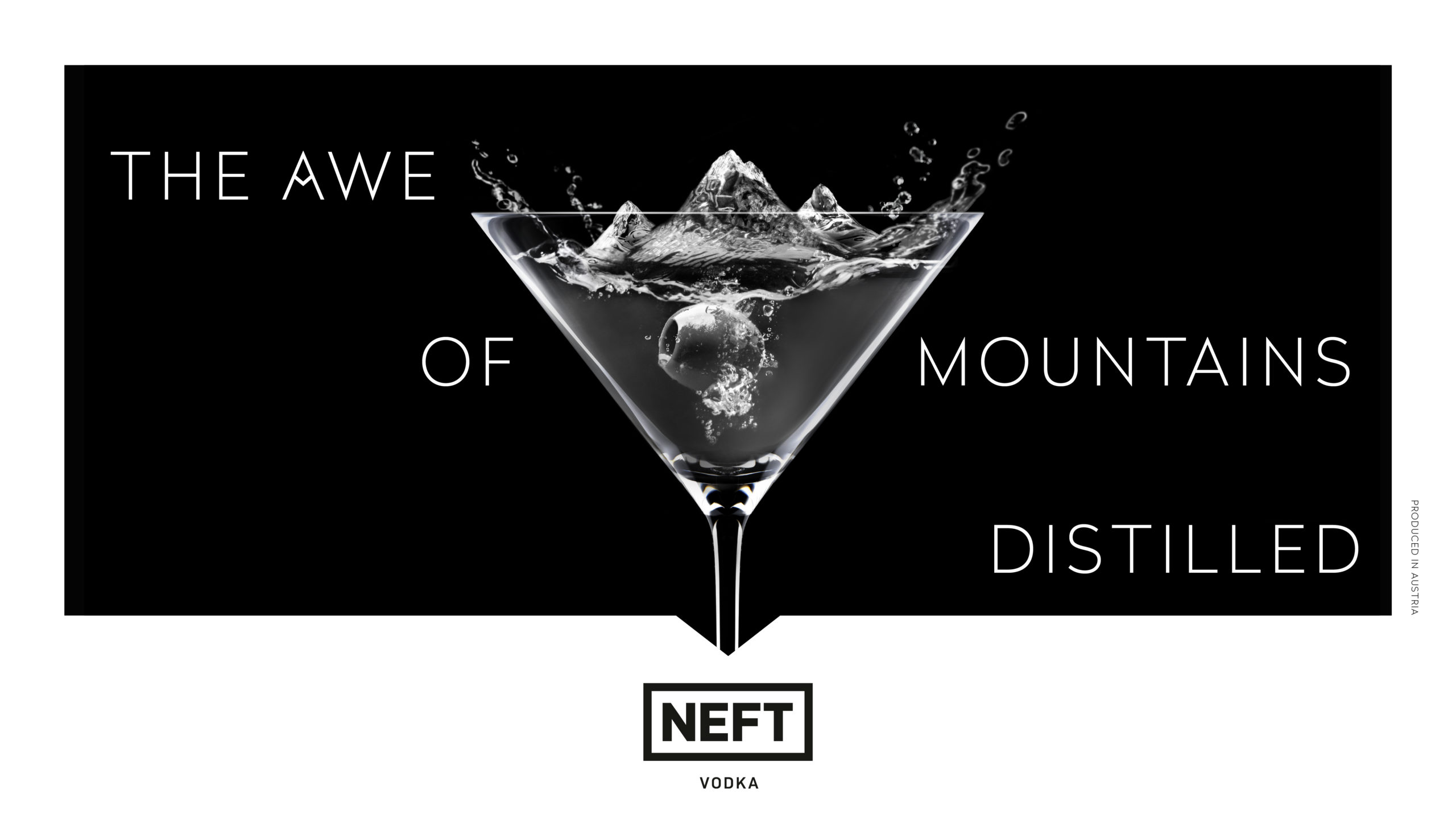
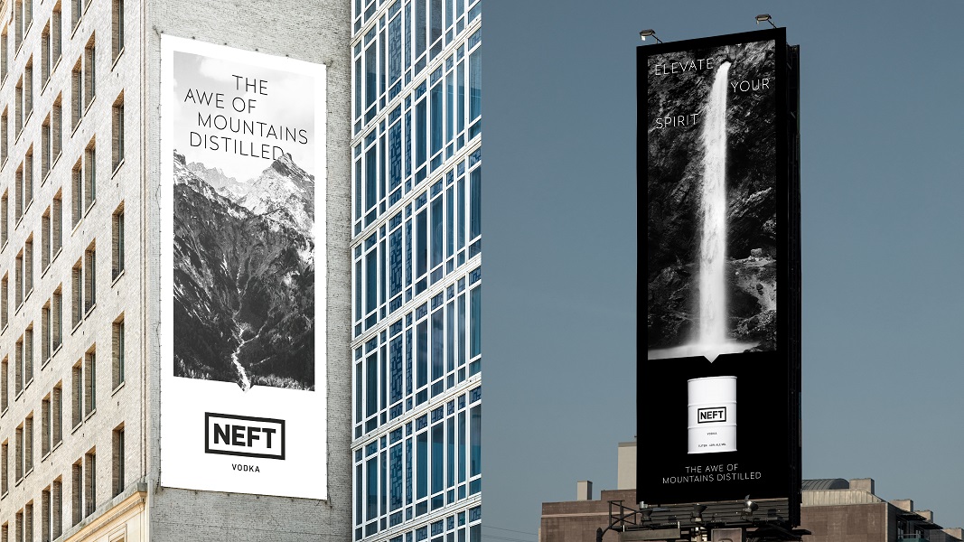
This October at London Cocktail Week, the UK will be the first market to experience NEFT’s new brand world, which is based around “The Awe of Mountains Distilled.” By telling the authentic story of NEFT’s Austrian provenance WMH&I captures the universal awe inspired by the mountains.
WMH&I was briefed to reposition and redesign the brand without altering the logo. The agency’s response was to refocus the identity and comms to create a more premium, standout message that connects NEFT with its roots in the majestic and awe-inspiring Austrian Alps.
NEFT is single distilled from four different varieties of ancient non-GMO rye grain, using water from the river Rhein that runs deep beneath the mountains. The result is a premium Alpine vodka so delicious that it can be sipped neat. Despite its premium price point, the Austrian vodka had lost its leading edge in a highly competitive sector.
WMH&I’s new brand world elevates NEFT by drawing on its provenance. The agency’s challenge was to express the majesty of the mountains in a way that resonates with the audience. The refreshed, more distinctive positioning connects the inner strength of the Alps with the entrepreneurial spirit of the aspirational target audience.
They are luxury consumers aged 30-50 across the gender spectrum, driven by an entrepreneurial energy and bold self-assurance that makes them uncompromising when it comes to quality and authenticity. To create an aspirational, gender-neutral feel, the agency has avoided the “rugged” mountain stereotypes of adventure and or extreme sports, and steered clear of snowstorms or White Snow Queens.
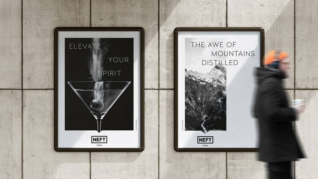
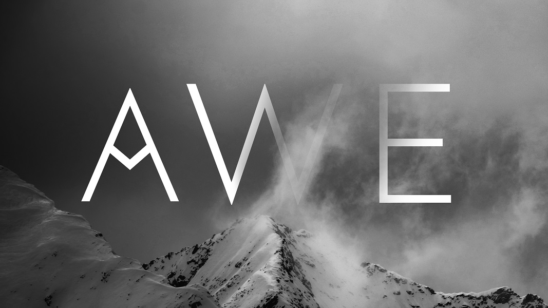
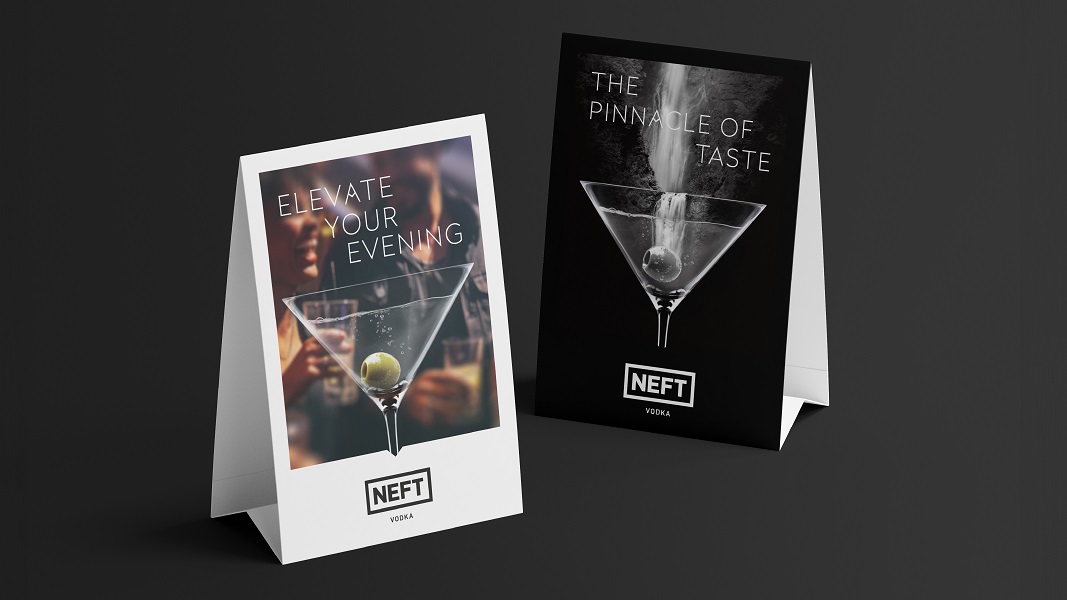
In contrast, NEFT’s new brand identity captures the quiet grandeur of the Alps. The cinematic photography dramatizes the Alpine connection. Images show expansive landscapes loaded with negative space, from out-of-the-ordinary perspectives. Whilst headlines are written as a call to action with a sense of greatness, such as “Elevate Your Spirit”, “Taste Greatness” and “Take the Night to New Heights”.
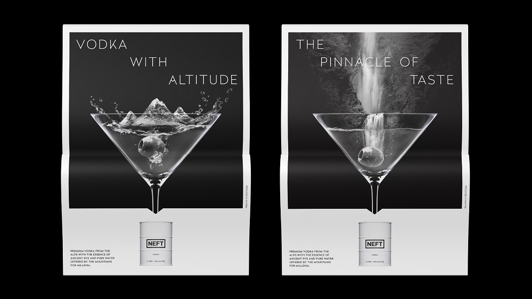
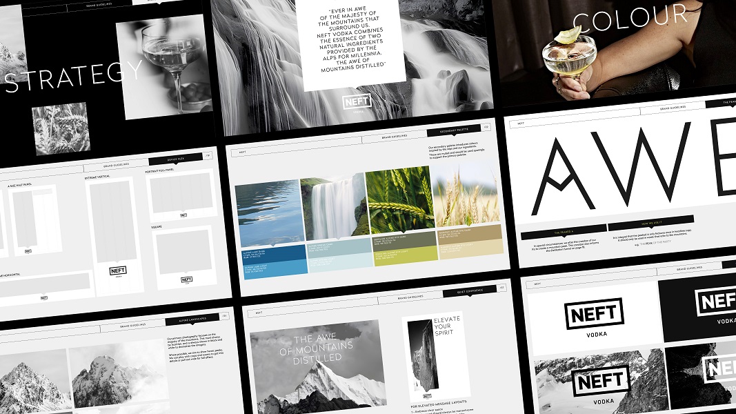
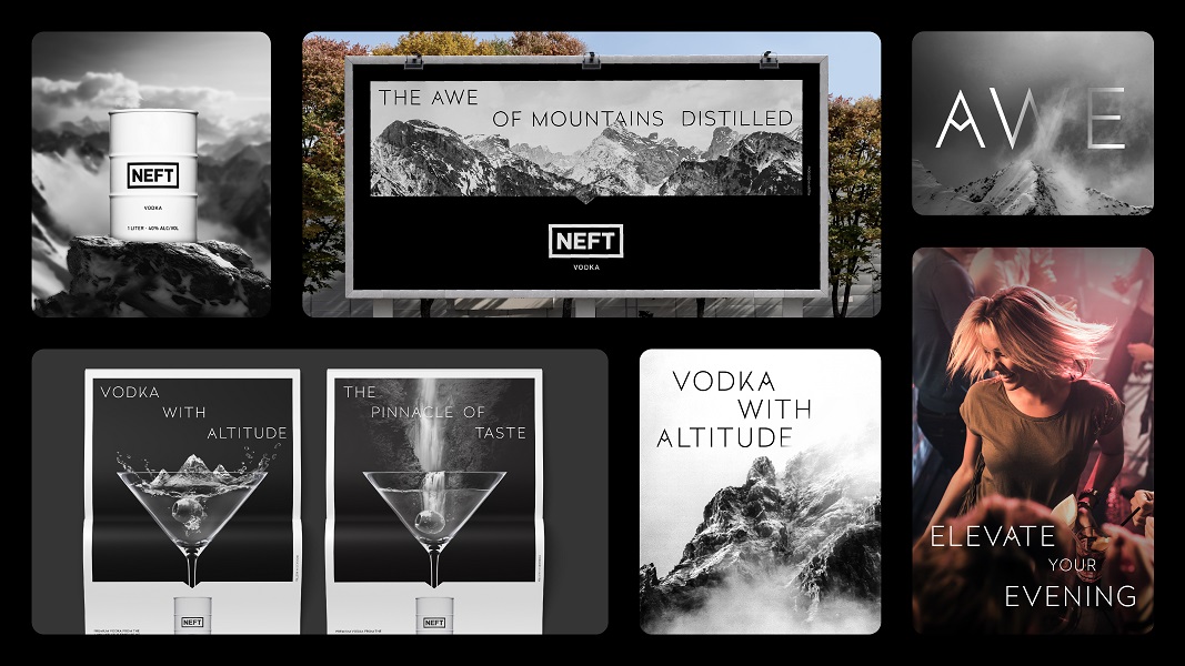
Key part of the identity system is a graphic frame device. It is inspired by the frame of the NEFT logo and is an ode to distilling the majesty of the Alps into the vodka itself. The device flexes accordingly to provide coherence across touchpoints.
The primary colour palette ranges from Alpine Glaciers White to NEFT Black, through the greys of Alpine Peaks and Crest Grey. More colour is introduced with the secondary palette, which includes shades inspired by the Alps and NEFT’s ingredients, bringing in water blues, greens, and Alpine rye.
Ekaterina Kuzmina, founder of NEFT said: “As we are based in the Austrian Alps, we are ever in awe of the majesty of the mountains that surround us. It made sense to go back to our origins and create a brand identity that is completely NEFT and aspirational.”
Mark Nichols, creative director at WMH&I said: “We anchored NEFT in its ownable brand truth; vodka from the Alps. Yet, instead of using the Alpine clichés of purity or winter sports, we build a distinctive and differentiated brand world.”
Source: WMH&I
You must be logged in to post a comment Login