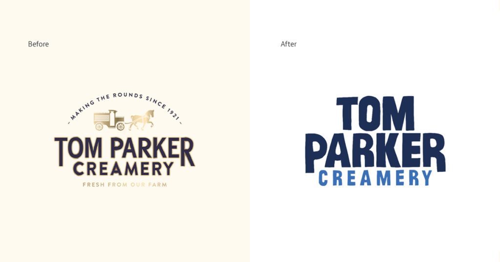
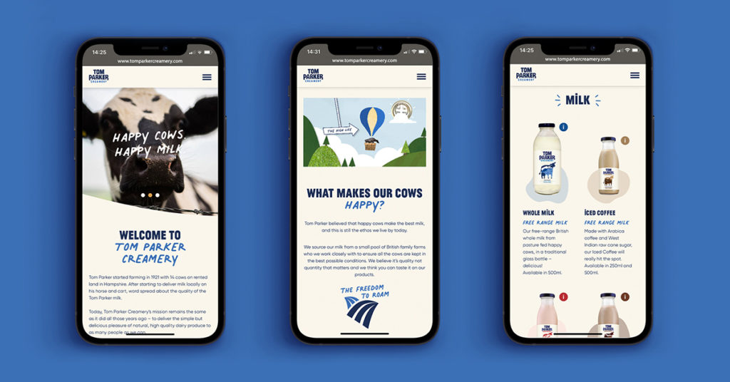
Tom Parker Creamery is shaking up the milk aisle. This family farm favourite has been producing delicious, eco-friendly milk from free-range, British cows for over a century. And how do you take a traditional dairy brand with 100 years on the clock and place it firmly on the radar of the 21st century consumer? London/Dublin based creative agency, White Bear Studio, have created a fresh, new brand, packaging, website and campaign design for these dairy disruptors.
The design team was inspired by the “businesses commitment to their cow’s welfare, their natural ingredients, and their rich heritage dating back a century”, according to Creative Director Kelly Mackenzie.
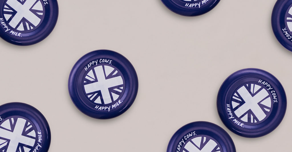
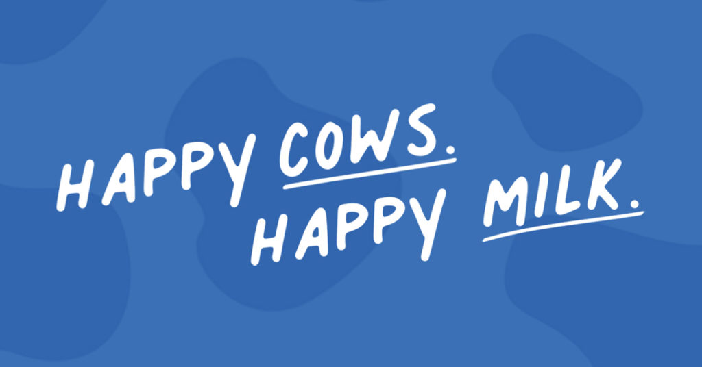
White Bear built the new brand around the proposition of ‘Happy cows. Happy milk’, doubling down on a key differentiator for Tom Parker – how they treat their cows. From free roaming, to music in their parlours, to having their backs scratched, Tom Parker wants their cows to be happy.
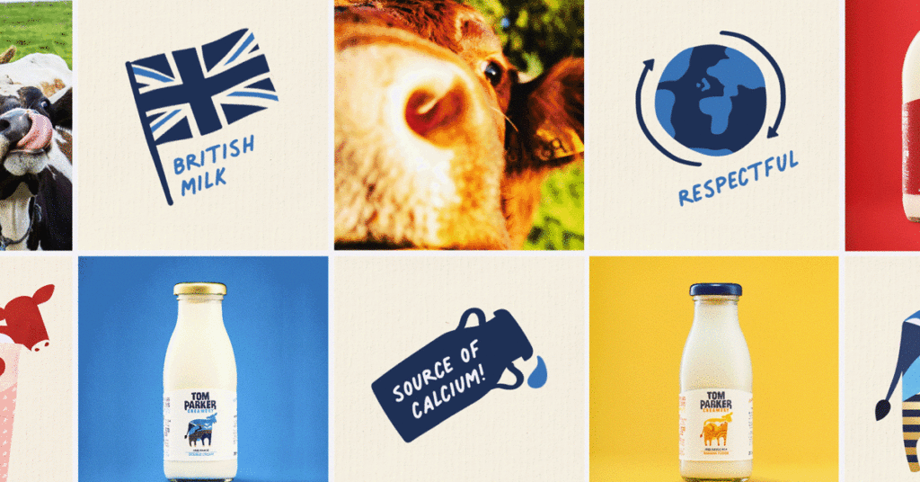
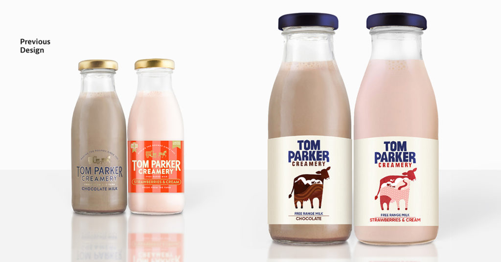
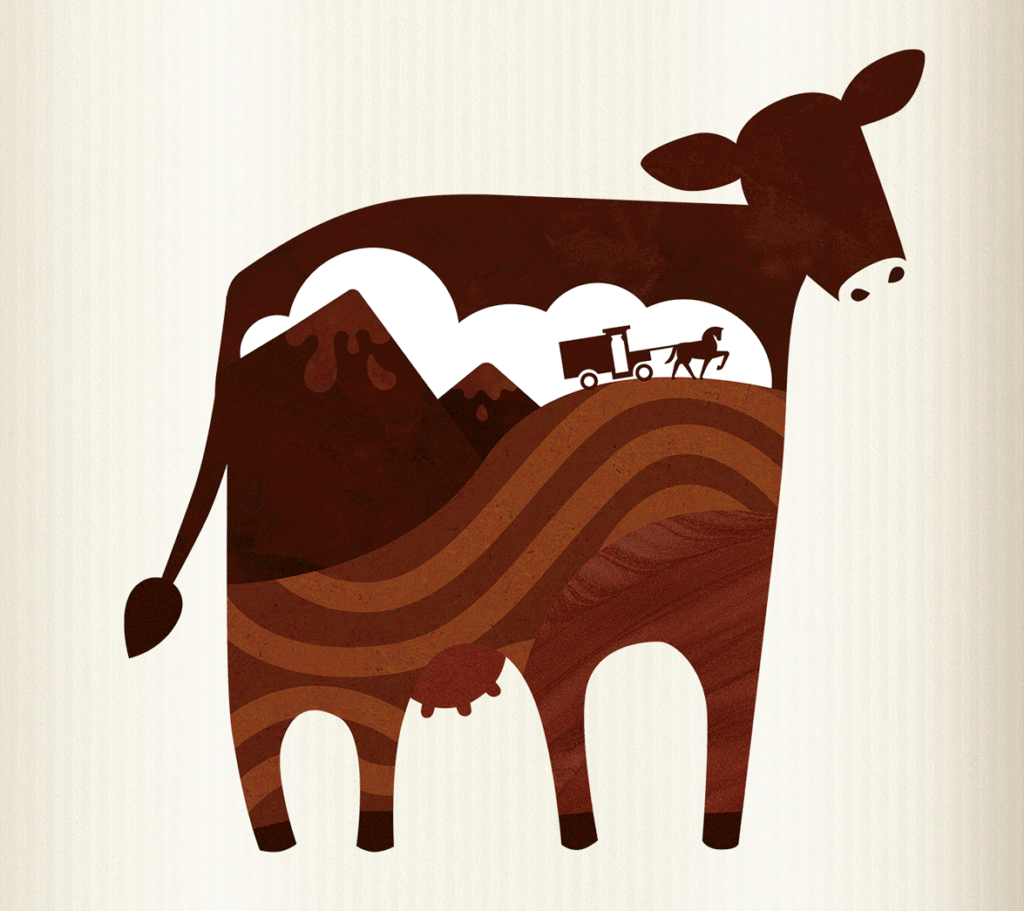
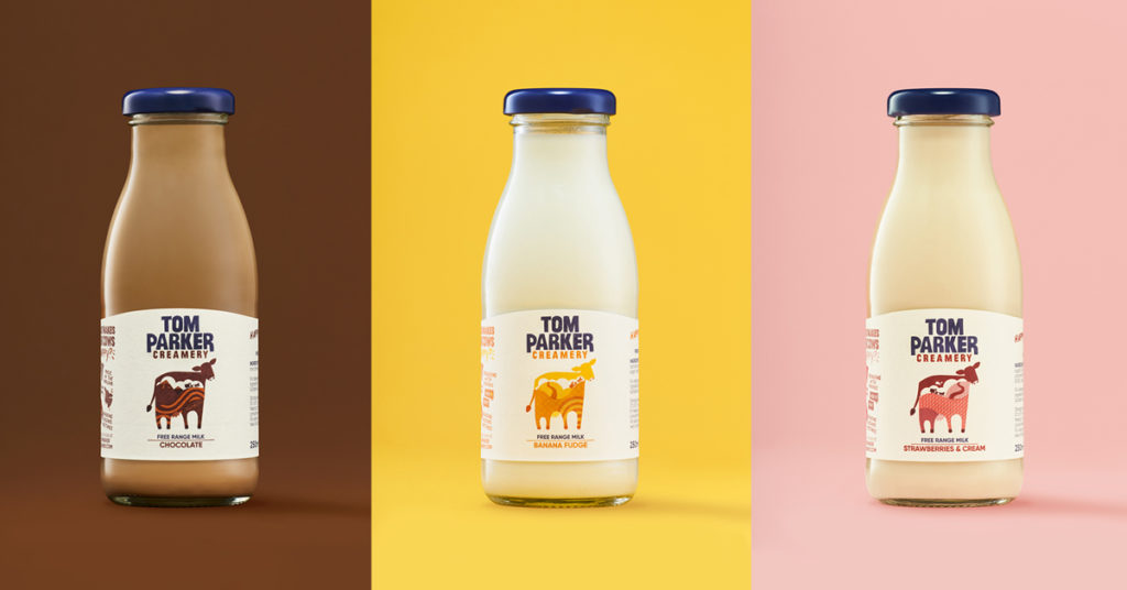
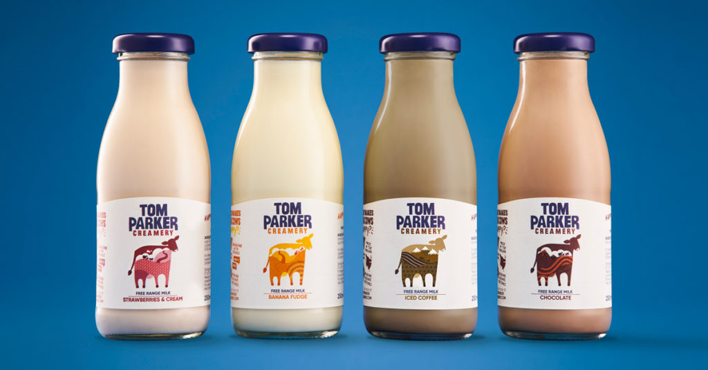
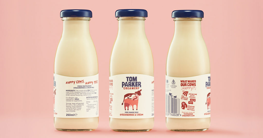
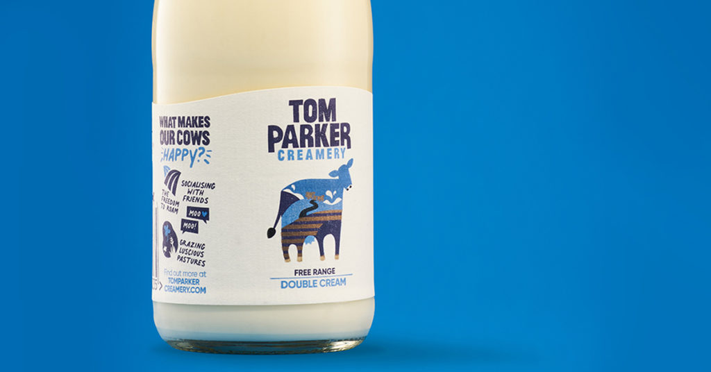
The new packaging heroes ‘the girls’ front and centre. Within their curvy, bovine outlines, every illustration speaks to the lush, wild landscapes which these ladies call home while hinting at their yummy natural flavoured ingredients too. The soft, sweet colour palette of strawberry, banana fudge, chocolate and more gives you a taste of the creamy goodness before you’ve even opened the bottle. Combined, these elements tell the story of happy cows, delicious flavour cues and tasty textures to complete the dairy-tale. When we take a closer look into the rich landscapes of every flavour Tom Parker can still be found delivering milk door to door in his 1920’s horse and cart, making sure we still firmly nod to the past while setting us up for scale for the future.
Back of pack also carries significant brand story elements – where iconography tells the story of the ‘Happy Cows’, and the glass packaging, and fully recyclable lids and labels, underpins the brands commitment to sustainability.
The results are loud and clear. Post-launch, their listings increased by 40% overnight. The rebrand successfully launched on the Milk & More platform and in Sainsburys stores with rocketing demand.
“Our re-brand has been a true partnership, unlike a lot of agencies, they totally understood the brief and really listened to our feedback, however they weren’t afraid to challenge our way of thinking.
The results speak for themselves – a bold new look which has shelf shout, a nod to our heritage and broad appeal. We couldn’t be happier!” Rob Yates Managing Director
Source: White Bear Studio

You must be logged in to post a comment Login