 ButterflyCannon has redesigned the packaging for Glenmorangie Signet. This iconic single malt draws upon 170 years of wisdom and craft to create a velvety smooth, rich and complex whisky.
Glenmorangie Signet is a multi-award winning expression in the Glenmorangie range of single malts. The challenge was to effectively communicate Signet’s unique provenance and product story to consumers.
Jon Davies, Creative Director, ButterflyCannon, says ”Good packaging clearly communicates what it contains, great packaging should evoke the product and brand story in a way that seems effortless. Signet represents a timeless masterpiece, representing the harmony of man working with the land over hundreds of years. This story was the key to unlocking the packaging design.”
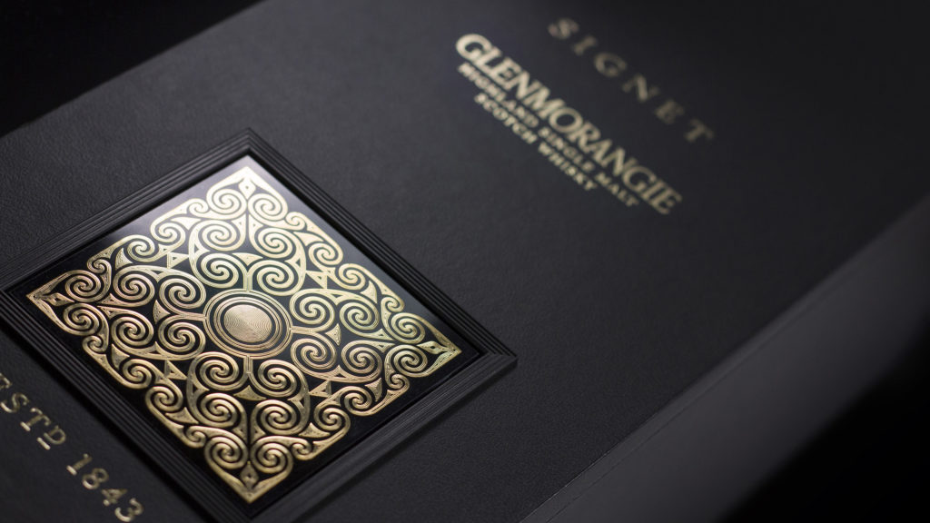
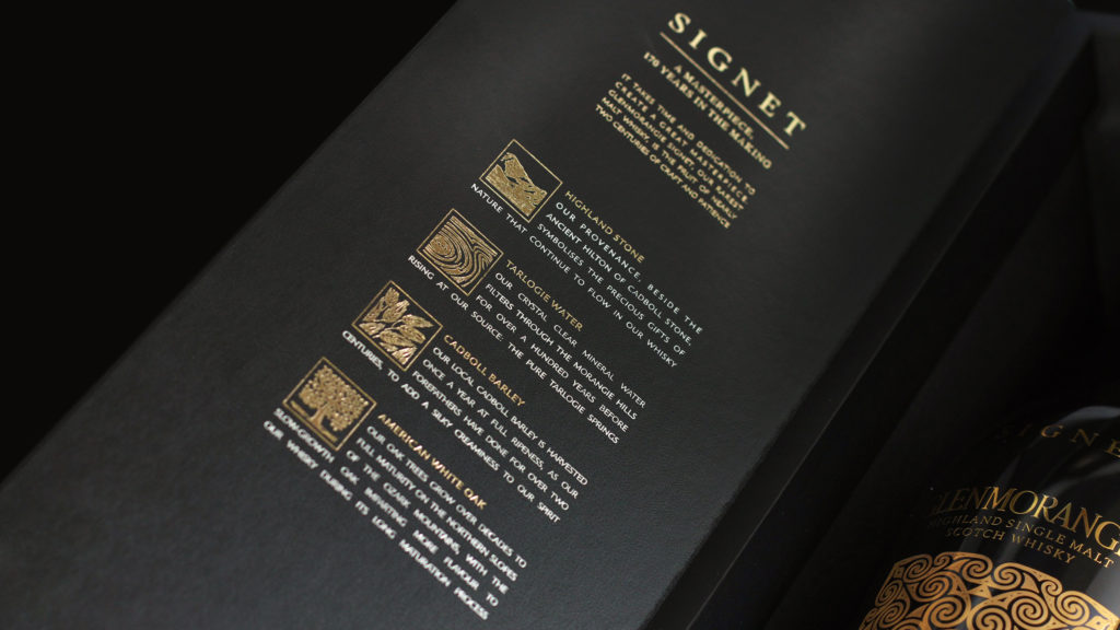
 A rigid board box with a seamless, frontwards opening door, allowing Signet’s iconic bottle to be showcased in the way it deserves, is wrapped in a matt black, soft touch Skivertex Matara stock from Winter and Company, inspired by the richness and smoothness of the liquid within. Whilst inside the pack, bespoke illustrations were commissioned to communicate the liquid’s sophisticated provenance in a timeless, pared back way.
 Glenmorangie’s iconic Signet was given special attention on the pack. Rich with layers of intricate detail, the Signet was printed onto a ceramic tile, giving it a cold, crisp tactile quality that evokes the pure spring water that the whisky is made from.
 Mike Atkinson, Global Marketing Manager for Glenmorangie adds, “a whisky of such outstanding quality which has had this much time, care and attention lavished on it deserves packaging to match. Just like Signet itself, it’s the many subtly crafted individual elements in ButterflyCannon’s design that combine to create an extraordinarily well thought out and impactful piece of packaging, fitting of this unique expression.”

You must be logged in to post a comment Login