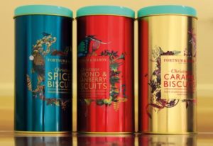
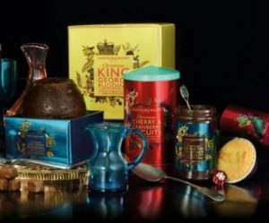
 Fortnum & Mason has rolled out its 2015 Christmas packaging designed by Design Bridge and illustrator Kristjana Williams.
The agency worked on the visual identity across the brand’s range of Christmas products, and was tasked with capturing the feeling of the festive season, and to reflect Fortnum & Mason’s positioning as the Christmas destination of choice for both Londoners and visitors from other parts of the country.
Design Bridge worked with Williams to create a series of illustrated frames for the packaging to unite all items in the range and this year’s Fortnum & Mason in-store Christmas experience.
 Symbols from the Christmas carol ‘The Twelve Days of Christmas’ feature in the design, as well as exotic birds, butterflies and woodland animals.
Chloe Templeman, design director at Design Bridge said: “We wanted to conjure all of the sumptuous tastes, smells and colourful sights of a bountiful Christmas feast with all the trimmings. Our designs centre around a square frame, like a Christmas table at home, with an array of vibrant and intricate illustrations bursting from within. Each frame is a lively assortment of illustrations including some of Fortnum’s favourite seasonal delicacies, fruits, berries and signature candlesticks and toy soldiers, that together create a mood of joyful celebration and festive cheerfulness.”
Design Bridge also created the tone of voice and copywriting for the range.

You must be logged in to post a comment Login