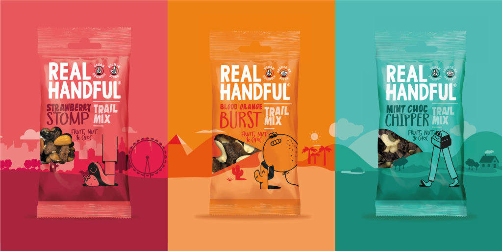
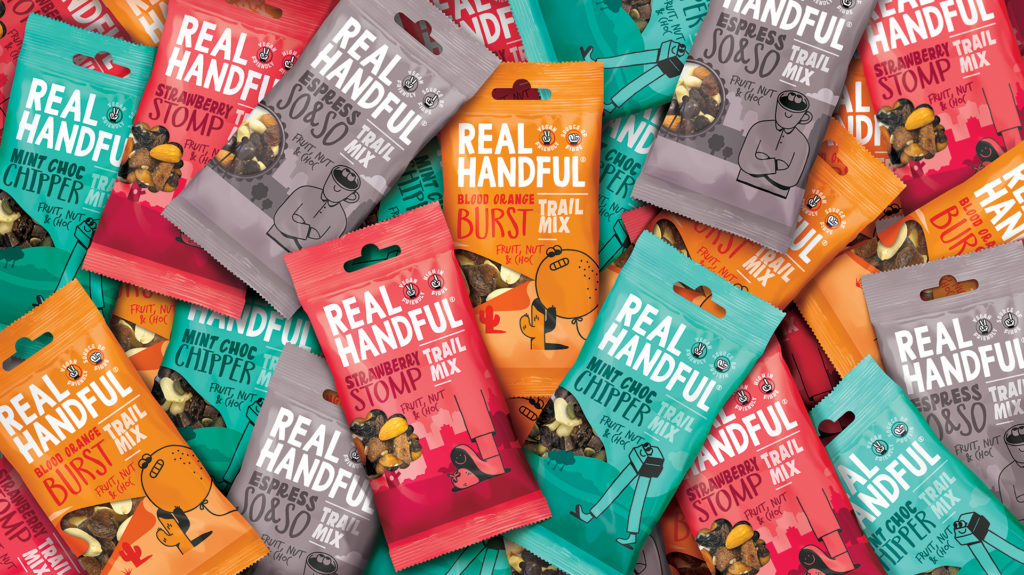
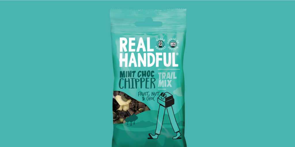
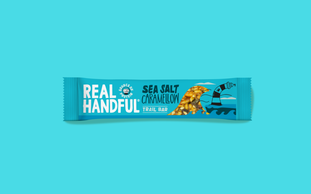
Real Handful, the successful healthier snacking start up, has this month, unveiled new packaging for its trail mix and protein bars with strategy and design by brand consultancy Brandon.
The design features on the brand’s new website and is being rolled out across its existing ranges over the next few months and into 2021.
Brand vs. Benefits
Real Handful is a brand with bags of personality and its bold design stood out amongst several ‘worthy and beige’ brands in the healthier snacking space. While the packaging design had served Real Handful well in terms of establishing the brand personality and gaining distribution, it had rapidly become clear that introducing Real Handful’s ‘Trail Mix’ inspired snacks to new consumers required much clearer communication of the snacks’ benefits.
Consumers were finding it difficult to navigate and understand the role of the brand’s range on shelf in an extremely competitive category, so Real Handful commissioned Brandon to evolve the brand identity and messaging on pack to encourage purchase and enable future growth.
Joe Taylor, Co-Founder at Real Handful, says:
“Real Handful exists to provide snackers with a healthier range of snacks that don’t compromise on taste. Our bars and trail mixes celebrate the awesome and unruly flavour possibilities of natural fruits, nuts and seeds, but we recognised that as a relatively unknown format in the UK, people may not know the natural functionality and benefits of trail mix. We loved Brandon’s ‘All Hail the Trail’ reframing of our brand proposition, creating a space that we could truly own.”
Emma Wilson, Account Director at Brandon, adds:
“Throughout the project we were keen to dial up the product benefits while ensuring that the heart and soul of the brand wasn’t lost; which isn’t easy on such a small pack format! All Hail the Trail is truly authentic to both product and brand with its bold and celebratory personality.
“Working collaboratively with Joe and Carly, we established the correct pack hierarchy for brand, flavour, range, descriptor and benefit, and which messages were the most motivating to their consumer.”
Steve Conchie, Creative Director at Brandon, continues:
“To increase differentiation between SKUs and aid consumer navigation, we retained the existing variant illustrations but added a suite of landscape backdrops to allow the characters to live within their own environments. The mountain, desert and city landscapes also hint at the great outdoors and the origin of trail mix to help establish a connection and ownability of the category.
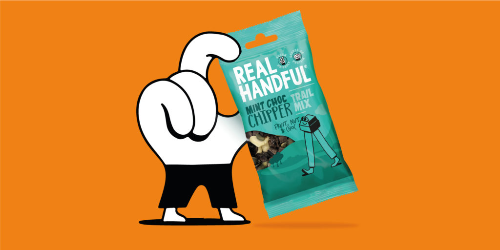
“Using the Real Handful hand icon, we also brought product benefits and nutritional claims, such as ‘vegan friendly’ and ‘gluten free’, to the front of pack to provide consumers with the information they want at a glance.”
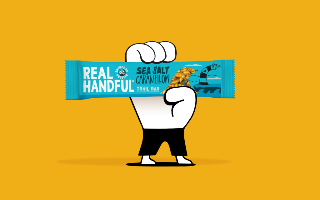
Brandon has also incorporated a window into the backdrop’s design on the trail mix and added a product shot to the bars in a ‘Real Handful’ way to dial up flavour cues and appetite appeal. As the brand launches into savoury, photography is also used on pack to differentiate between the existing sweet mixes.
Joe Taylor concludes:
“We’ve enjoyed working with the Brandon team throughout this project and found them very supportive. Their work has given us a solid platform to take Real Handful and ‘Trail Mix’ to the masses while also enabling innovation within the range. As a smaller company, we’ve also hugely appreciated the completeness of the project handover with Brandon which has provided us with all the assets we’ve needed to communicate the evolution of the brand with our trade partners. We’re very excited to see this refresh rollout across our range in the coming months.”
Source: Brandon

You must be logged in to post a comment Login