Pearlfisher’s evolution of the master brand – and creation of a new world of design assets and touchpoints – is framing a new future for Middle Eastern food processing company and confectionery icon, Gandour.
A family brand, steeped in history since its inception in Beirut in 1857 – and a pioneering innovator continually boosting its diverse portfolio of sub-brands, Gandour was looking to strengthen its master brand to help future development and expansion plans. Describing the creative approach, Design Director, Rich Wilson, said, “We needed to devise a creative strategy to leverage the emotion at the heart of the brand and create a unique platform for activation across the brand portfolio. We did this by bringing together Gandour’s foundational values: its history, its operational expertise and its human side.
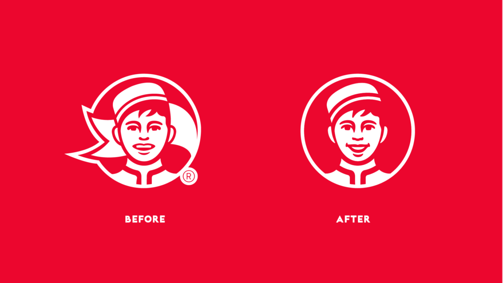
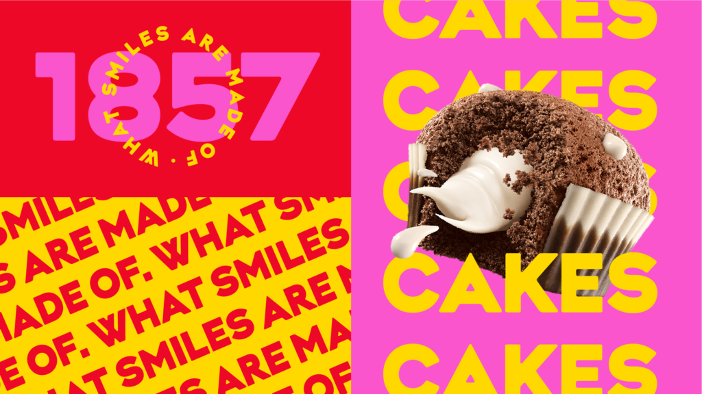
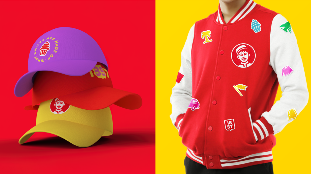
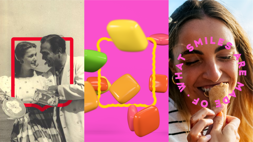
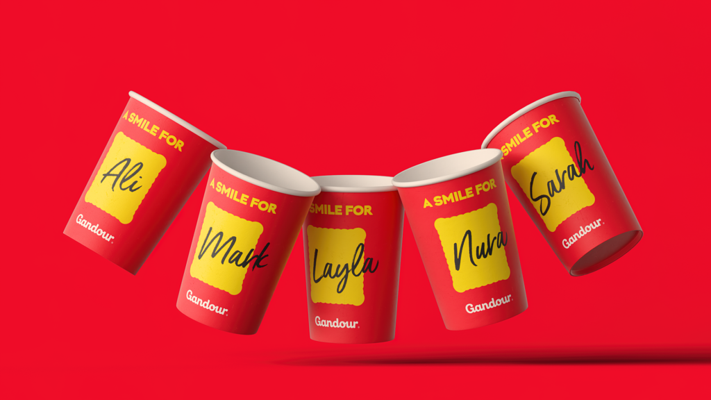
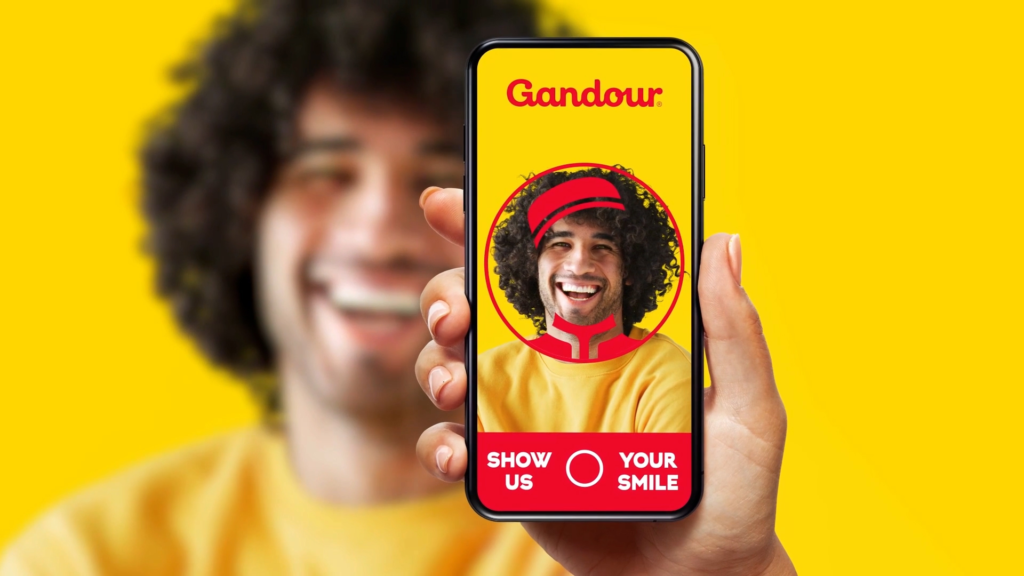
For Gandour’s iconic logo, we evolved the bellboy’s face to inject a more joyful personality and enhance the genuine nature and generosity of his smile; mirroring this in the creation of a more naturalistic and fluid wordmark. The new tagline – What smiles are made of – is rooted in Gandour’s approach and mission to making people smile with its products and offers. We also created modern, stand-out frames that can be used in a multitude of different ways, across all corporate and consumer touchpoints to frame products, social media, photography and moments in life that conjure up the wider world and rich heritage of Gandour.”


Rafic Ghandour, Managing Director at Gandour,
“A smile is a universal symbol of connection and emotion and how Pearlfisher has now framed our smile and our values will connect with each and every member of our different audiences and speak to the different moments in life that we pride ourselves in catering for. We’re excited to be heading into the next chapter for the brand with a fresh, new look – that makes us smile.”
Source: Pearlfisher

You must be logged in to post a comment Login