A STORM IS COMING
For people in the brewing industry Timothy Taylor’s stands at the top of both brewing quality and expertise. “People will travel miles for a pint of Timothy Taylor’s” and it’s true. The brewery has respect from peers and passion from drinkers. The brief was to create the same desire in younger drinkers without creating ‘yet another craft beer’.
WEATHER WARNING
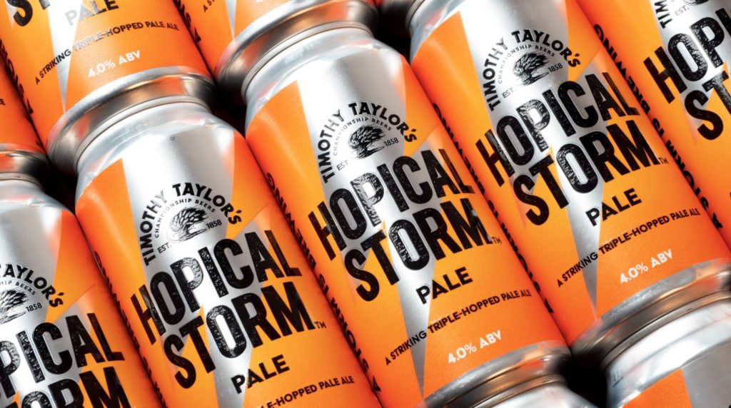
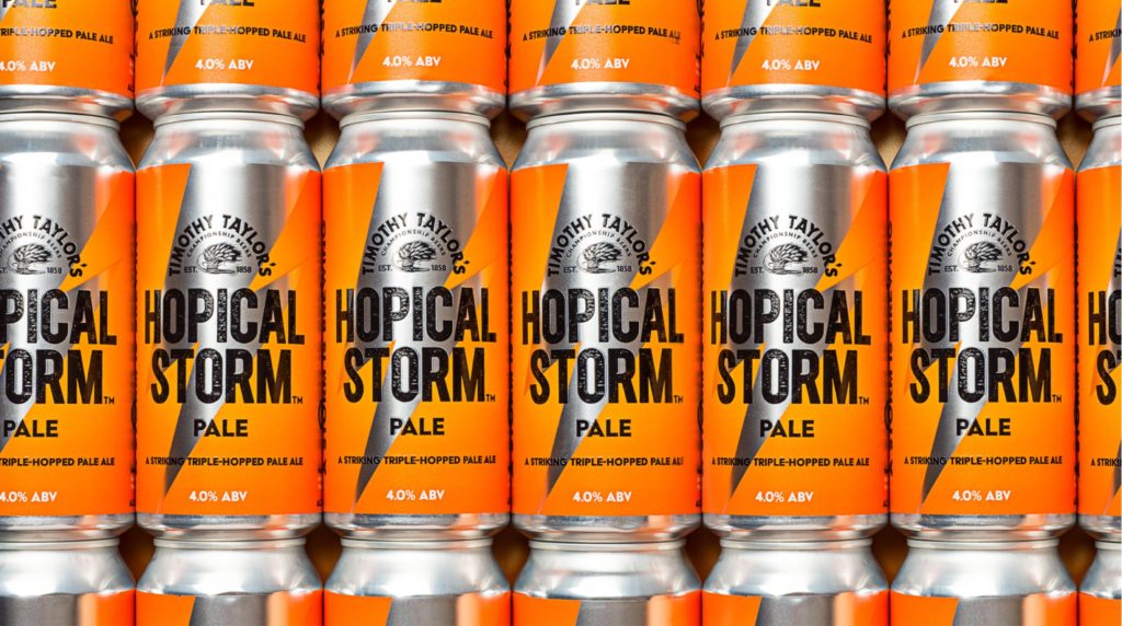
The master brewers unleashed a triple-hopped pale ale, a cyclone of tropical refreshment with flavours of mandarin, mango and passion-fruit. The brand had to be confident on both bar and shelf to attract a younger drinker to the Timothy Taylor’s brand and grab the interest of their core drinker. The colour orange was inspired by the flavour profile of mandarin and mango, but also a colour strongly associated with warnings and storms. We designed a single lightning strike icon to represent the ‘HS’ of Hopical Storm but also to symbolise a hit of taste. The Timothy Taylor’s Golden Promise Barley icon was also hit and re-crafted to appear blown in the storm. We created the brands tone of voice to reflect the name with ‘a storm is brewing’ ‘strike thirst’ and ‘a strikingly triple hopped pale ale’.
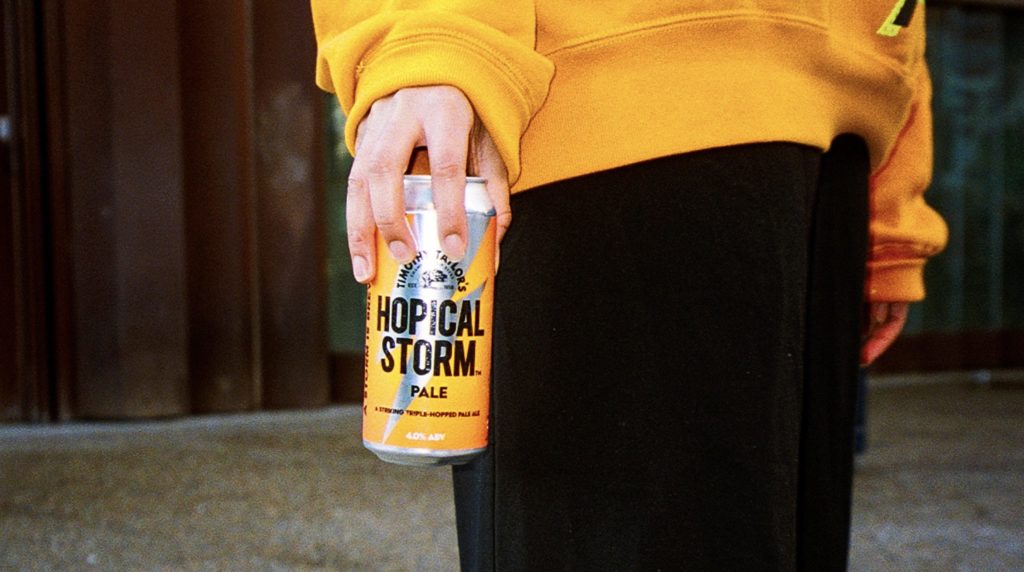
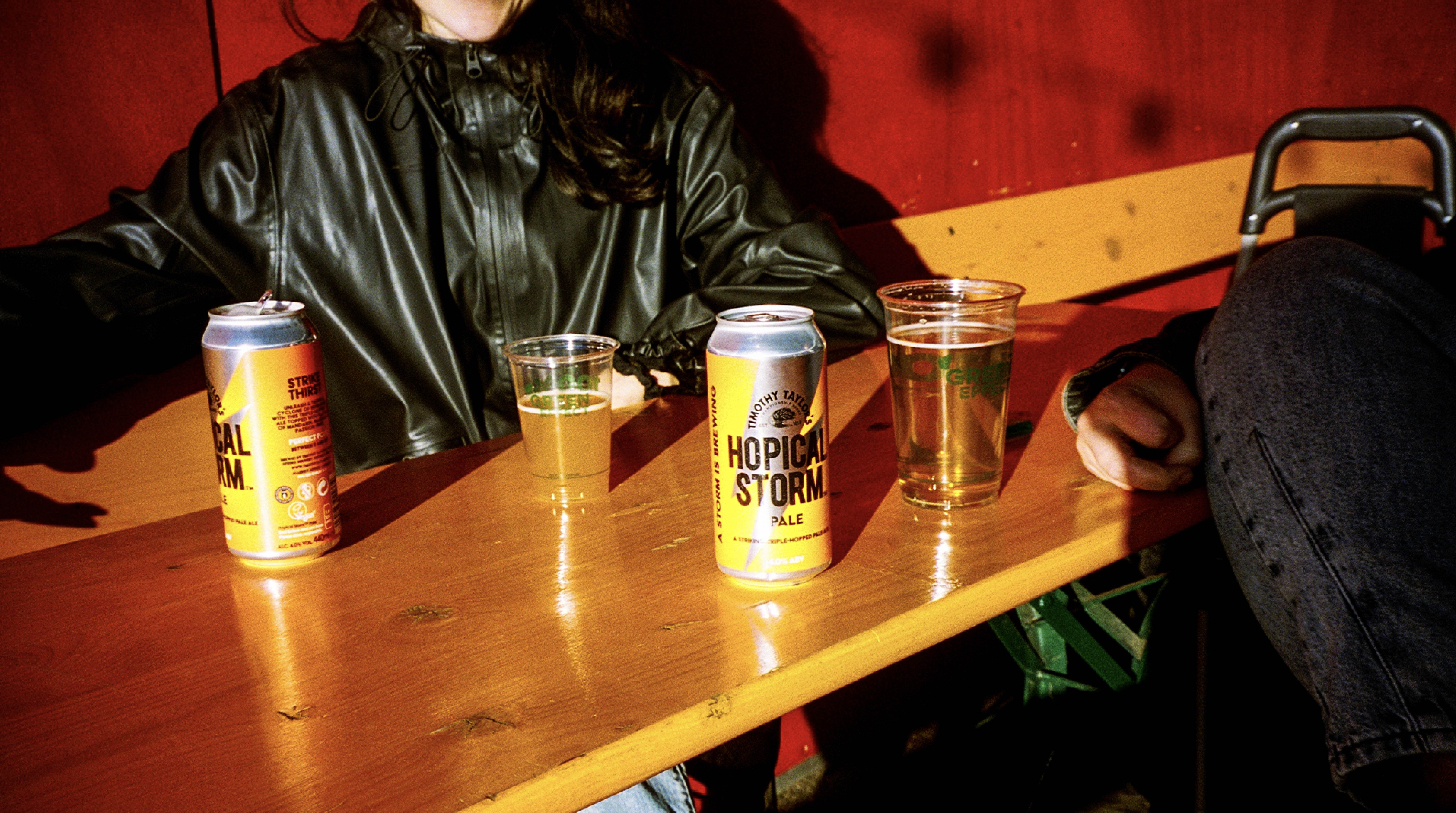
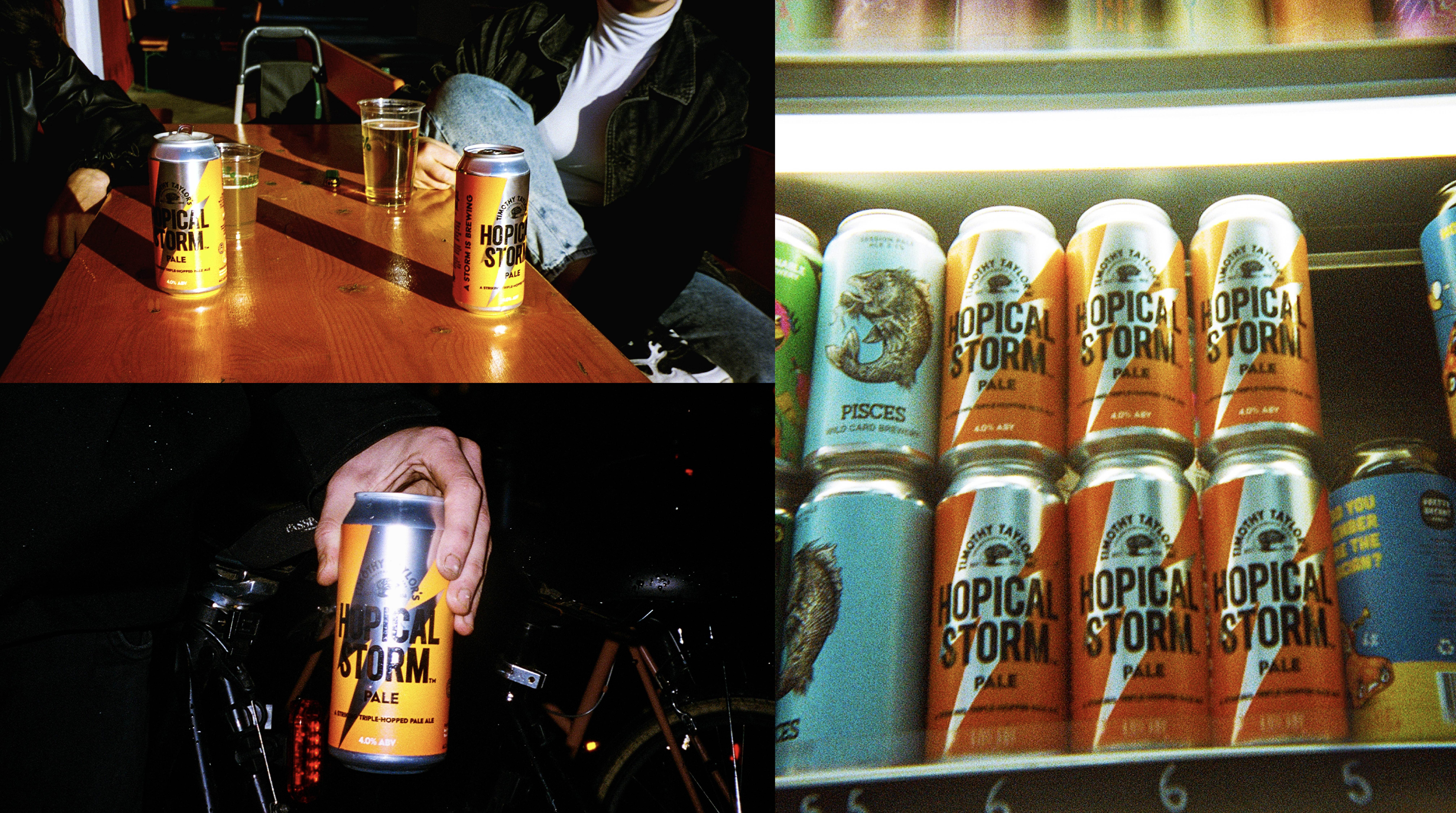
Jane Jenkins, Head of Marketing at Timothy Taylor’s Brewery, said: “ The results have been amazing with a national spread of on trade outlets stocking the keg product and Punch pub group reporting back that it was their most successful ‘craft tap’ promotion last summer. Praise indeed as the ‘modern pale’ keg segment of the beer market is fiercely competitive. New branding will be rolled into the on-trade spring 2023 ahead of ‘The storm has landed’ advertising and promotional activity to raise awareness and support the drive for more stockists. Success has been achieved in the off trade also with listings for the 440ml can secured in Waitrose and Sainsbury’s from March and Morrisons from July”
Credits: Springetts Brand Design
Source: Hopical Storm

You must be logged in to post a comment Login