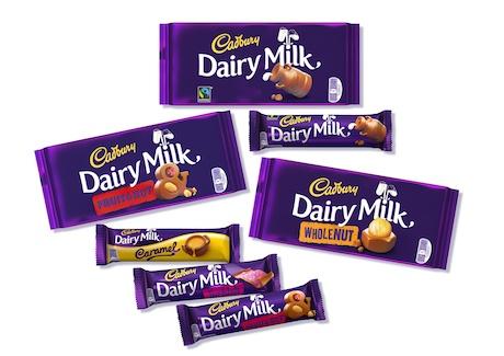
 Cadbury is to introduce what it claims is a more “accessible” look to the packaging for its flagship Dairy Milk brand in an attempt to bring the product closer to the “informal” tone of its marketing.
The makeover, the 23rd in the brand’s 108-year history, introduces brighter colours and lower-case font to give the packaging more prominence on-shelf. It retains the “Cadbury Glass and a Half” logo, but has swapped the chocolate shots with images of each flavour after claiming rivals had copied the styling.
A QR code will also be included on each pack allowing customers to access video content when scanned.
Matthew Williams, Cadbury marketing director at Mondelez International told Marketing Week, the move was born out of a need to make the chocolate’s packaging less “traditional”.
He adds: “We noticed during our research that customers felt there was a disconnect between the fun and inclusive brand they were seeing on TV and what they were seeing on packs. The last redesign we did was in 2008 and what we’ve tried to do now is arrive at a design that better expressed our brand personality of being generous but is also more ownable for us.”
The packaging is being rolled out to stores nationwide over the coming weeks with Cadbury Dairy Milk, Cadbury Dairy Milk Whole Nut & Cadbury Dairy Milk Fruit and Nut the first to hit shelves. It will then be extended to the brand’s wider range alongside a roll out to other global markets.
The UK launch is to be supported by activity across the brand’s Facebook, Twitter and Google+ profiles to gauge feedback. The designs are set to appear in Dairy Milk’s first advertising campaign of 2014 as the chocolate maker looks to drum up interest ahead of the crucial Easter period.
It comes just weeks after the UK Court of Appeal ruled Nestle and any other sweet maker can sell chocolate products using the same colour purple used on packaging for Cadbury’s Dairy Milk. While “disappointed” with the decision, Williams says the makeover will reinforce the Dairy Milk brand’s association to the colour in the eyes of consumers.
“[The redesign] has taken over 18 months to complete so its not really connected to the ruling. We’ve tried to come up with a better way to express our brand personality thorough the packaging in a way that’s more ownable for us – there are aspects of the design that we’ve been doing for years and therefore competition has copied us.”, he adds.

You must be logged in to post a comment Login