The Prisoner briefed Co-Partnership to elevate low alcohol wine category perceptions with an intriguing low alcohol white wine to appeal to luxury wine drinkers seeking moderation—a design to break the mould and deliver the disruptive edge the brand is known for.
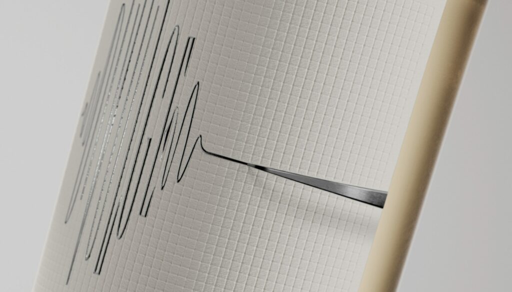
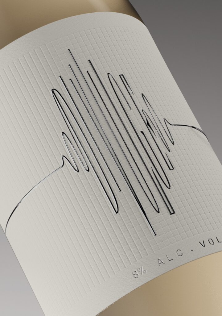
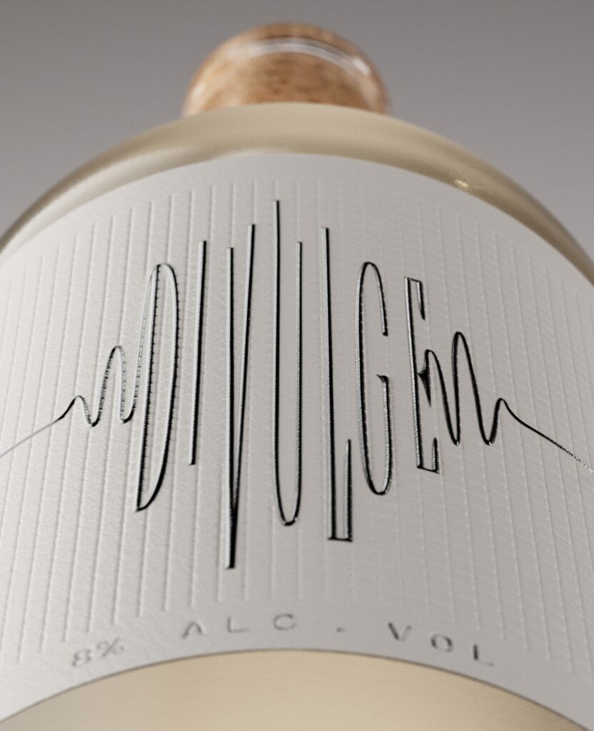
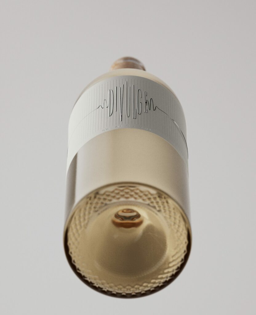
The wine name Divulge means to ‘reveal’ and informs the concept of this low alcohol wine that’s more than it seems. The design uses a polygraph as a dark, gritty visual metaphor for reveal—the label depicts a needle sketching out the erratic line of a heartbeat in silver ink, but tilt the bottle to look from another perspective and the wine’s name is divulged.
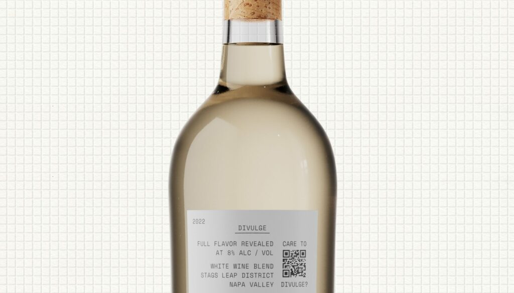
Print finishes reinforce the creative concept. Debossed stock mimics polygraph paper. Typography printed in silver foil elevates the pack’s luxury feel and drives white wine taste appeal. An exposed cork speaks to reveal.
From product to design, the consumer experience of Divulge is one of discovery—learning that this low alcohol wine sourced from Stags Leap District of Napa Valley has all the flavour and quality of a full-strength luxury offering from The Prisoner, and interacting with Co-Partnership’s label design that’s more than meets the eye.
“The attention and interaction that this packaging receives from consumers is exciting to see for the brand – and the super premium execution reinforces the standard of quality TPWC fans have come to expect.”
Max Harkness, Creative Director
Source: Co-Partnership

You must be logged in to post a comment Login