
Wild Lady Eggs set out to redefine expectations within a traditionally functional category by introducing a premium egg brand rooted in provenance, animal welfare, and sustainability. The challenge was to create a distinctive product and packaging system from scratch that could command attention in farm shop environments while elevating eggs into a considered, gift-worthy purchase.
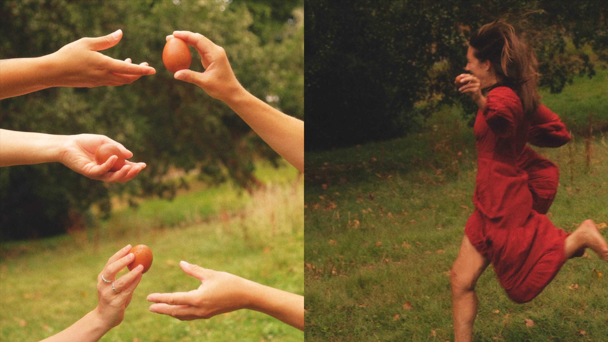
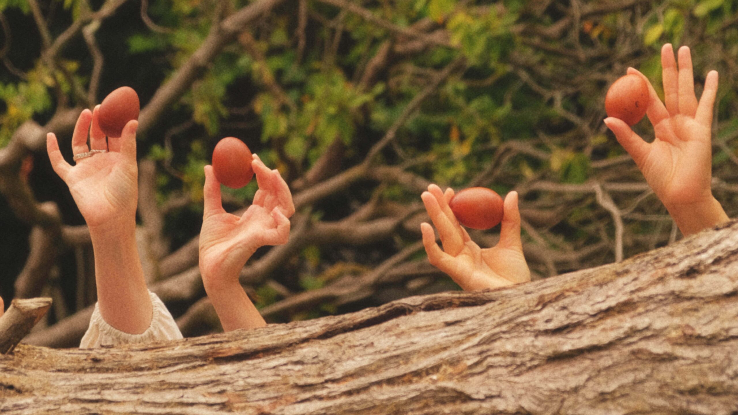
At the heart of the brand are the Wild Lady hens, which roam freely within a woodland habitat, producing eggs of exceptional visual and culinary quality. We translated this into a packaging concept that celebrates both origin and experience positioning the product not simply as eggs, but as a rare, nature-led indulgence.
The creative ambition was to create something “wildly different” from the rustic sameness of the category, moving beyond craft clichés to deliver a premium, story-led identity with strong shelf distinction.
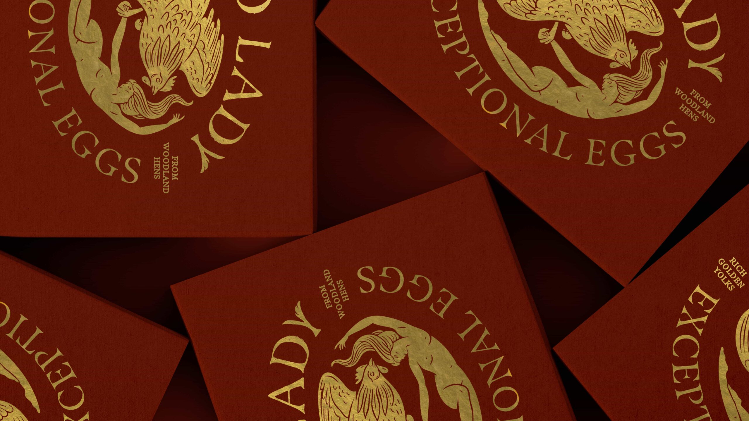
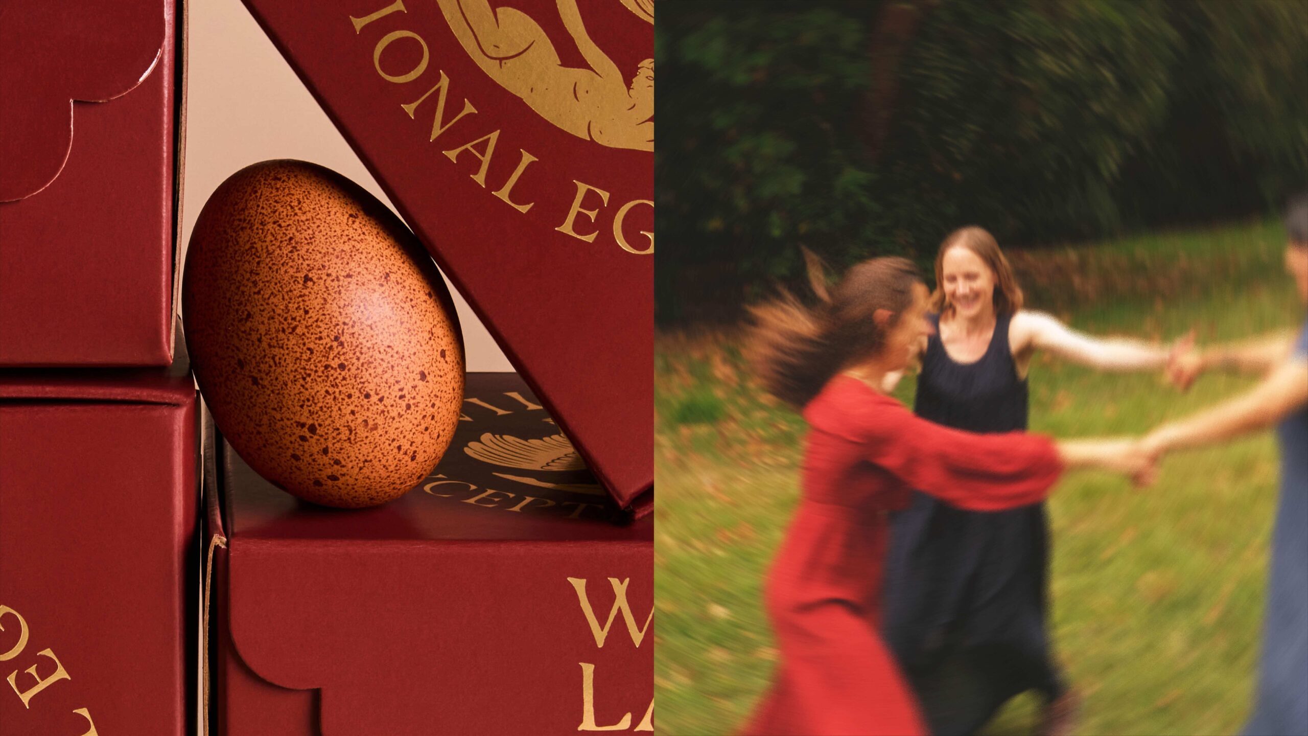
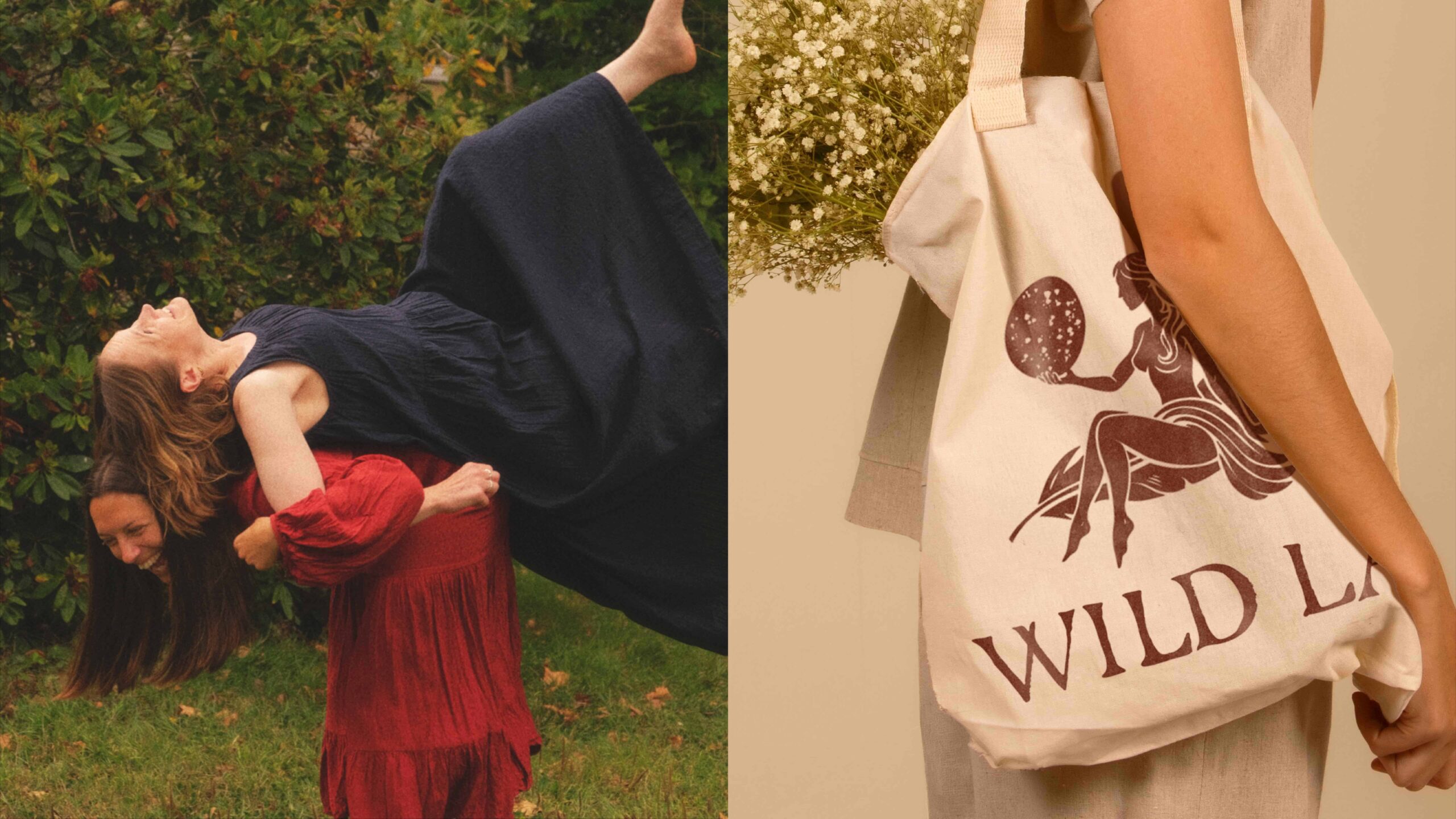
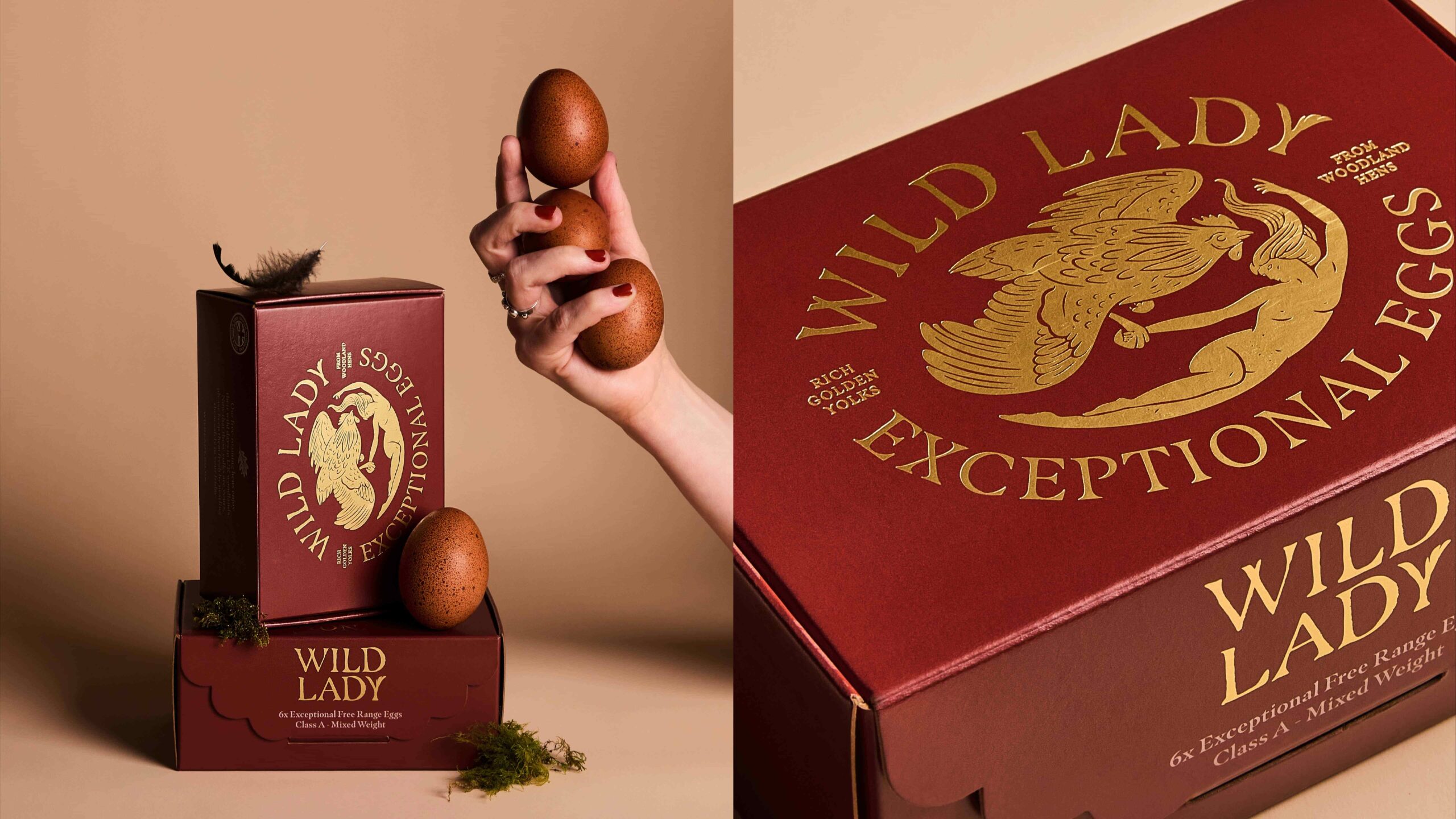
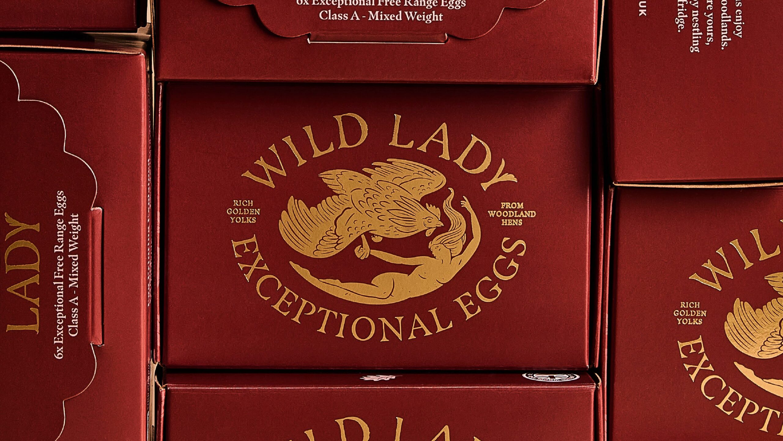
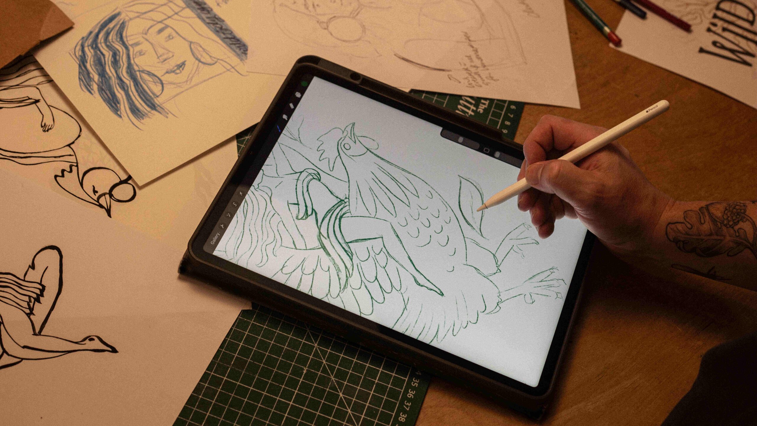
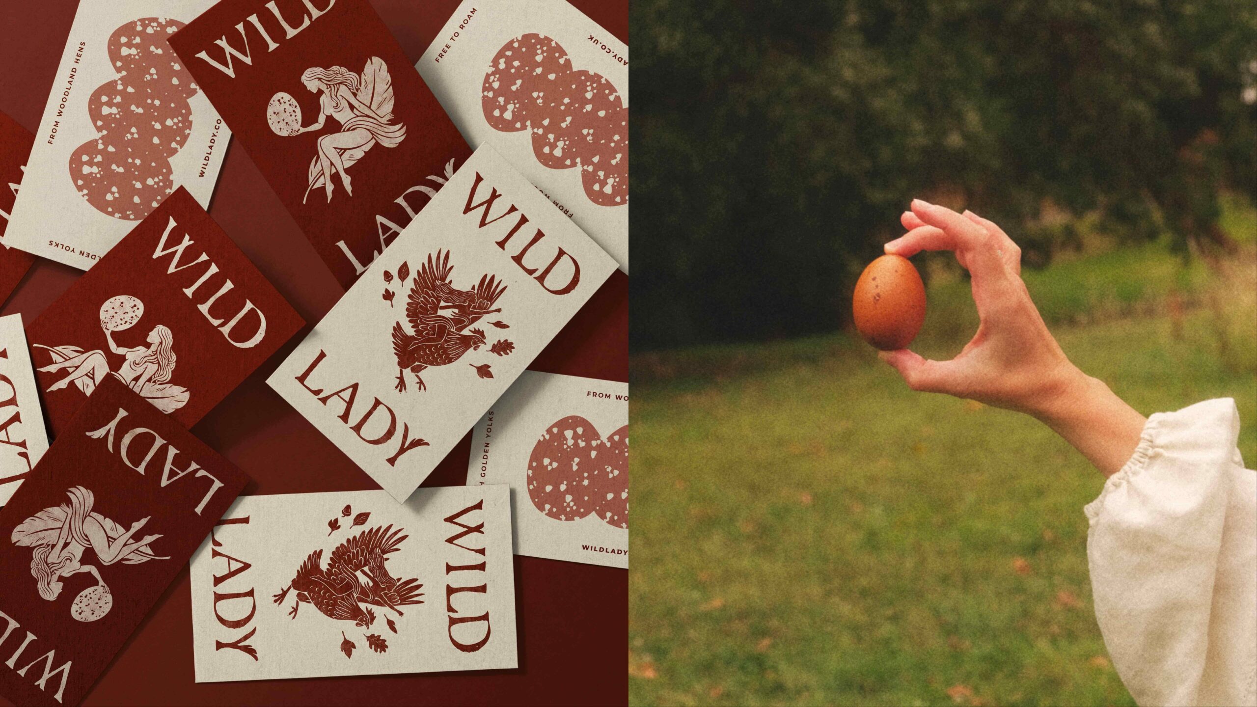
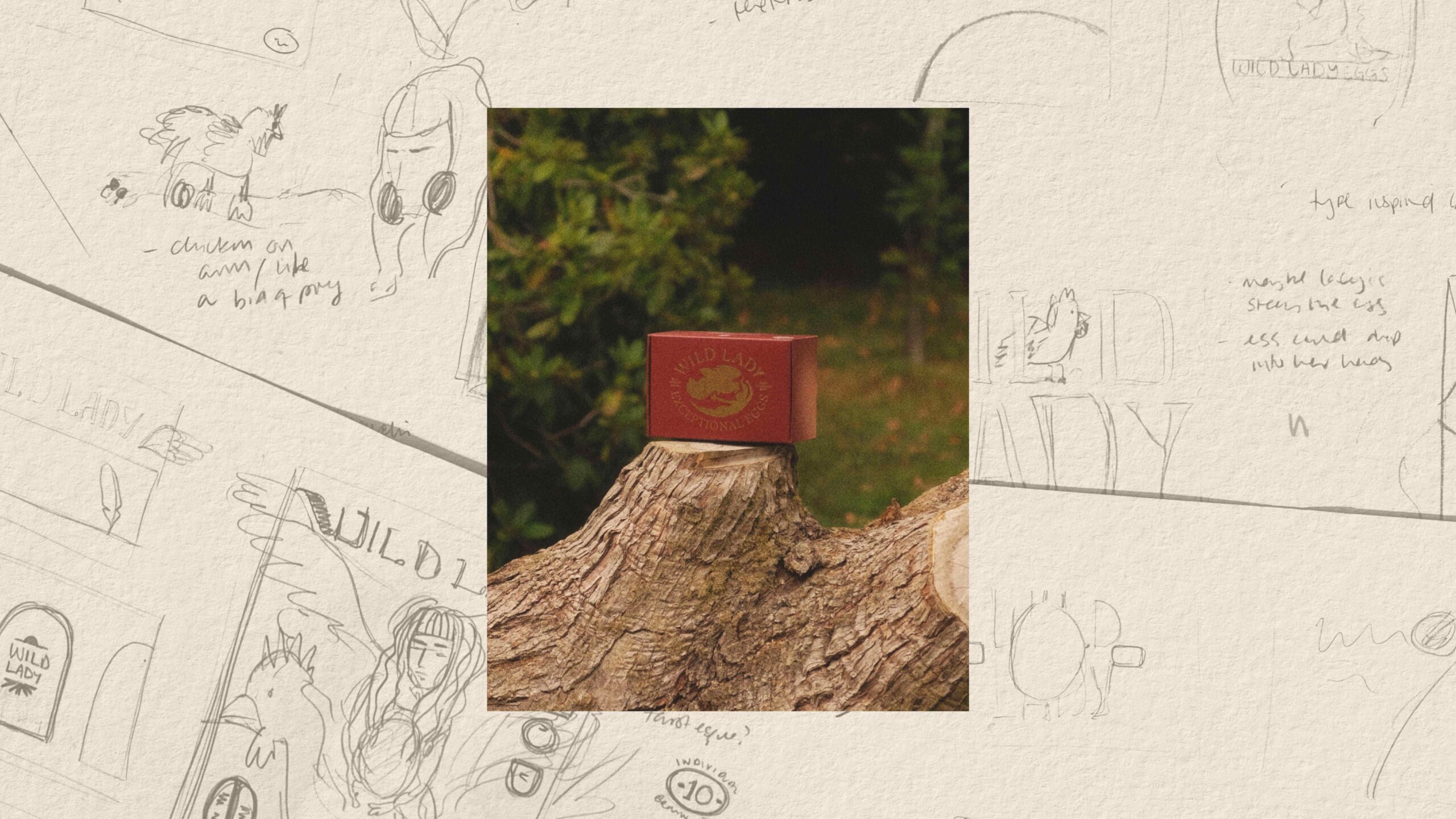
Kingdom & Sparrow developed a unique, illustrative identity centred around a folkloric woodland narrative. The brand emblem features a hand-drawn ‘wild lady’ figure, part guardian, part nymph holding hands with a chicken, subtly enclosed within an egg-shaped frame. This device creates an immediate and ownable visual asset that connects product, place, and mythology.
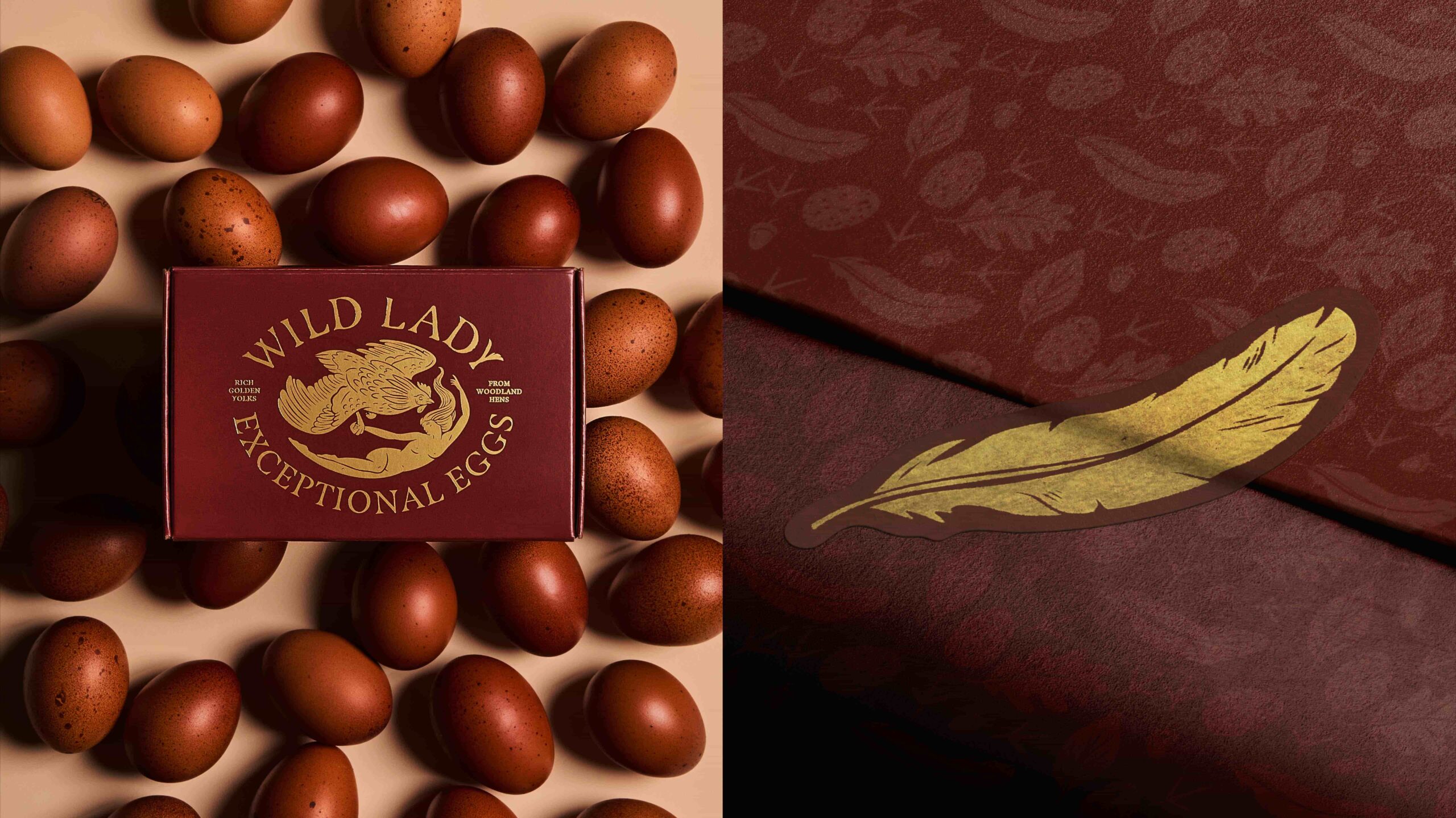
Supporting illustrations extend the storytelling, including a secondary motif of the wild lady floating on a feather while cradling an egg, reinforcing lightness, care, and wonder. A rich, earthy colour palette reflects the woodland floor, layered with intricate background illustrations of leaves, footprints, and eggs. Each egg is individually stamped with a bespoke oak leaf mark, creating a direct, physical link between product and place. Together, these elements create a tactile, immersive visual world that communicates provenance while elevating perceived value.
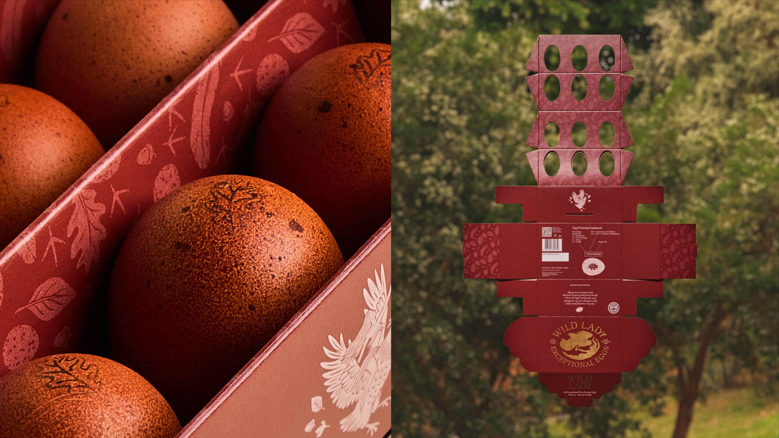
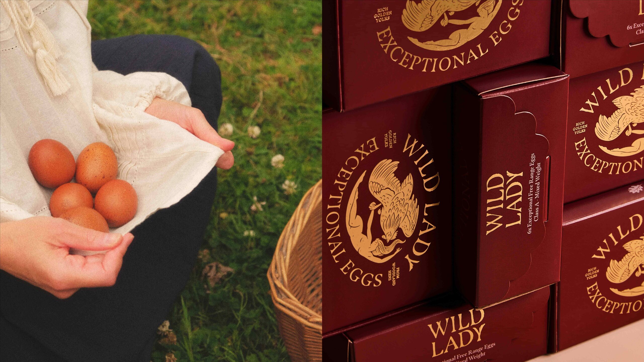
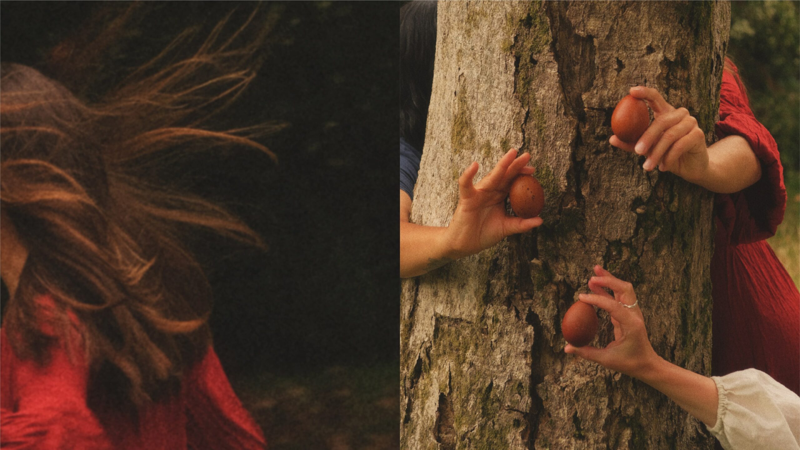
For the packaging, to match the brand’s premium positioning we collaborated with Blackmore Printers, who designed a fully bespoke pack format engineering the structure from a single flat sheet, minimising material use while maximising visual and functional impact. Inside, a custom-formed interior cradles each egg securely while presenting them in an organic arrangement inspired by the woodland floor. This transforms the act of opening the box into a curated reveal, enhancing the overall product experience. The outer pack is finished with gold foil detailing on the emblem, delivering standout shelf presence and reinforcing premium cues without compromising the brand’s natural credentials. Every touchpoint was considered to reinforce authenticity and storytelling.
Wild Lady Eggs establishes a new benchmark for premiumisation within the category, demonstrating how thoughtful packaging design can transform everyday products into objects of desire.
Source: Kingdom & Sparrow
You must be logged in to post a comment Login