
 Drinks brand Angostura has introduced a redesign across its range of rum to better align with its well-known bitters drink.
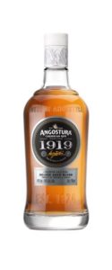
The range, redesigned by Good, now features two bottle shapes – a taller bottle for the standard range of Angostura 5 Year Old and Reserva three-year aged white rum – and a brand new bottle created for the premium range of Angostura 1824, Angostura 1919 and Angostura 7 year old.
Labels for the entire range have also been overhauled. New typography aims to conjure up the fun, handmade feel of Trinidad’s rum and seafood beach shack signs but with a luxury feel.
A Trinidad feel has also been added to the bottle closures, which use red and orange highlights, along with an illustration reflecting the icons of the country such as a sugar cane and the Scarlet Ibis bird.
“We wanted our rum range to reflect both the quality of the product and the strong design heritage of the brand,” said Genevieve Jodhan, executive manager – international sales and marketing. “Angostura is known for its iconic bitters with the oversized label; a staple of bars and cocktail cabinets the world over. We wanted our rums to be equally at home alongside customers’ favourite whiskies, as well as in bars all over the world.”
The brand’s butterfly has been made smaller and is now centred on the label, with two new brand icons: a map of Trinidad and Tobago on the left of the label, and an illustration of butterfly and molasses on the right.
You must be logged in to post a comment Login