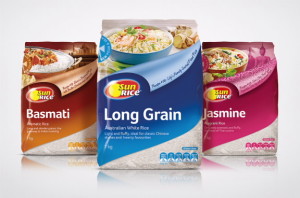
 SunRice has launched a packaging rebrand designed by Sydney’s Boxer & Co.
The rebrand reshapes the packaging from landscape orientation to portrait.
“Whilst being a clear evolution of the old pack, this product has moved into a portrait pack, which enhances shelf visibility and features an innovative re-sealable pouring spout,” Boxer and Co said in a statement.
“SunRice wanted to clearly differentiate their two new product ranges – a Health & Wellbeing Range and a Gourmet Rice Range, to appeal to their relevant target markets and meanwhile re-vamp their existing Everyday Essentials offering. It was important to portray the vision of the new ranges, whilst leveraging the trust and loyalty that the SunRice brand has gained during its 63 years,” it added.
Boxer and Co said each variant was designed to demonstrate its unique origin and usage through typography, imagery and graphics.

You must be logged in to post a comment Login