
Design consultancy Brandon has today unveiled a new strategy and brand identity for iconic British brand Horlicks.
The new Horlicks brand identity is being rolled out across the core Horlicks’ range; Original, Light and Chocolate variants, with 14 SKU formats launched through the retail trade in September.
Horlicks, which have been making malted drinks for over 140 years, approached Brandon to help broaden their audience base by communicating the wider benefits of the product that are relevant in today’s busy modern world.
More than just a sleep aid
Brandon initially addressed two misconceptions of the brand that their initial research uncovered.
“Horlicks is a well-loved brand with a fanatical consumer base. Our challenge was to change the perception that it is a drink just for bedtime and there is a place in our lives throughout the day,” says Simon Ellis, Client Services Director of Brandon.
“Our second key challenge was to broaden the target audience to both lapsed users and younger consumers, who may have previously thought Horlicks was a drink for an older generation.”
Finding the right proposition
Brandon started by looking at Horlicks as a brand and just what the brand stood for. The proposition that resonated best with the Horlicks ethos was born from the nature of the product intrinsic – the concept of “slowing down.”
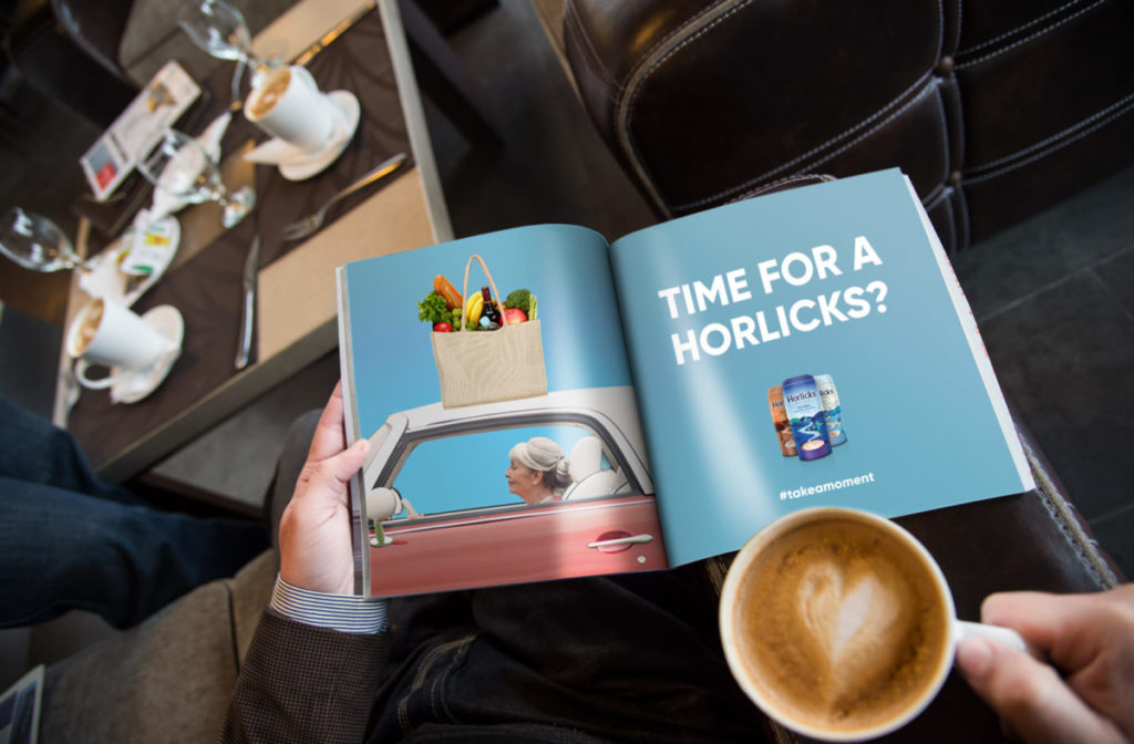
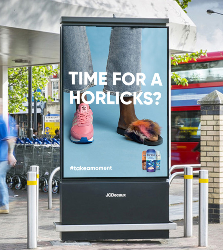
“We wanted to communicate that Horlicks understands modern life can be chaotic and having lengthy ‘me time’ is generally an unachievable task. We developed the idea of a Horlicks moment that could be taken at any time of the day,” continues Simon.
Contemporary and iconic
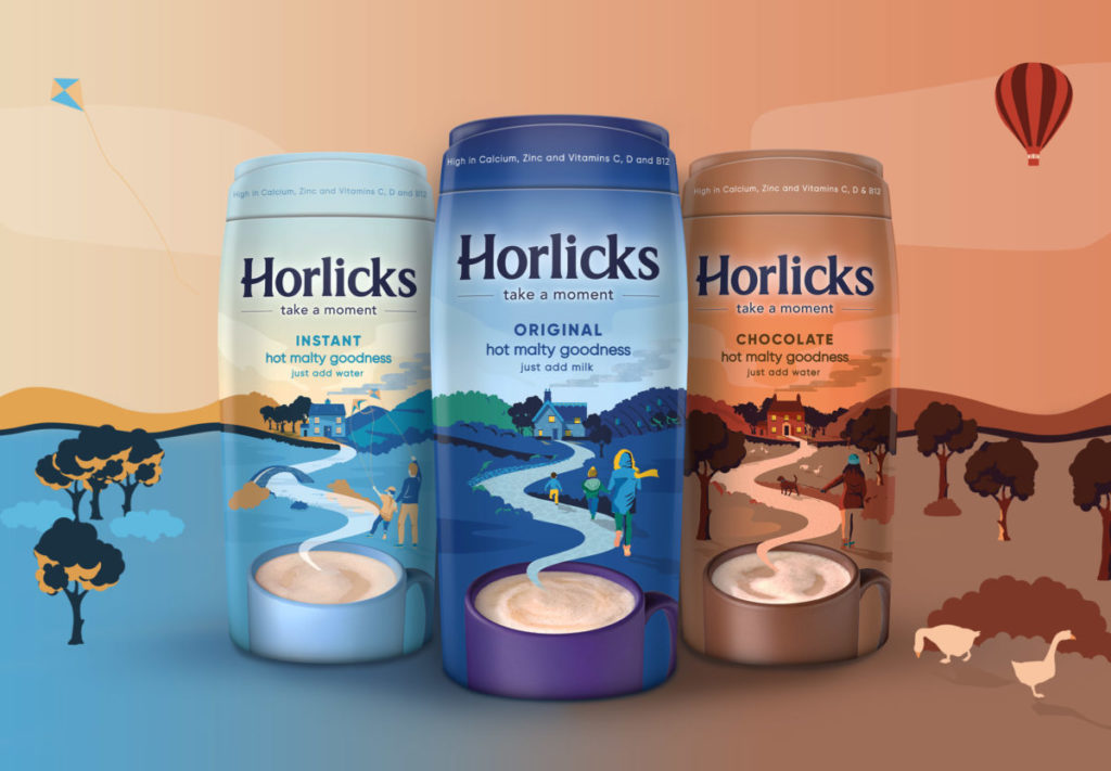
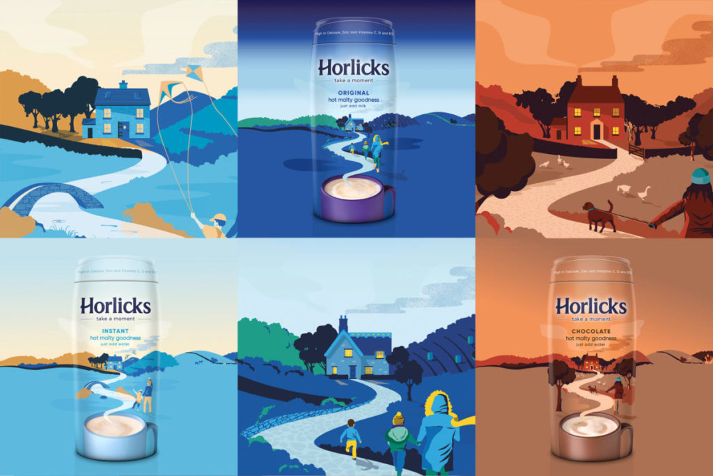
The new brand identity, created from the revised strategy, reflects a day-dream like moment in a mug. On each pack, relaxing scenes are born out of the comforting vapour from a frothy mug of Horlicks.
Taking influence from the British countryside, the three different scenes represent the three variants of Original, Instant and Chocolate, with each visualising a happy relaxing place that consumers might imagine their moment of calm would take them to.
The focus of each scene is a warm inviting home that the ‘steam/road’ rising from the mug is leading the silhouette style characters to. A warm and welcoming human element helps to tell the different stories on pack.
The contemporary pastel colour palettes add depth to the images through the use of highlights and shadows, while the consistent elements of the illustration architecture brings strong product blocking and shelf-standout.
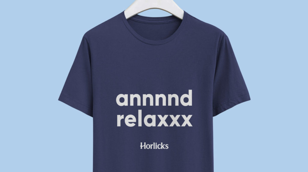
The brand mark has been slightly modified with the typographic bar of the ‘H’ changed to an upward smile creating a warmer, welcoming feel, while the combination of the illustrations and the tagline “Take a moment” communicates that Horlicks is a drink that can be enjoyed at any time, not just the evening.

Front of mind
Steve Conchie, Creative Director at Brandon said: “The revitilised look and positioning not only brings Horlicks back to the front of people’s minds, but sets them up as an ‘anytime drink’. It also imbues a much needed sense of calmness and warming sense of nostalgia, all helping us to take a moment from our ‘always on’ lives.”
Michelle Younger, Marketing Manager at Horlicks says: “Brandon has successfully found a way to communicate the wider relaxation benefits of Horlicks to appeal to a fresh audience, but also ensure our loyal consumer base has not been alienated. Initial research already shows the new identity appeals to Horlicks’ consumers and those who drink hot milky drinks.”
Source: Brandon
You must be logged in to post a comment Login