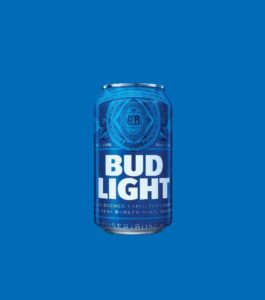
Bud Light unveiled its plans to give America’s favourite beer a fresh new look in the coming year. This redesign – the first major overhaul of Bud Light’s visual identity in eight years – will include a reimagined Bud Light logo and contemporised primary and secondary packaging, and is part of a larger brand evolution underway at Bud Light.
“In 2016, we’ll put a more modern twist on Bud Light, from the way the brand looks to the way it acts,” said Bud Light vice president of marketing, Alexander Lambrecht. “We’re proud to introduce our fresh new look, which pays homage to our most iconic packaging of the past, yet feels current and unique with its bolder logo and distinctive blue colour way. It’s a design that truly stands out from what’s become a sea of sameness in the light beer category.”
By bringing back the brewer’s historic trademark “AB” crest – not used on Bud Light packaging since 2001 – the design emphasises the attributes that established the brand as the country’s most popular beer: premium ingredients, care in brewing, a crisp, clean finish and a smooth drinkability. “It’s a more intentional communication of the brewing excellence and premium light beer that goes into every bottle and can,” said Lambrecht.
“Consumers today want a brand with genuine brewing credentials,” said Tosh Hall, creative director at Jones Knowles Ritchie. “Bud Light is leaning into its heritage and unrivalled brewing expertise in a way that’s looking forward, not back. The result is a confident and contemporary expression of a brand consumers have known and loved for decades.”
The firm collaborated with Bud Light’s creative agency, Wieden + Kennedy New York, on the design to ensure it would be cohesive with the new marketing campaign currently under development. Earlier this year, Bud Light confirmed it would debut a new tagline and creative approach in time for Super Bowl 50.
Rolling out new packaging for the best-selling beer in the US is no simple feat; more than 20,000 Bud Lights are sold every minute. Yet, it’s a challenge well worth undertaking, according to Anheuser-Busch head of marketing Jorn Socquet. “This is a brand that embraces reinvention – changing with the times is part of Bud Light’s DNA, and a reason the brand has remained relevant in popular culture of years.” He added, “This redesign is an important and symbolic investment in our largest brand.”
The new Bud Light packaging will roll out nationwide in the US in cans and both glass and aluminum bottles in early spring 2016.

You must be logged in to post a comment Login