
Meridian, best known for their range of nut butters, has partnered with independent strategic brand design agency, Bulletproof to rekindle the popular brand – inspiring a new Sensory Brand World that heroes the brand’s positive ethical stance. Bulletproof was appointed to the project in July 2019.
Meridian challenged Bulletproof to first reposition the brand in line with their values, followed by re-imagining the visual identity with the intention of creating an iconic design that would appeal to a wider audience, encompassing those that shop in health food stores and larger supermarket chains.
Bulletproof comments: “As soon as we engaged with the team at Meridian, we realised that this was a brand, and company, that lived true to their values. And it just so happens that those values perfectly reflect the consumer shift towards more considered and sustainable brands that take their responsibility to our world seriously.”
“With that in mind, we knew we needed to deliver more than just a brand refresh. First, we needed to reposition the brand around its core product values; a commitment to: never using palm oil, shipping rather than flying their products, and finally, engaging in as little ‘process’ as possible.”
“Inspired by the notion that ‘good tastes better’ and with our Sensory Brand World idea of ‘Nature Liberated’, we set about redesigning each distinctive brand asset and defining their relationship with one another; from core logo lock-up and packaging to tone of voice, leaning in to an inherent appreciation of, and desire to work with nature in its purest form. We did this with a view that the design approach would later extend far beyond their range of nut butters and into bars and sauces.”
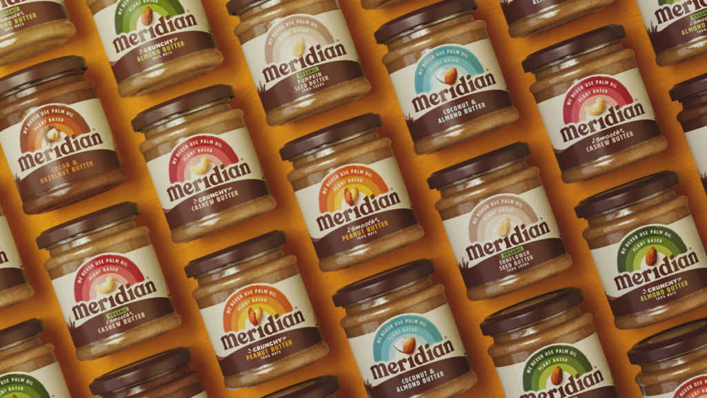
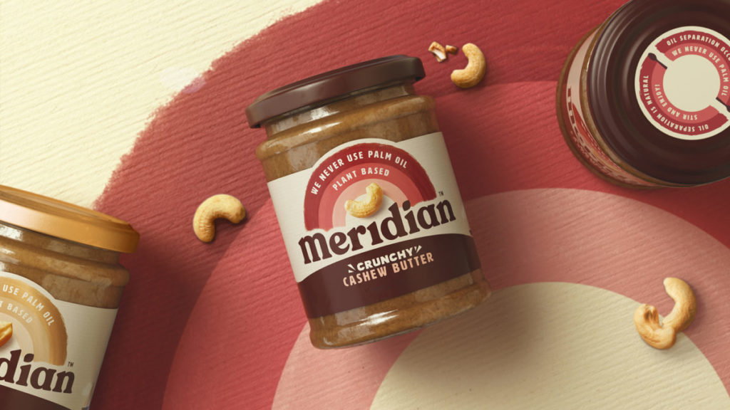
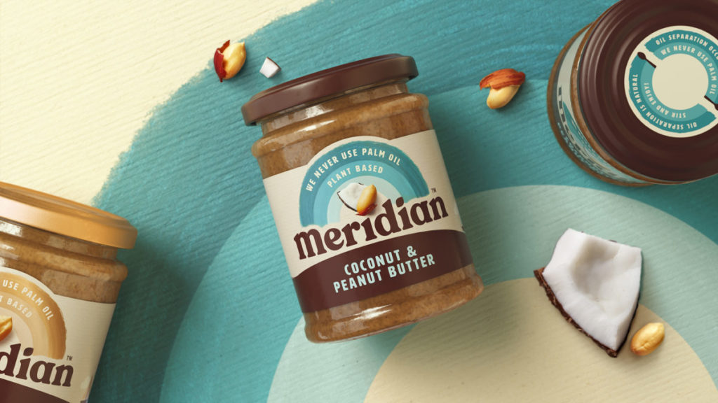
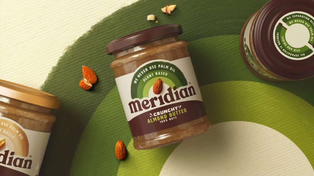
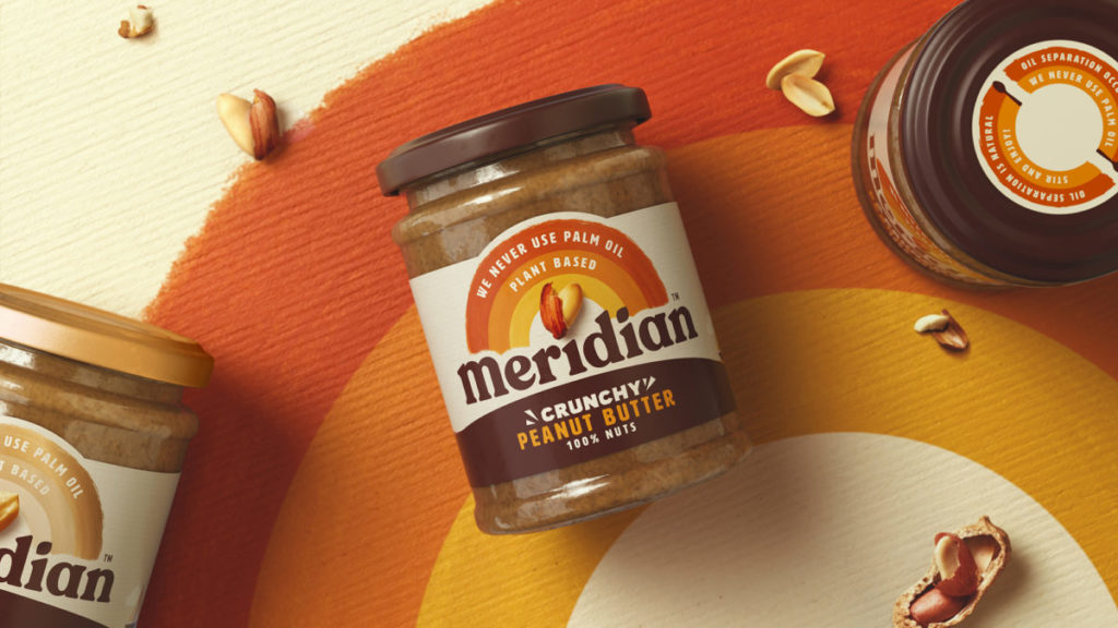
“The old design was lacking a recognisable brand icon, so we created a vibrant ‘Rainbow’; a symbol that inherently stands for positivity and radiates energy. We wanted to clearly call out our core product values and proudly run these within the arches. We used multiple touchpoints as an opportunity to build a bold and uplifting application of our joyful brand icon – ‘Spreading good.’”
“In line with our Sensory Brand World idea, our deep autumnal brown provides richness and a connection to nature, whilst our brand icon is an uplifting injection of colour; aiding shelf navigation and delivering taste appeal.”
“The current logotype was very serious and lacking weight and recognisability. We chose an ultra-bold san serif typeface which has a friendly and approachable character. We grounded the logotype so it doesn’t curve around the horizon, adding the bold authority that the brand was previously lacking.”
“Meridian creates delicious products adding nothing but natural ingredients in a one step process – with nothing to hide. Therefore, it was important to showcase the raw nuts in their purest form with minimal retouching.”
“Our frankly optimistic tone of voice means we can talk about wider issues with a light-heartedness and visually show our core values and love for the planet with simplistic illustrations and bold iconography.”
Sue McIntosh, Head of Marketing for Meridian, said: “Bulletproof approached the brief with a real passion, understanding and respect for Meridian’s core values. The new identity proudly represents those core values and ethical practices, living true to Meridian’s origin. Bulletproof inherently understood the brand and have been extremely collaborative and true partners in helping us bring to life the vision for the brand.”
The new Meridian branding launches in the UK throughout May.
Source: Bulletproof
You must be logged in to post a comment Login