 ButterflyCannon has redesigned the packaging for Lasanta, Quinta Ruban, and Nectar D’Or, the extra-matured whiskies in Glenmorangie’s range of single malts. The extra-matured expressions spend ten years maturing in ex-bourbon casks, and are then ‘Extra-Matured’ for a period of two years in different casks, (an original Glenmorangie concept) to add an enticing range of flavours.
Mike Atkinson, marketing manager for Glenmorangie adds, “After a total of 12 years maturing in their exquisite casks, these expressions deserve packaging that reflects the beauty of the liquid within. ButterflyCannon ensured that they retained their family appearance whilst also allowing their distinct personalities to shine through.”
The Glenmorangie Lasanta, Gaelic for ‘warmth and passion’, is extra matured in sherry casks. The new design reflects the whisky’s intensity through its fiery colour palette and Andalusian inspired detailing. The branding has been amplified and the characteristics of the expression put into a clearer hierarchy.
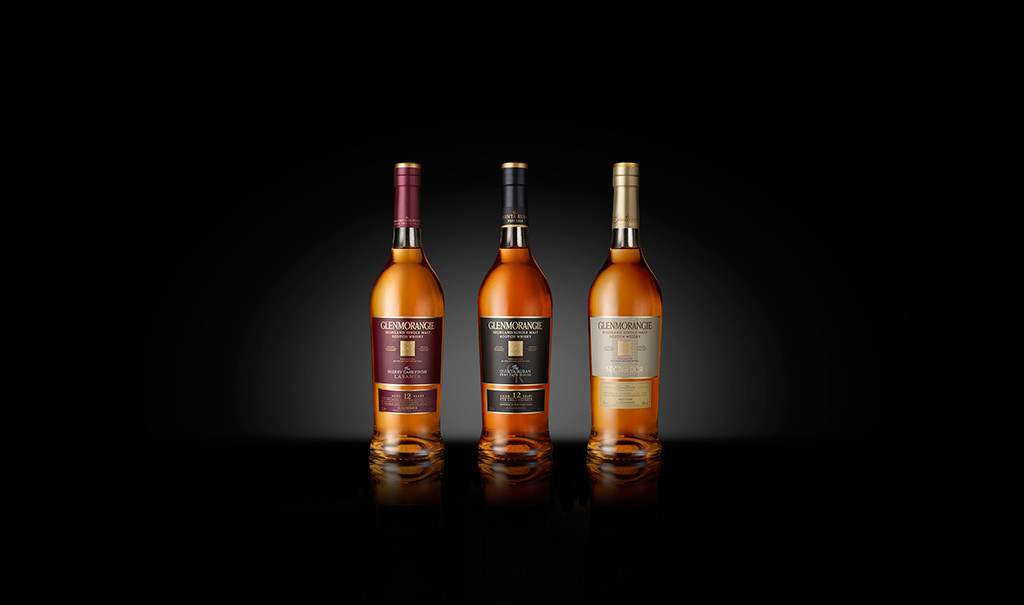 In the 2014 Whisky bible, Jim Murray described the Glenmorangie Quinta Ruban whisky as ‘complexity…portrayed with clarity and confidence’, which also goes a long way in describing the new packaging design. This dark and powerful whisky’s packaging now has a black satin finish and proudly wears a Porto styled QR monogram.
Glenmorangie Nectar D’Or is extra matured in high value ex ‘Sauternes’ barriques, the most famous sweet-wine-growing region in France. The liquid has a silky smooth, warm honeyed, rich taste profile epitomised by its name. The soft touch rigid board construct immediately signifies both the status and silkiness of the liquid. The Nectar D’Or logo takes you to vintage France, the gold foiling reflects the rich nectar flavours and liquid colours and the Sauternes typography is reminiscent of the wine labels of this region. This is all balanced with Glenmorangie’s brand codes and its modern and contemporary style.
 “Nectar D’Or is a stunning liquid and demanded packaging that respected its credentials. Its rich product story, silky smooth finish, golden colour and honey flavours needed to be brought to life through the packaging, this was not just a graphic redesign but a sensory expression of the flavour experience,” says Jon Davies, Creative Director, ButterflyCannon.




You must be logged in to post a comment Login