
Leading UK premium cider brand, Aspall, have partnered with global brand-led creative agency BrandOpus to develop a new brand strategy and visual identity. The rebrand aims to elevate Aspall within the category as the cider of sophistication.
“Using symbolism to drive meaning, we wanted to create a more premium and contemporary look and feel that was inspired by the brands almost 300-year heritage and rich brand story.” says Nir Wegrzyn, CEO and Founder, BrandOpus.
The rebrand comes less than two years after Molson Coors acquired Aspall from the Chevallier Family in 2018.
Phil Pick at Molson Coors comments “Aspall is not like other ciders, it’s long-held practices of cider making buck the trend of modern methods. We needed to reinforce this through a new identity that spoke to those who believe that things are worth doing properly and anything less is a compromise”.
The brand idea encapsulates the mindset of choosing the road less travelled, which was introduced to reflect the brand’s overall approach to cider. Wegrzyn comments, “We wanted the brand’s will to take the long route by not following conventions, to achieve remarkable, unwavering excellence and stand out to a discerning audience”.
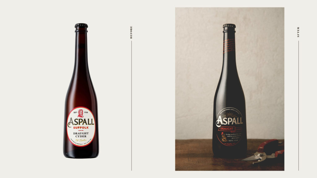
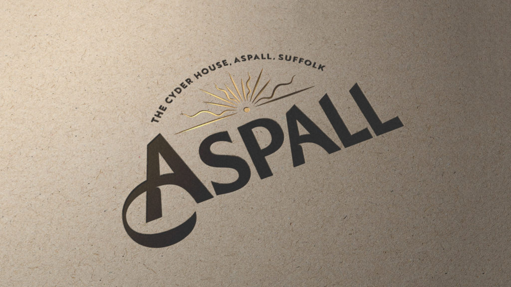
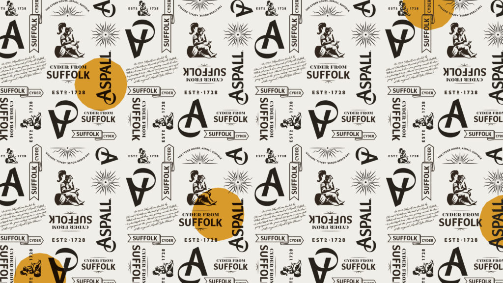
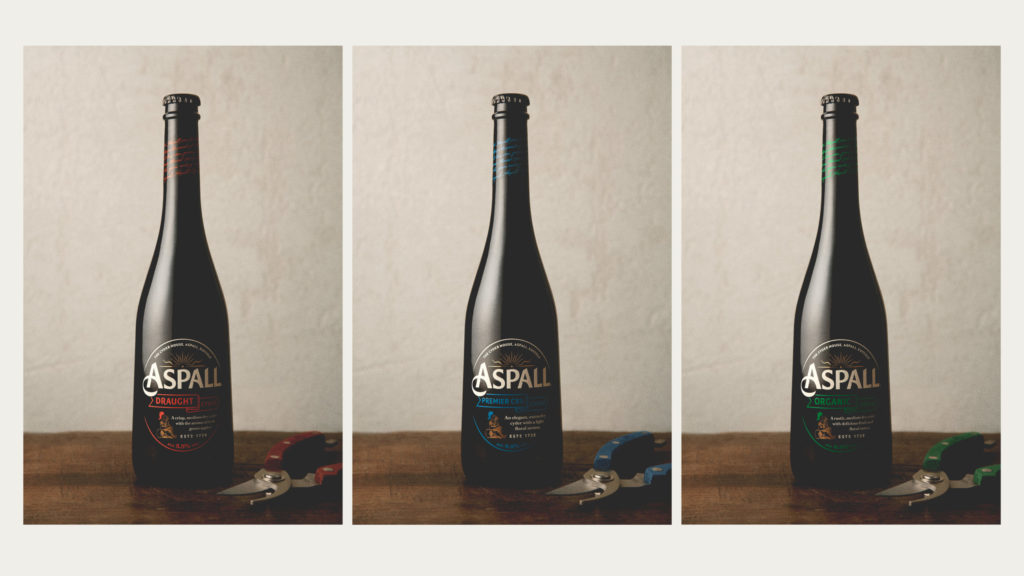
The new look and feel delves into the brands past and establishes new symbolism that celebrates its unconventional characteristics and Easterly home in Suffolk. With cider commonly originating from the West of England, the rising sun and Easterly ribbon were placed at the heart of the visual identity, to signify the brands unconventional spirit. The design is sealed with the knight, inspired by a Chevallier family memorial. He breaks from the expected by downing tools in favour of thoughtfully writing – a reference to the historic journals kept by the Aspall family.
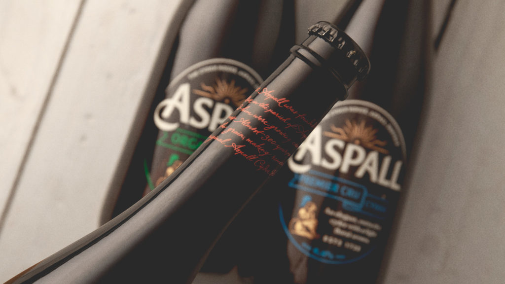
This is further alluded to with the addition of a handwritten script on pack.
“We wanted to stay true to the brands belief of taking the time to do things properly, crafting a bespoke calligraphic script applied to the neck of the brands iconic bottle” comments Ian Ritch, Design Director, BrandOpus. “A more elegant and sophisticated design has been created through combining traditional crafts with contemporary colours and finishes” he says.
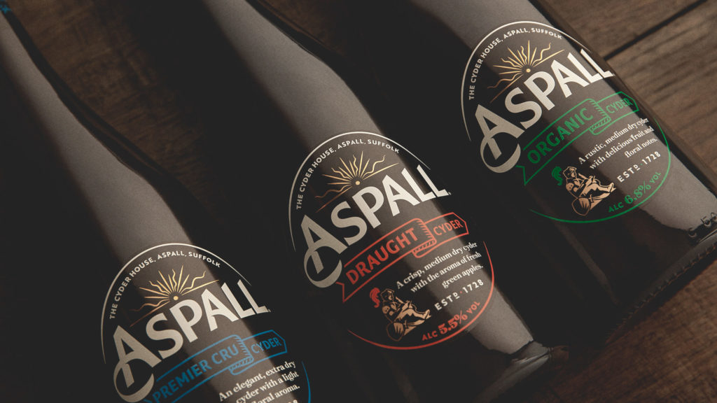
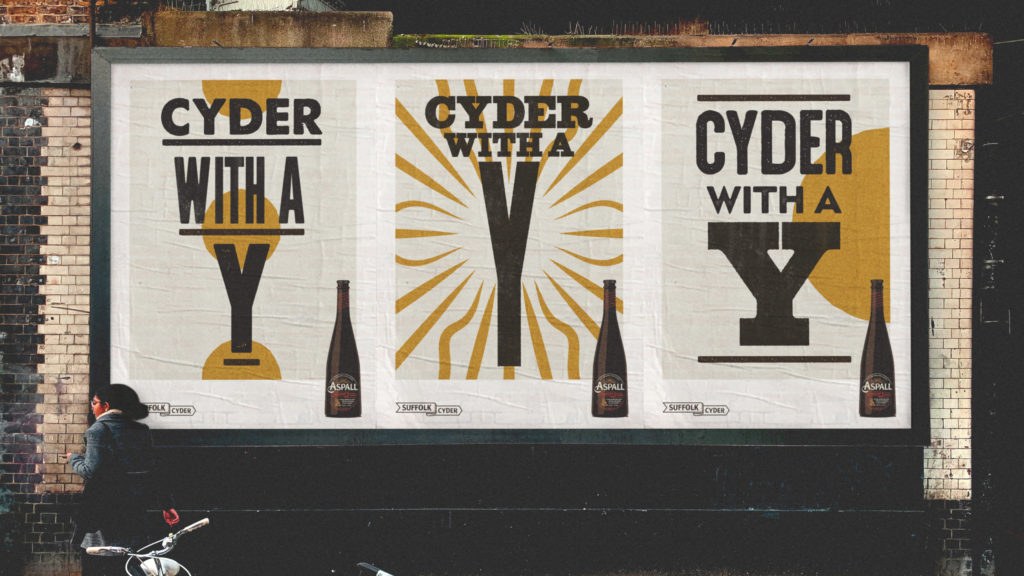
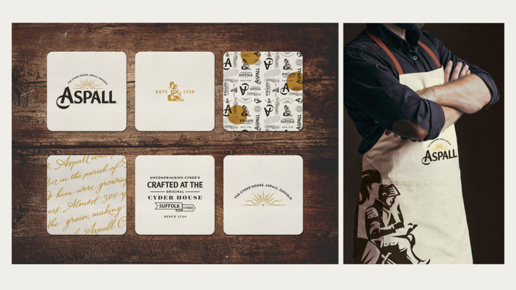
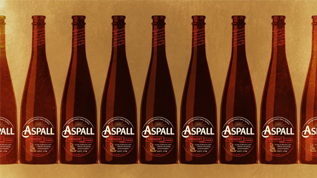
The new work has been brought to life across the brand’s visual identity, primary and secondary packaging and point-of-sale, with universally positive reaction
Source: BrandOpus
You must be logged in to post a comment Login