
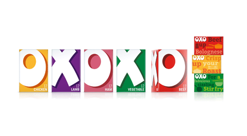
 OXO has refreshed the look of its Cubes and Shake & Flavour ranges to modernise the brand but without losing recognisable elements of its design.
Coley Porter Bell (CPB) carried out the work and the agency was tasked with creating a design that reflects the brand essence of vibrant colours as well as OXO’s heritage.
For the OXO cube range, CPB included different messages to inspire consumers to use the cubes in different ways, for example ‘Liven up your Lasagne’ and ‘Sprinkle for spectacular stir fry’.
Stephen Bell, executive creative director at Coley Porter Bell, commented: “OXO and OXO Cubes are iconic, but over time the packaging had become overly complicated and fussy. We stripped all this away and enlarged the OXO letters as they stand for so much, we wanted to reinstate a boldness and confidence along with great shelf impact.”
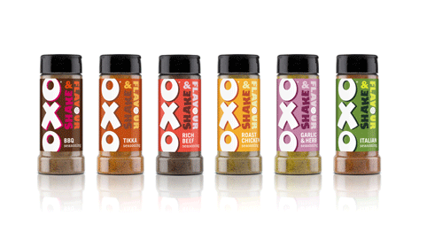 In line with the cube range, the Shake & Flavour variety features a new logo that bolsters the brand identity, highlighting its creative personality. To enhance the taste perceptions of the product CPB bold ‘foodie’ colours to inspire consumers to use Shake & Flavour in different meals.
The new design uses peelable labels printed with different recipes using the products.
You must be logged in to post a comment Login