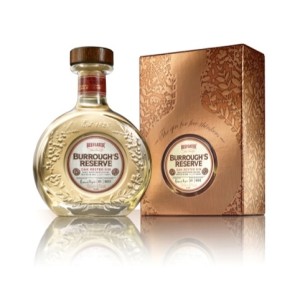
 New premium Beefeater’s gin Burrough’s Reserve is launching next month, with branding and packaging created by Coley Porter Bell.
Coley Porter Bell was appointed to create the proposition, name and structural and graphics packaging designs for the brand, which is intended as a ‘sipping gin’, according to Beefeater.
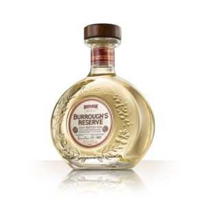
The packaging uses a rounded glass, decanter-style bottle, aiming to convey the colour of gin.
Coley Porter Bell told Design Week:
“The packaging is largely a metaphor for the way the gin is produced. The rounded glass structure and the label shape evoke the ends of the Jean de Lillet oak barrels in which it is rested. [The bottle’s] shallow profile allows light to refract off the edges of the embossed wreath of botanicals that also acts as a frame for the label.”
 The label displays the signatures of James Burrough, who created the original recipe, and Desmond Payne, who created the Burrough’s Reserve product, alongside the batch and bottle number, looking to convey the hand-produced nature of the product.
The Beefeater red brand colour is used with copper to reference the wooden stopper used in the oak barrels.
Stuart Humm, Coley Porter Bell creative director, said, “We wanted to create something that balances the ultra premium codes often found in dark spirits, for example hand craftsmanship and cues of discernment and status, with the world of gin and Beefeater.”
Burrough’s Reserve will initially launch in Spain, rolling-out in the UK from June.

You must be logged in to post a comment Login