New and innovative Australian winery Cowpunk Wines is launching its inaugural brand: a natural wine range with inventive, sustainable and accessible brand strategy and packaging by Denomination.

Natural wines are made with minimal intervention from the winemaker with no traditional “fining” or preservatives, which gives the wines a distinctive cloudiness and an immediate freshness. Highly popular with hipster drinkers and sommeliers, and with a profusion of colourful and edgy labels, the natural wine category can be intimidating for consumers navigating the relatively unknown in this booming niche. Cowpunk taps into the growing desire of consumers for natural, unadulterated products and is aimed not just at hipsters but a broader market.
Nicholas Crampton, co-owner, says: “We wanted to respond to the growing consumer desire for additive-free, sustainably produced original-state wines, but it was important that the range appealed to a broad market. Cool, yes, but not intimidating. Denomination’s strategy has helped us to take a niche, boutique and uncommercial sector and make it available to everyone.”
Edgy and earthy
“We called the brand, and the business, Cowpunk to capture its earthy naturalness and edginess,” says Rowena Curlewis, CEO at Denomination. “Cowpunk music – a mixture of country and punk- is unvarnished and edgy and was inspired by the real, raw sound of country music before it became hugely commercialised. We thought this was a great analogy for what natural wines are all about.”
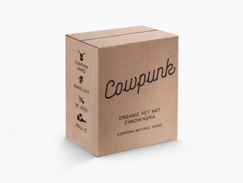
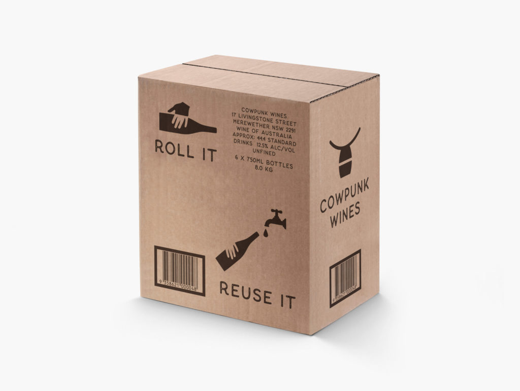
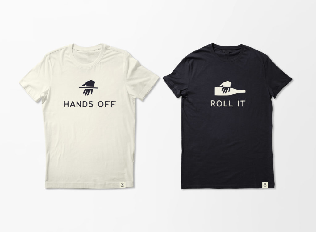
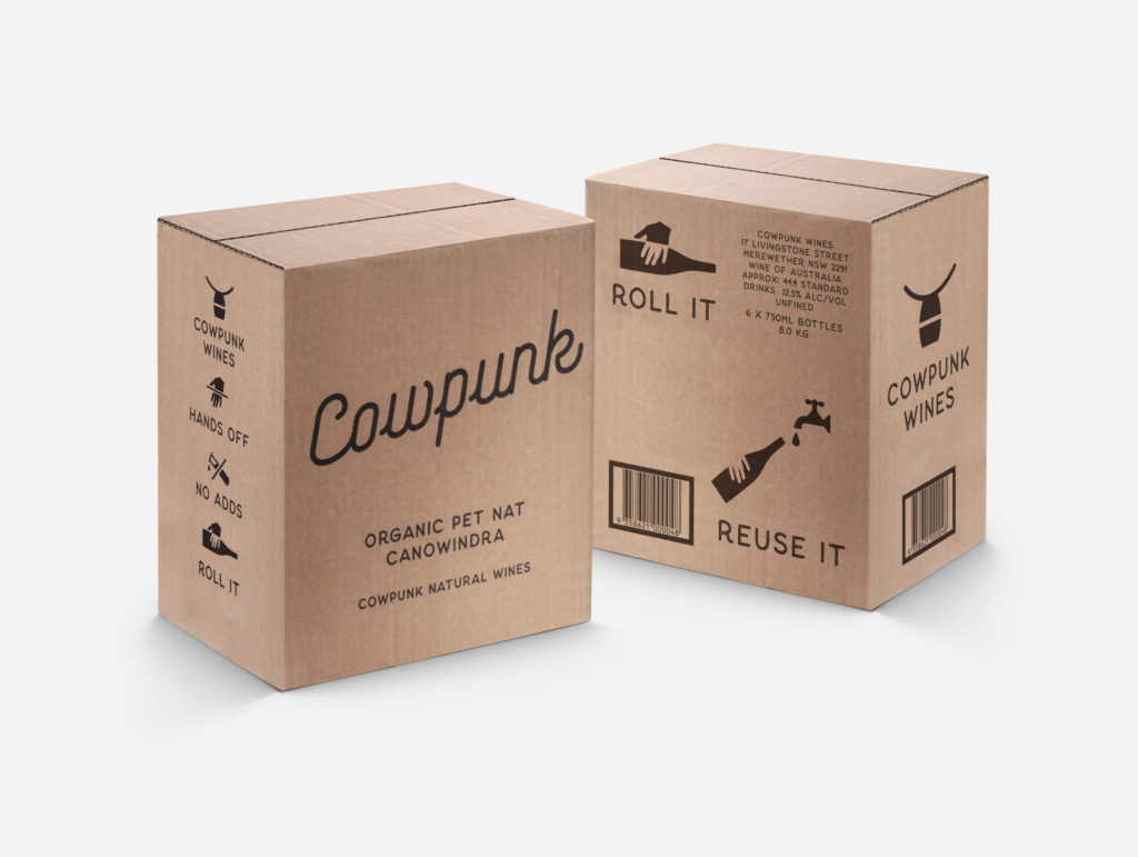
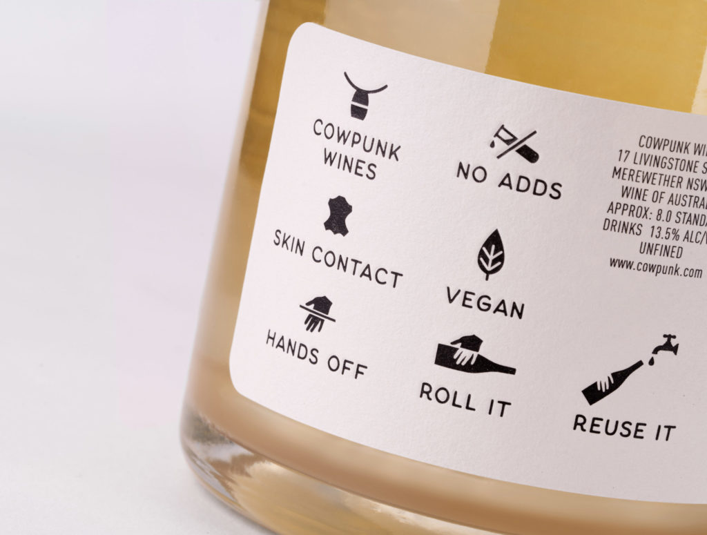
The packaging identity harks back to early hand-made ranch signage often welded into shape using steel or old bits of iron. A series of icons, inspired by cattle branding, replaces the traditional back label copy. Used on both the labels and shippers, the infographics keep the messaging short and simple. A “Roll it” icon demonstrates to those who are new to natural wines that the bottle needs to be agitated before opening – a counter-intuitive step for many people – and also becomes an icon for the natural wine “movement” when used on merchandising.
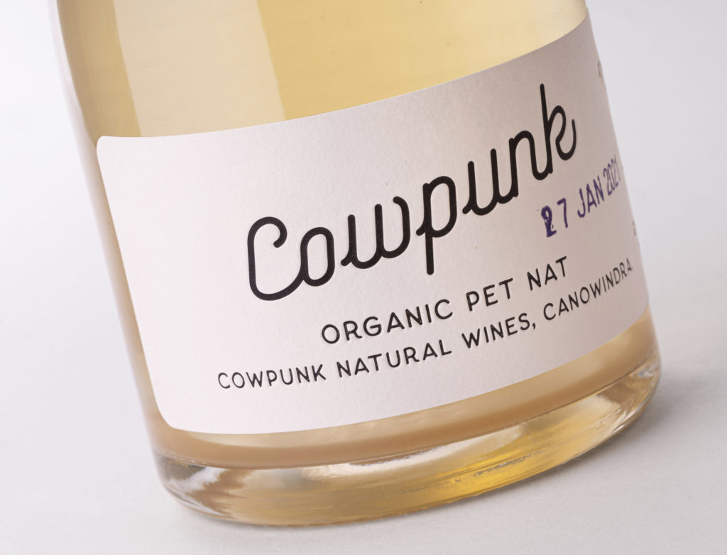
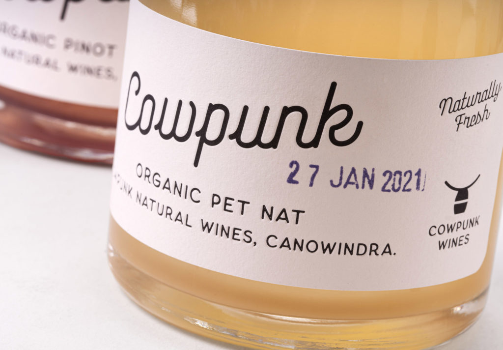
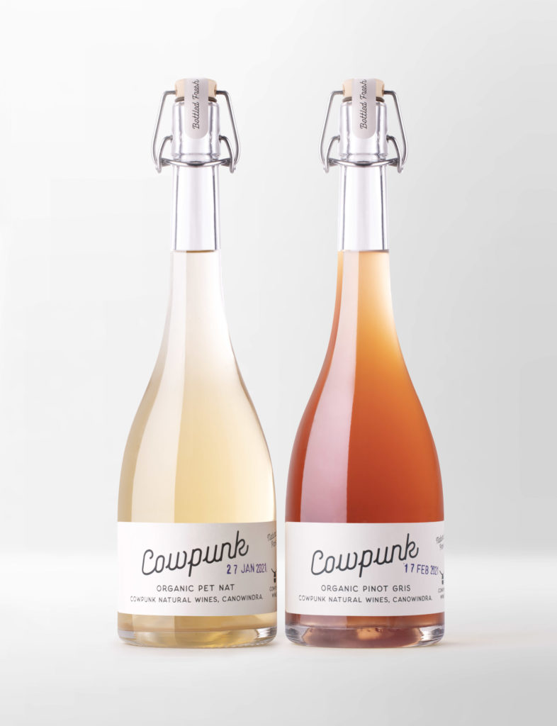
Freshness is the key benefit of natural wines, therefore the labels are hand-stamped with not only the year but also the month – and day – the grapes were picked, echoing the use by date on fresh foods. This also has the added benefit of communicating the small batch, hand-made nature of the wine.
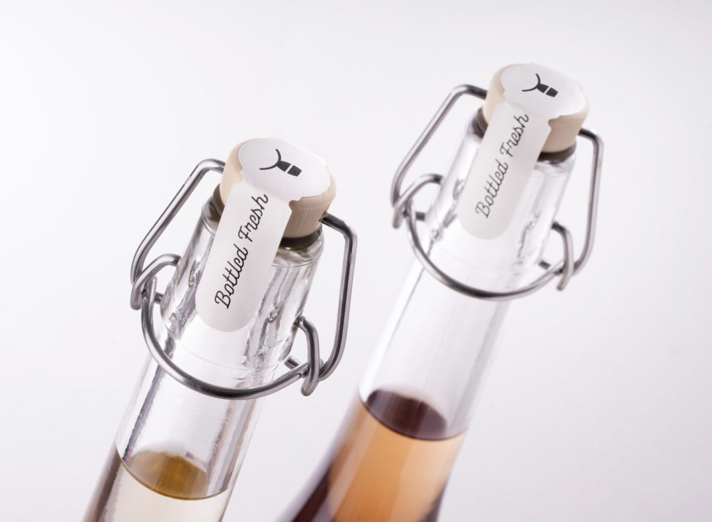
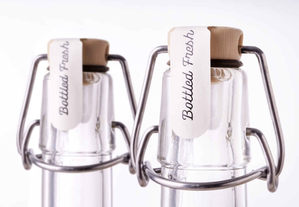
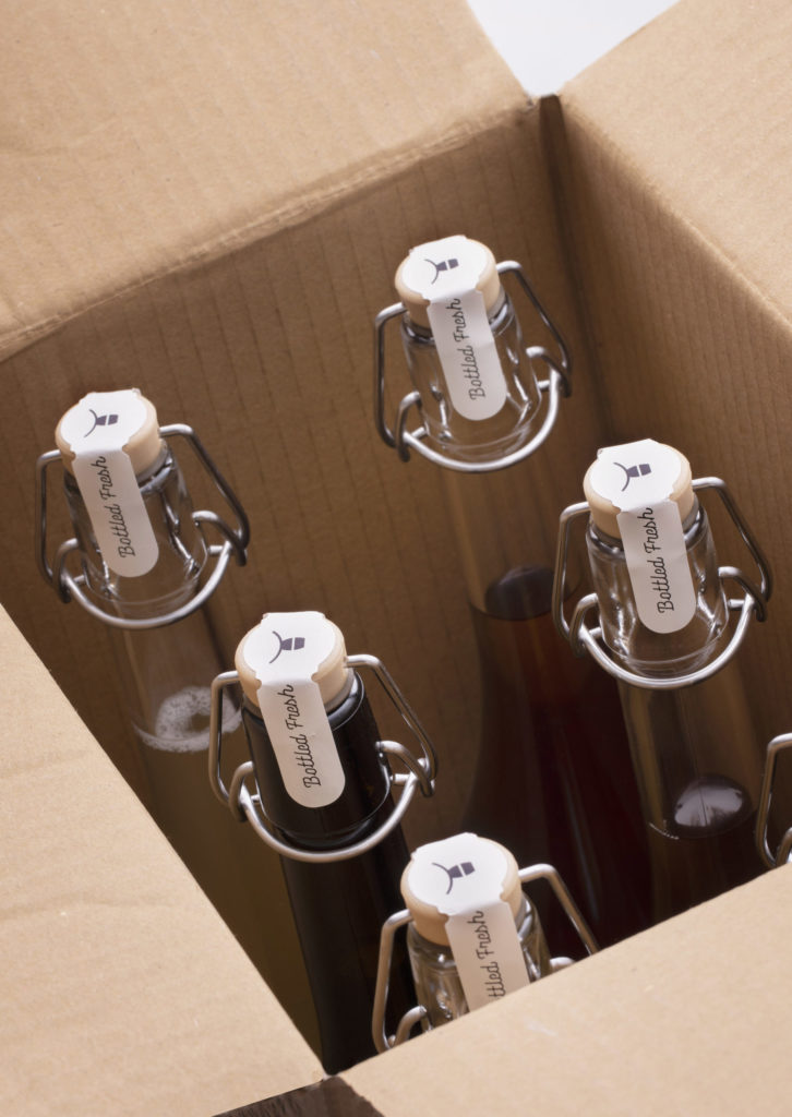
To highlight the difference in the wine style, the bottle comes with a swing top closure. Again this borrows from the fresh food category of pickles and preserves, creating a homely yet appealing personality for the brand and a real point of difference on shelf.
A sustainable message
Thanks to this swing-top enclosure, the bottle is 100% resealable and re-usable with the aim of eventually having refill stations at selected retailers. “Re-use it” on the back label and shipper encourages consumers to re-use the packaging as opposed to simply recycling it. The simple two-colour print cuts down on ink usage, plus no gloss varnishes or treatments have been used, and the stock is a natural 100% cotton paper with impurities and slight variations in tone.
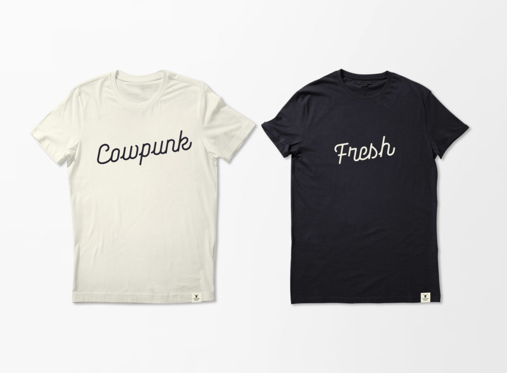
The icons are completely ownable by Cowpunk and are also being used across merchandise, such as trucker caps and T-shirts, and as a call to arms to embrace natural wines and sustainable packaging.
Crampton says: “Cowpunk’s natural wines are sustainably made, so Denomination, which is also working to futureproof the industry, was the perfect partner for this project. Denomination is committed to helping winemakers and other drinks producers on their sustainability journeys and has put together an unparalleled network of experts to help make that happen. The team’s work on Cowpunk is as brave and progressive as it gets, and it’s this kind of thinking that will protect as well as grow our industry.”
Source: Denomination.

You must be logged in to post a comment Login