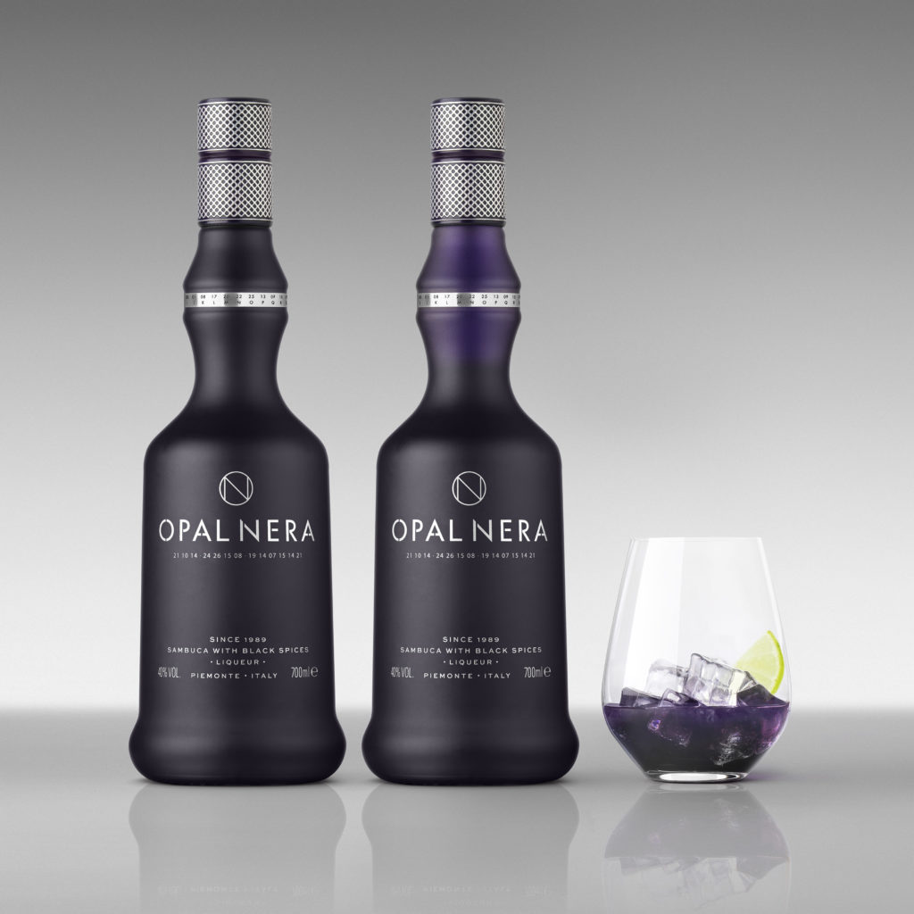
Premium Italian liqueur Opal Nera relaunches around the world, with brand refresh by drinks design specialist Denomination.
Opal Nera, a sambuca-based dark liqueur, was created by family-run Distillerie Francoli back in the 1980s, achieving great success globally. However, as competitor brands started to appear, its popularity was affected. The distillery approached Denomination to help address this, and to create a modern, luxe look and feel ahead of an international push to re-establish it as the premier product of its kind on the market.
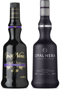
Keeping the classic and much-loved bottle, Denomination has made Opal Nera relevant to the modern consumer, whilst also tapping into an explosion in the popularity of Insta-worthy liqueurs and aperitifs.
Opal Nera – a premium product made from ten ingredients including elderberries, which give it its unique purple hue – needed to reclaim pole position on shelf in pubs and clubs. So a chief challenge for the Denomination team was to create a design that looked at home in trendy inner-city bars, whilst retaining existing consumers and attracting new people to the brand.
Purple reigns
Rowena Curlewis, CEO, Denomination, says: “Opal Nera’s USP – its ‘dark secret’ – is that it turns purple on contact with ice, so we modified the bottle to reflect that. At first glance it looks like black frosted glass but, on pouring, a purple colour that matches the liquid is revealed.”
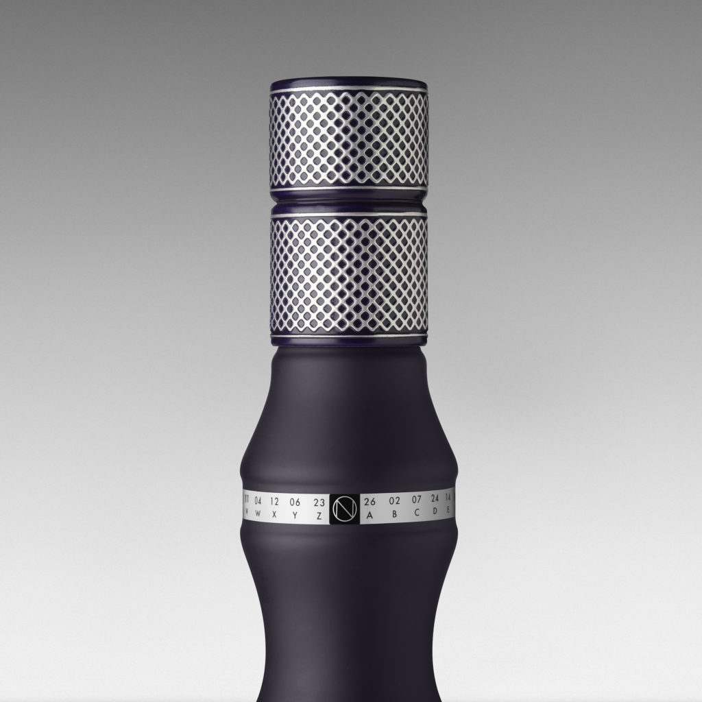
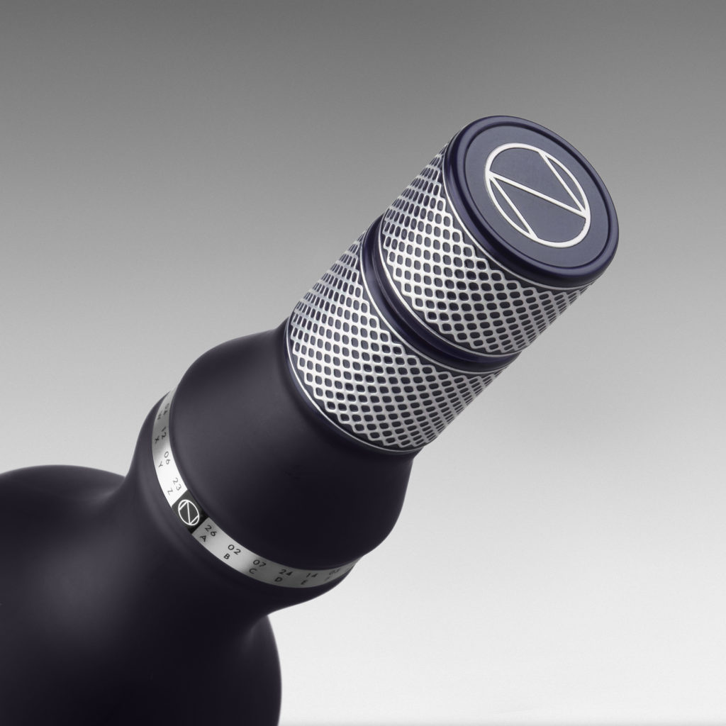
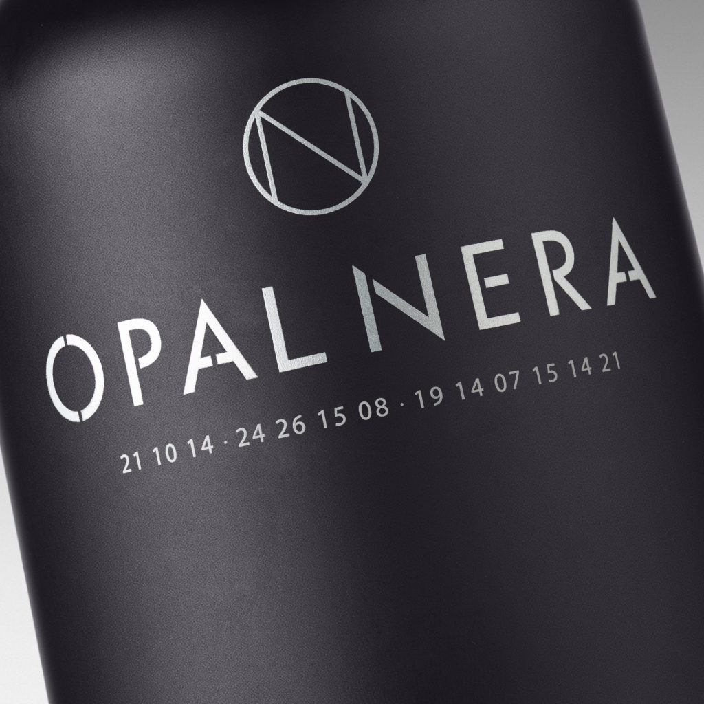
Playing on this mysterious point of difference, Denomination added a code beneath the logo, which consumers can decipher using a sequence of letters and numbers that appears on the rim to reveal the words ‘dark secret’.
Rowena says: “We wanted to tell the story in a unique way, and our ‘secret code’ mechanism is distinctive and really engages the consumer.”
#LiqueurBoom
As well as celebrating Opal Nera’s distinctive colour, Denomination’s approach to the packaging identity has positioned the product centre stage so that Distillerie Francoli can take full advantage of the current liqueur boom. (According to the Wine and Spirit Trade Association, sales of liqueurs and aperitifs soared by 54% in the UK last year.)
To achieve this, Denomination has used contemporary typography, and devised a distinctive ON logo with negative tension on the bottle. The design team also made a virtue of the provenance in the messaging hierarchy, and created a textural capsule with luxury design semiotics to emphasise that this is a prestigious product.
Nigel Brown, Commercial Director, Gruppo Francoli, says: “Denomination has developed a beautiful design solution that captures people’s attention. It is still recognisably Opal Nera but has been brought up to date so that it will appeal to the modern consumer.
“It’s a sophisticated response that plays to Opal Nera’s distinctive qualities, making it stand out in a sea of conservative brands. We love the way consumers are now drawn in and taken on a journey of discovery, with layered packaging that engages bar tenders and drinkers and makes Opal Nera a memorable experience.”
Source: Denomination


You must be logged in to post a comment Login