
The New York studio of the international design agency, Design Bridge and CKE Restaurant Holdings, INC.; the parent company of Carl’s Jr.® and Hardee’s®, launched the brands’ new visual identity today. Tasked with bringing the two regional brands – Carl’s Jr and Hardee’s together under one recognizable identity, the new look and feel invites fans to continue to “Feed Your Happy” and to satisfy their insatiable cravings for the brands’ delicious food.
Transformed to boldly blaze across the brand experience, Happy Star, leads the way to fulfilling every crave, leaving tasty, charbroiled grill marks and in-your-face flavor in its wake.
“For us, the recipe for success was clear,” says Claire Parker, executive creative director of Design Bridge North America, “Bring the story back to the experience. Make flavor the star. Carl’s Jr. and Hardee’s now focus on what makes them special: the food. And with this new visual identity, it looks like something that’s going to satisfy every sense.
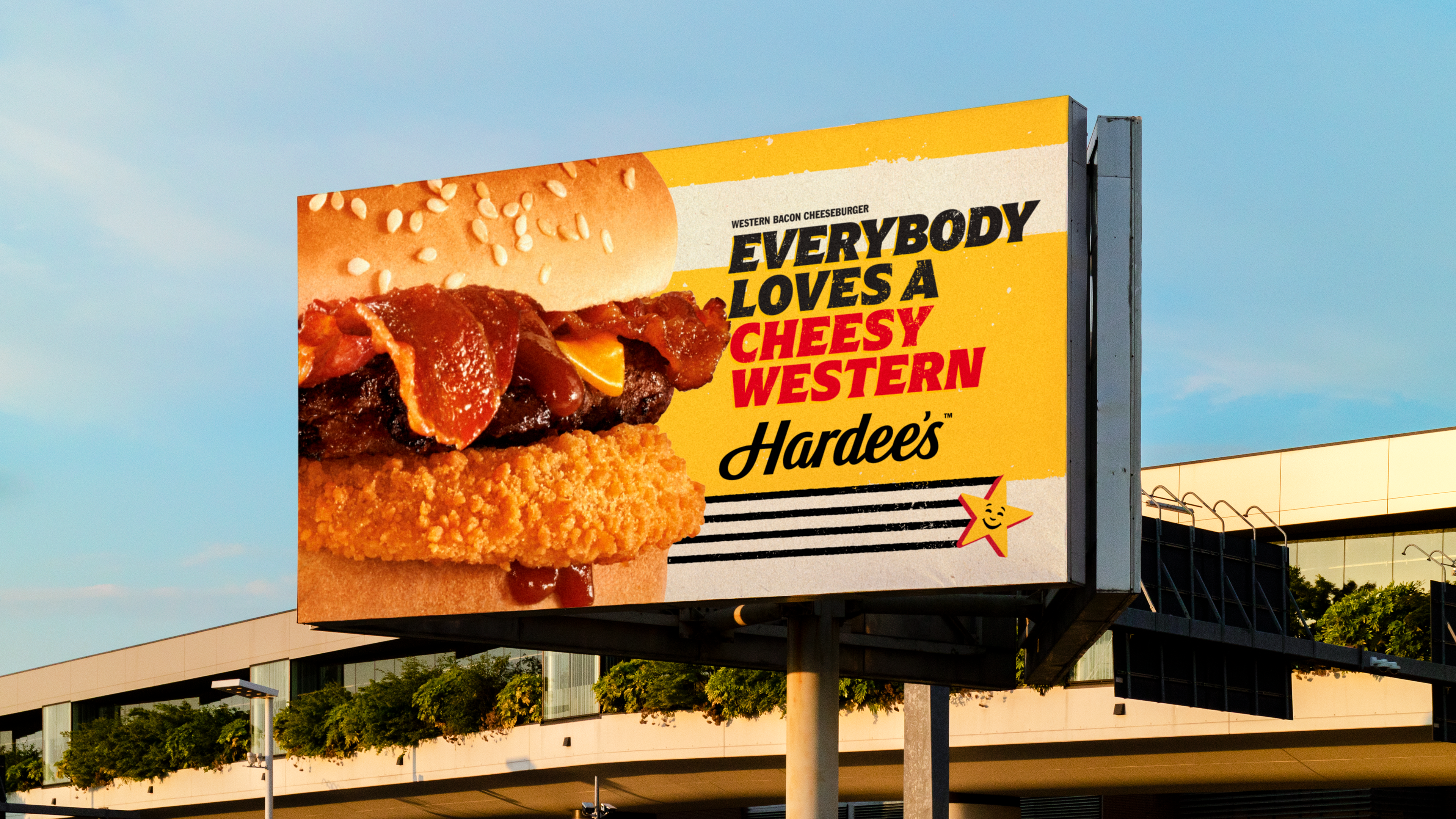
Every photo’s a feast for the eyes with a bold attitude to express it. We’re talking big, juicy, dramatic, crave-worthy satisfaction, in a welcoming world where more is more.

The new design system includes:
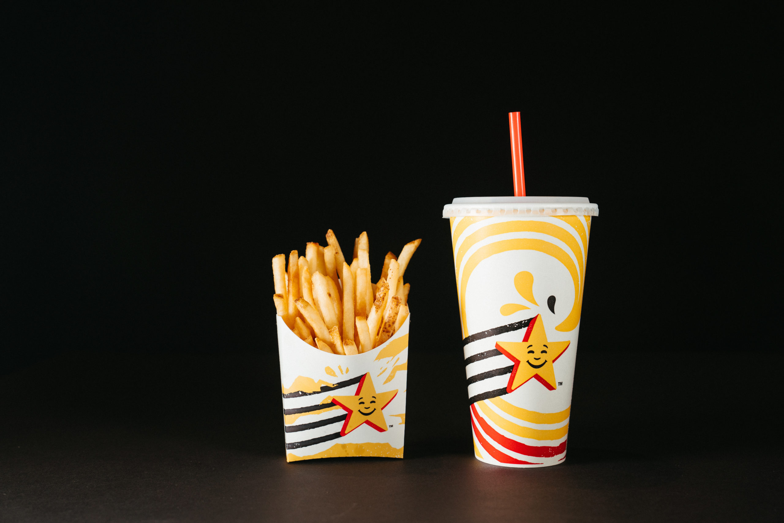
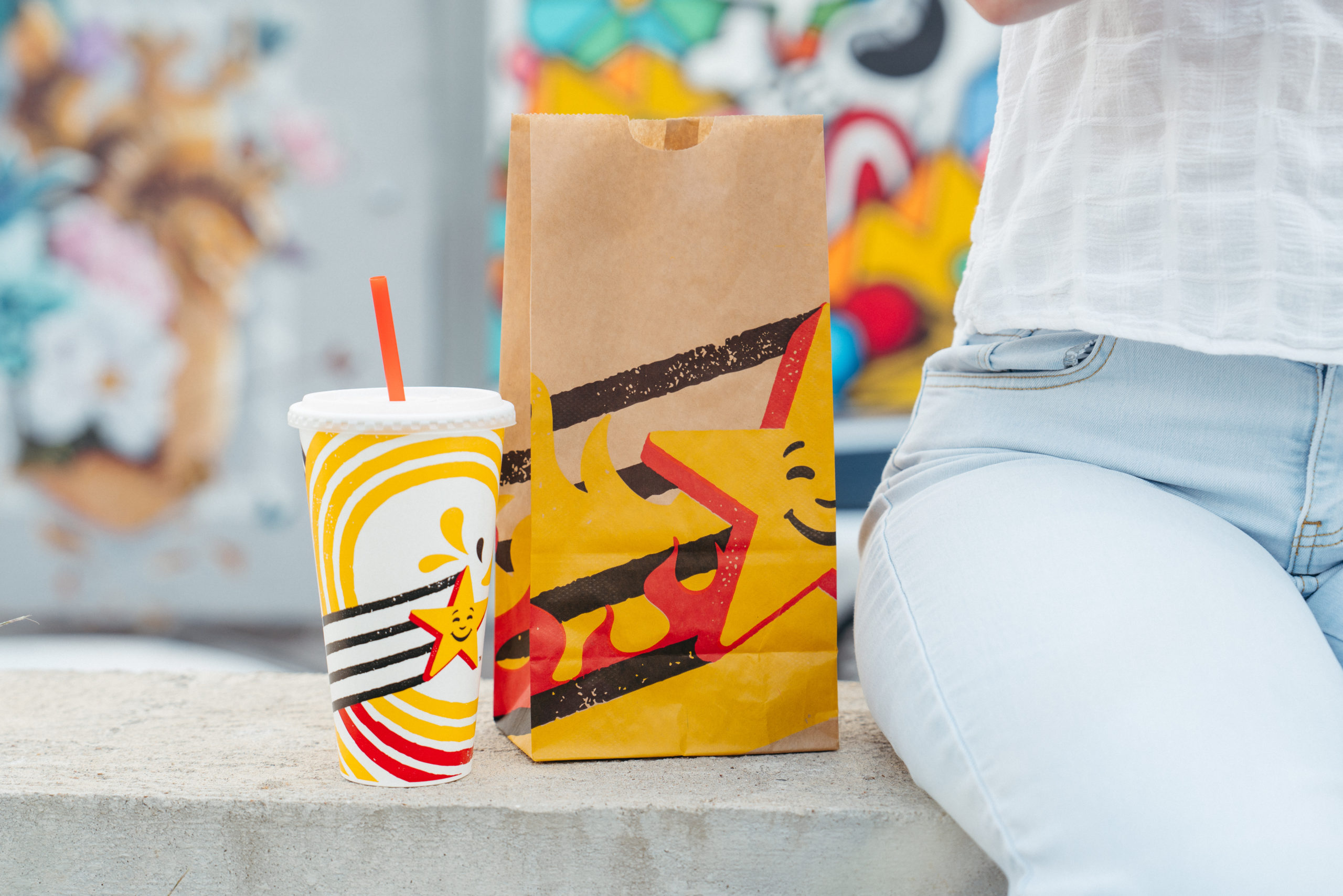
● FLAVOR TRAIL: Textured to be charbroiled like the brand’s famous burgers, Happy Star and his flavor trails come to life in different illustrations that imbue flavors of ‘crispy’ (Hand-Breaded Chicken) or ‘fire’ (Angus Beef Burgers). This new design feature follows Happy Star and reminds consumers to come to Carl’s Jr. and Hardee’s through packaging, restaurant design and online presence.
● LOGO: Happy Star has had a complete makeover. The new logo is now a visual instigator with a flavor trail that leads consumers to our brands. Crafted as carefully as our biscuits and burgers, our star logo has been updated with a charbroiled textured shadow to lead the flavor trail, along with an ode to their founders’ names in their honor.
● COLOR PALETTE: CKE Restaurants new color palette encompasses new bold colors inspired by its trademark and food items including Charbroil Black, American Cheese Yellow, Flame Red and Biscuit Cream.
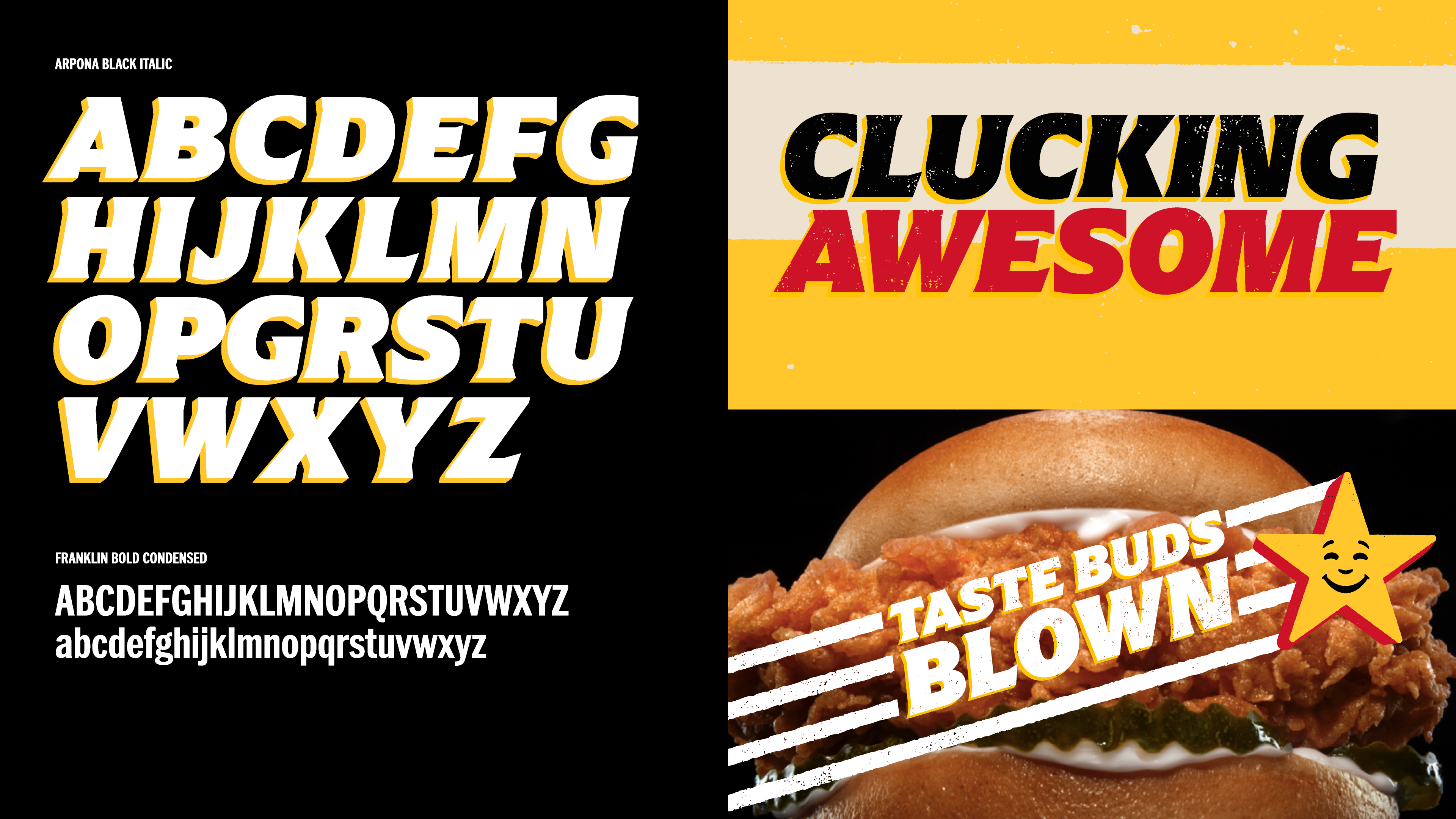
● TYPOGRAPHY: Carl’s Jr. and Hardee’s have used arpona wedge serifs, to mimic the shapes and angles of Happy Star. The new typography highlights the fun nature of the brands, and is loaded with character — it’s big, bold, and impactful to match the overall tone of voice.

“This reimagined identity not only rings in a new era for both Carl’s Jr. and Hardee’s but gives us a platform to unite our total brand experience around leading our guests to what feeds their happy,” said Meredith Martin, senior director of marketing communications at CKE Restaurants. “It took a detailed process and many months to create all this, and we’re extremely proud of the refresh and its ability to emotionally connect guests to our brands and amplify the craveable truth surrounding our food.”
All design changes will be echoed throughout the restaurants and will be included across employee uniforms, in-store signage, food packaging, advertising, and the brands’ online presence. Carl’s Jr. and Hardee’s newest advertising featuring the updated brand look and feel will launch in a 360 campaign across television, radio and on digital platforms including Snapchat, TikTok, Kargo, Yahoo! and brand channels.
Source: Design Bridge
You must be logged in to post a comment Login