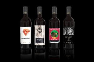
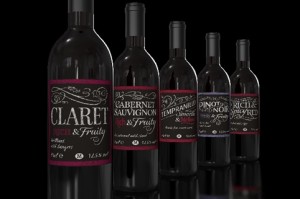
 Elmwood has created new designs for Morrisons’ own-brand wine ranges, aiming ‘to transform the supermarket in to a true wine destination’.
Elmwood has previously worked with Morrisons on projects including packaging for the Just for Kids readymeals range, branding the Little Big baby range and creating the identity for the Market Street offer.
The project has seen Elmwood work with Morrisons’ in-house team to develop new branding and product hierarchy for the Morrisons wine range, looking to make the products more accessible for customers.
 The designs for the labels that denote wine by the grape use hand-drawn typography, formed to look like chalkboard writing.
Wine by region uses labels with details such as travel stamps, illustrations and block colours, with ‘accessible and inviting’ copy by Morrisons copy manager Liz O’Connor, says Elmwood.
Martyn Hayes, designer director at Elmwood, says, ‘It was really important to understand the design cues that resonate with customers when buying regional wines, while also giving the wines an ownable look and feel. The project was a great opportunity to use an array of illustrators and typographers to bring our ideas to life.’

You must be logged in to post a comment Login