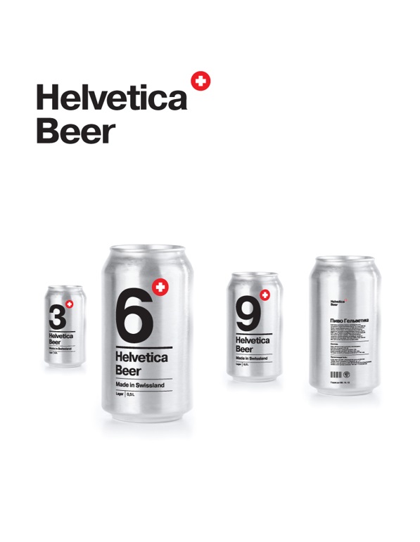
 Russian designer Sasha Kischenko has designed a wonderful concept packaging for a Swiss beer using the popular Helvetica typeface.
Called ‘Helvetica Beer’, the number on the can indicates the alcohol percentage, while the color reflects the type of beer—lager or stout.
Though it’s only a concept, design blog Design Taxi have a feeling that it’ll sell really well in the creative industry if it were actually produced.


You must be logged in to post a comment Login