Gü, the premium desserts brand, has launched new global packaging designed by Bristol-based design studio Outlaw. The new design follows the acquisition of Gü by private equity firm Exponent in 2021.
When it first launched Gü was a pioneering challenger, setting new standards in premium pleasure with a world of wicked indulgence. But the current packaging had lost this edge, becoming cold and logical in a category that’s anything but, and leaving the brand stuck in an overly formal, infrequent ‘after dinner’ occasion.
Outlaw’s new design draws from the best of Gü’s past while moving the brand forwards, shortcutting logic with packs which are distinctive, contemporary and irresistibly indulgent to challenge ice cream and chocolate for a spot in more informal sofa moments.
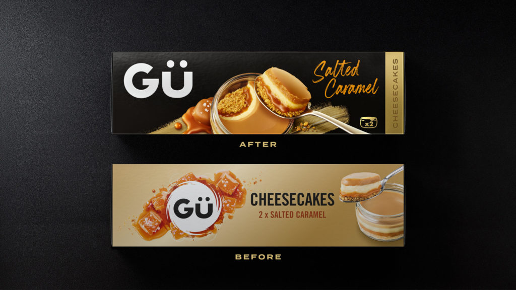
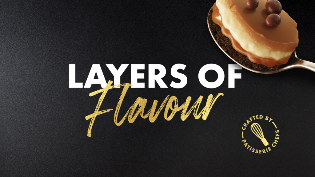
Taking the brand back to black was the first step, delivering impact at shelf while reclaming a distinctive piece of the brand’s history – something missing from current packs but which research revealed lived on strongly in consumers’ minds.
Inspired by Gü’s patisserie roots Outlaw put the signature ramekin at the heart of the design, investing time and care in photography to make sure every shot was oozing with indulgence, expertly overseen by Gü’s team of pastry chefs. Each product also includes a dynamic ‘spoon push’ to showcase the luxurious layers which have always set the brand apart.
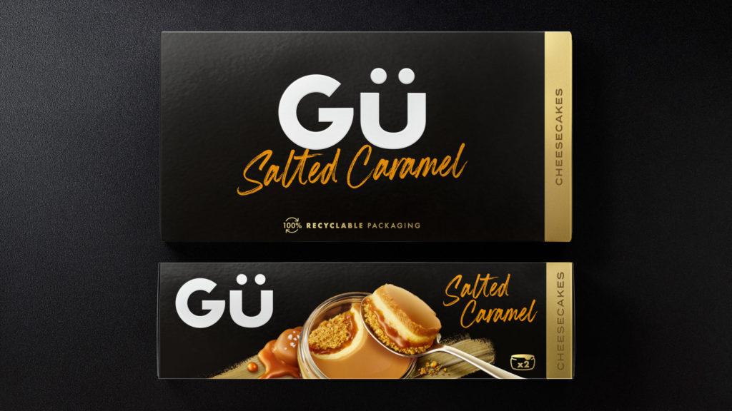
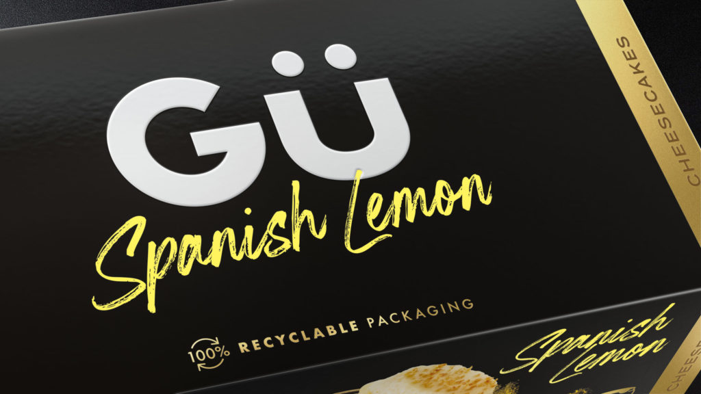
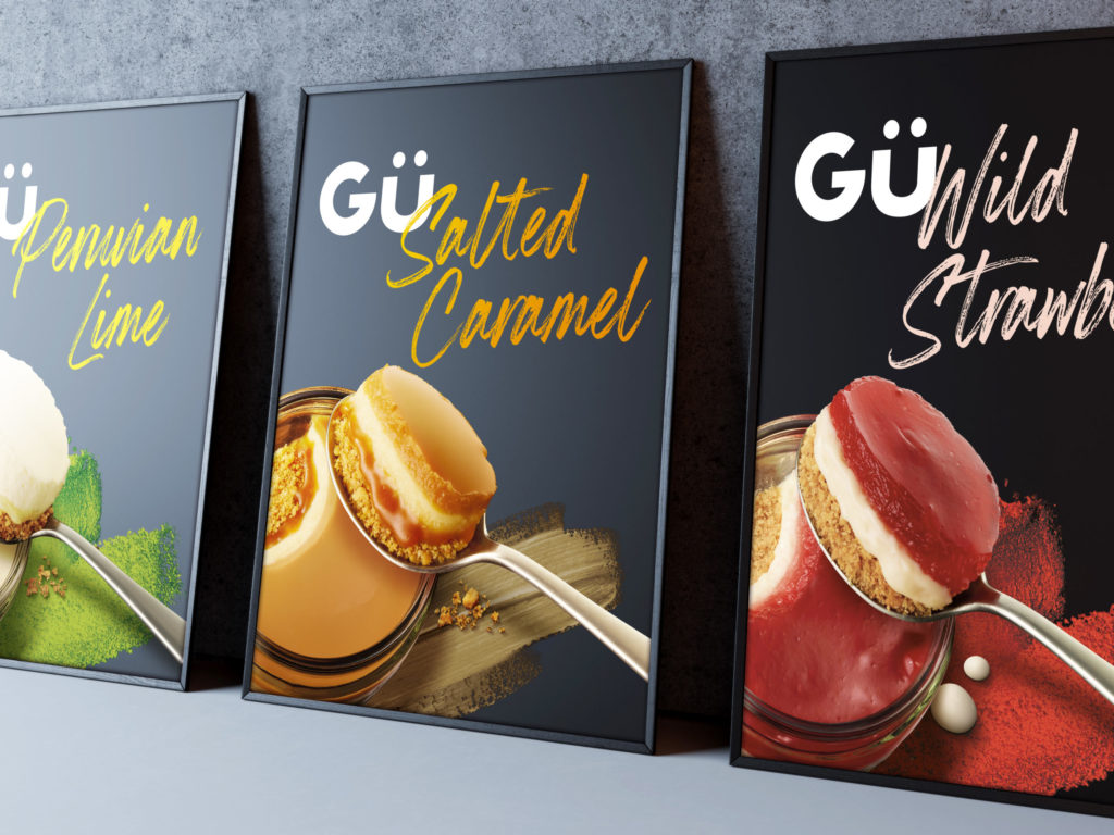
The iconic Gü brand marque has been given space to breathe, delivering strong recognition on shelf and throughout the brand world by balancing premium simplicity with layered product communication. This is complimented by flavoursome typography to help shoppers easily find their favourite treat.
The result is a modern, dynamic design that builds recognition at shelf and has the the flex to accommodate different product pillars and flavours – including the core range and its plant-based counterparts, the ‘Inspirations’ range of bakery-inspired treats and an upcoming pipeline of exciting new product and flavour innovations.
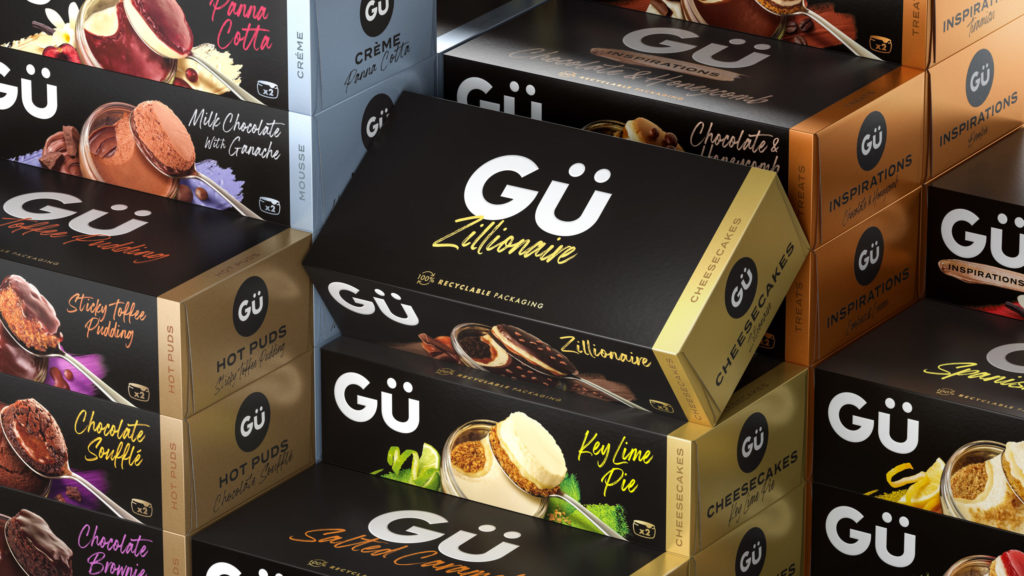
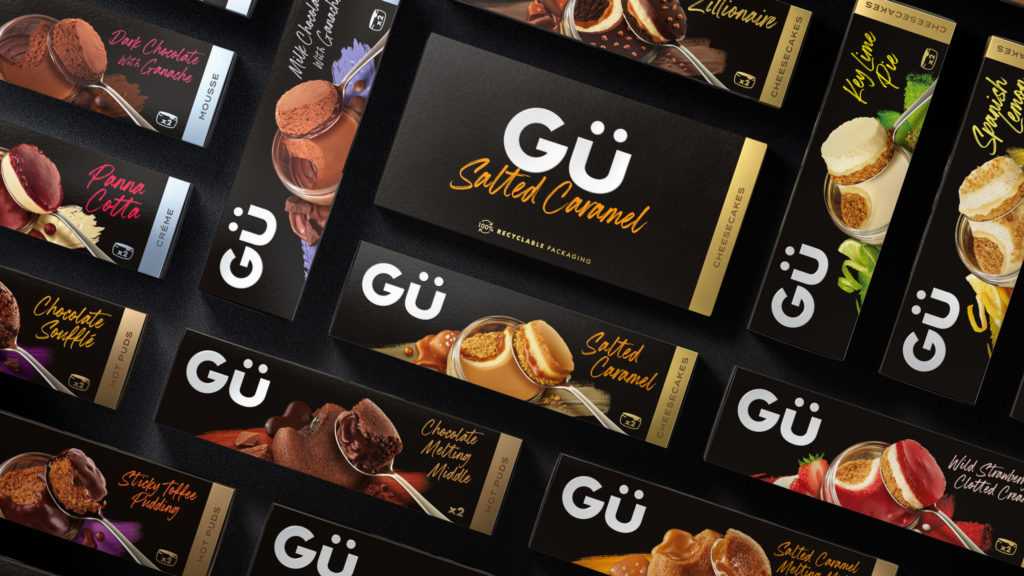
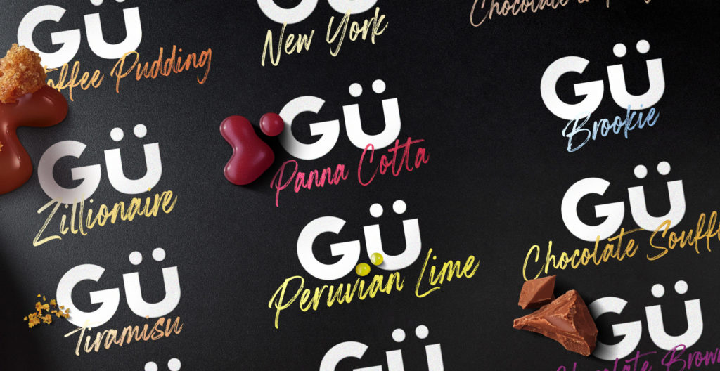
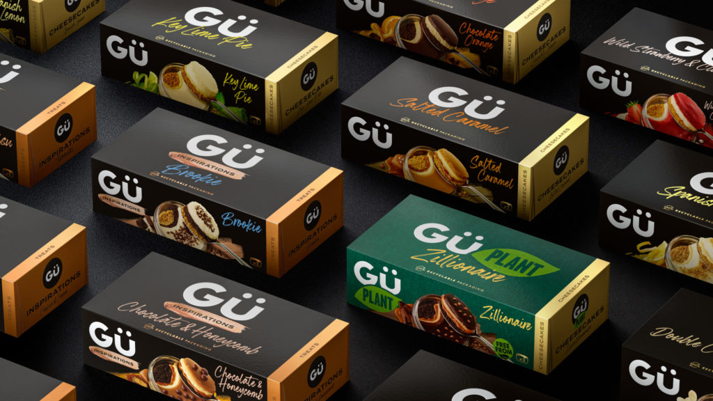
Outlaw said: “Like most consumers we had a picture of Gü in our minds which didn’t match the current reality on shelf – but turning back the clock wasn’t enough. Instead the new design combines the iconic, established elements of the brand with new photography styling and more dynamic typography and assets, ushering Gü away from the dinner table and into the hands of anyone looking to dial up the indulgence of their Friday night sofa moment.”
Gü CMO Anthony Wells said: “A critical part of our strategy to double our growth is establishing a modern Gü visual identity – a need to reflect our global positioning and build new distinctive brand assets. Outlaw have been the perfect partner on our journey so far, understanding and reacting to the strategic and creative challenges of our fast-moving and highly ambitious business to deliver our new identity that builds our brand and improves shelf impact. We’re excited to continue that partnership into a pipeline of delicious innovation over the next 18 months!”
Source: Outlaw

You must be logged in to post a comment Login