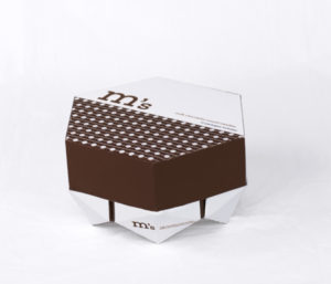
 Brooklyn, New York-based aspiring graphic design Alyssa Phillips has given the packaging of M&M’s chocolate candies a redesign to make it more presentable.
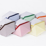
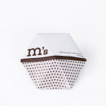
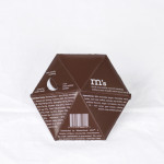
Instead of keeping to the standard plastic flimsy wrappers the chocolate snack is known for, Phillips opted for a structured geometric look that also mimics the round shape of its candy—and renamed the candies “M’s” to give it a modern updated feel.
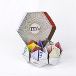
Each small packet was made of cardboard, so that a single serving size could fit comfortably in a person’s hand. In case the packets can’t be finished, the cardboard packet also comes with a resealable tear strip.
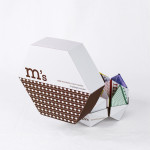
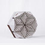
Phillips also thought of a countertop display for parties: she created a larger cardboard box with indented bottom, so that single serving packets could fit snuggly into it—making it presentable as well as functional at the same time.



You must be logged in to post a comment Login