
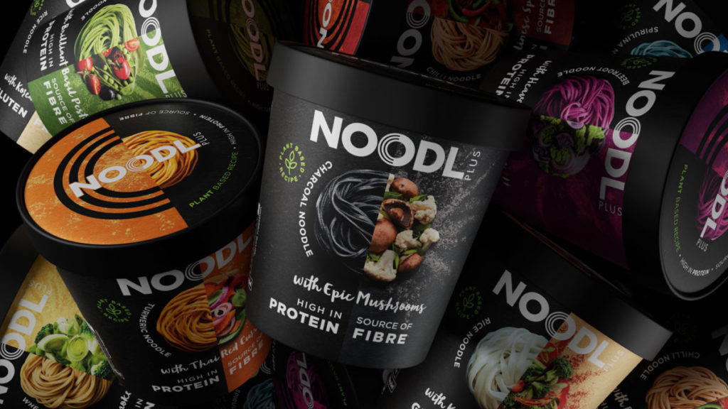
Award winning design consultancy Path, have partnered with Westmill Foods to transform the noodle-pot shelf with a vibrant and healthy new brand. The coloured noodles of Noodl Plus are infused with charcoal, turmeric and other super nutrients to bring visual excitement, taste and health to an otherwise stale category.
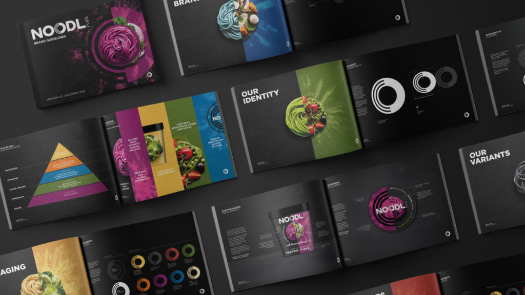
Westmill, known for their range of authentic market leading ethnic brands and exceptional quality noodles for both consumer and food service, asked Path to help expand their consumer brands portfolio. Path is a cross-over agency built to develop, design and launch new products and brands faster and better in every dimension. They have won awards for convenience food brand creation and have an expert team forecasting the future of foods in their journal, Map. An agile approach, from concept creation, screening and crafting to design, through implementation and activation, enabled Westmill to work with them all the way from insight to the products on shelf.
Path was able to rapidly validate Westmill’s hunch that a totally new, striking and healthy noodle brand would resonate with the Instagram generation. In collaboration they crafted and designed concepts guided by the client’s consumer research and informed by Path’s own design insight series, Map.
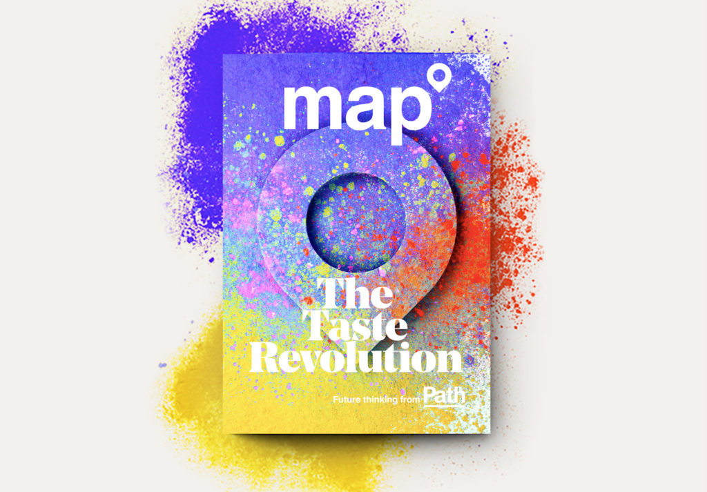
“As we wrote in “Visual Delicacies’, The Taste Revolution (Map 2018), Instagram is the perfect platform to support the launch of a food brand which is as good for your eyes as it is for your body and soul.” – Ollie Moore, Strategy Director, Path
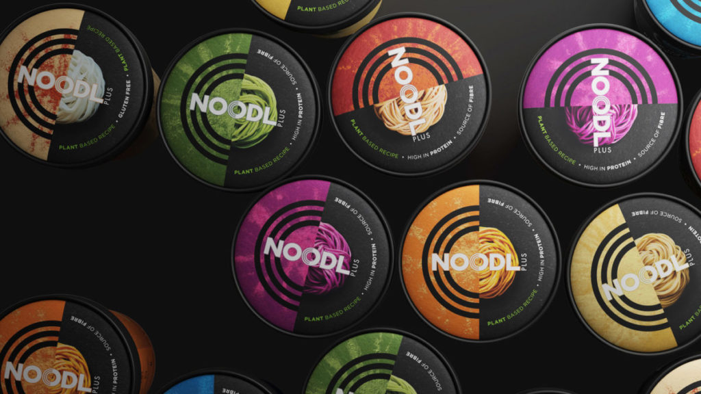
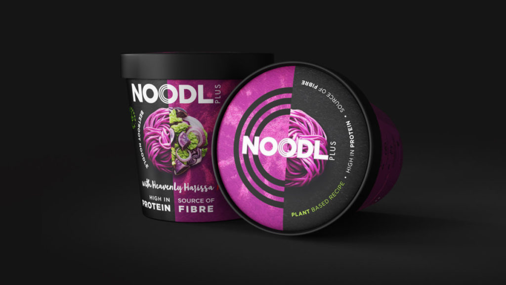
A social led strategy meant, more than ever, the brand and design needed to be visually direct and coded to create distinctive assets for communications. ‘Noodl Plus’ was conceived to ‘feed the soul and live life with colour’. The wonderfully coloured noodles needed to be a key differentiator of the product, so Path found a way to hero the nests whilst also communicating details of flavour and benefits in a unique and campaign-able way. This was all distilled into a single, central brand icon that can work on and off-pack on social and in activations.
Source: Path
You must be logged in to post a comment Login