
 As they turned ten years old, Little Dish looked to set a new standard of health for the children’s chilled meals category with its new range of pots and pies.
They called upon Design Agency Pearlfisher to develop a vision, voice and series of packaging structures that would bring the nutritional credentials of the new meals to the fore.
“The Little Dish brand was born in the Pearlfisher building and thus, they were the only partners we trusted to take our brand forward. What they have done is truly category-defining,” said Little Dish Co-founder, Hillary Graves.
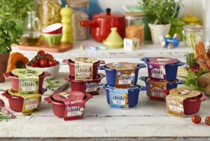
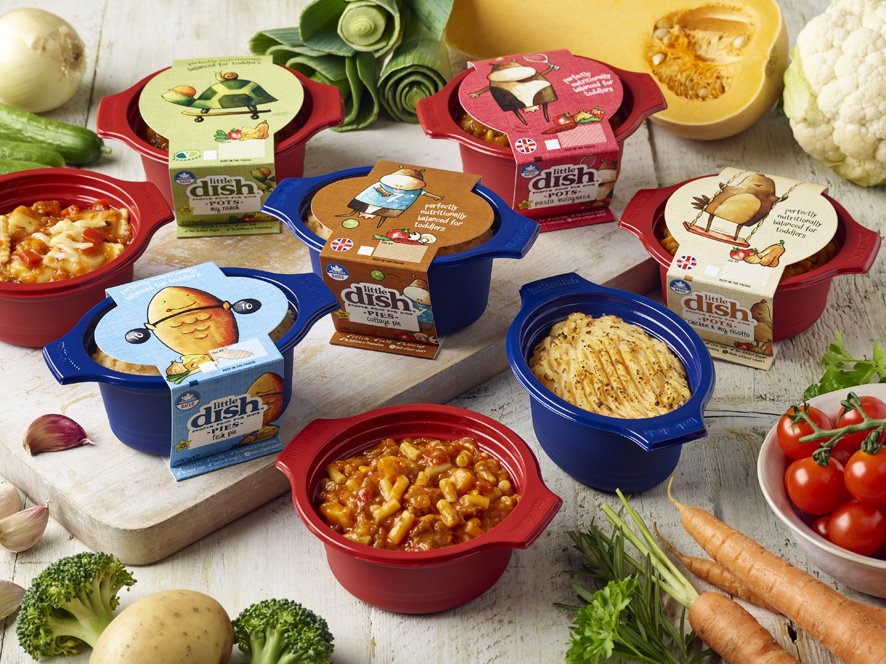
Tasked with better connecting parents to the brand’s mission of “feeding healthy kids,” the new strategy takes inspiration from colourfully-enamelled cookware to establish a set of portfolio segmentation principles from which an eclectic mix of products – homely and diverse, yet unified as a range – have been created.
 By using structural form, colour and material finish to hero the new Little Dish brand experience, the new design brings the meals’ nutritional credentials to the fore.
The ‘pot’ and ‘pie’ containers are a first of their kind, with bespoke shape, colour, surfacing and embossed detailing on unique handles; communicating premium quality and driving ultimate differentiation on shelf.
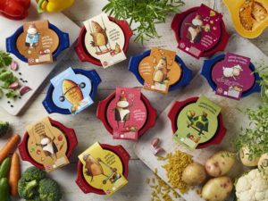
Bold graphic treatment and placement ensures that the card sleeve talks to both parents and kids, bringing the ‘zoo crew characters’ playfully to life.
Mike Beauchamp, 3D design director at Pearlfisher, said: “We used form, colour and material finish to hero the new Little Dish brand experience. We used the card sleeve to talk to both parents and kids: a deli-style sticker on the side of pack helps parents navigate stacked meals on-shelf, leaving the entire top face for kids to see Mabel the Cow skipping with a spaghetti string or Charlie the Chicken juggling butternut squashes. Graphically, we assigned bold colours to different protein sources to help with product identification and used handwriting cues to emphasise the youthful naiveté of the brand.”
You must be logged in to post a comment Login