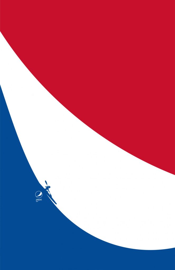
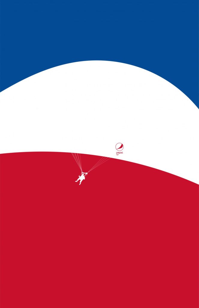
 The Pepsi logo has enough curves to invite people to think that the brand is perfect for refreshment on the water or while doing outdoor activities.
That was the inspiration behind an outdoor and print campaign called ‘Feel Light’ for Pepsi Light by Sancho BBDO in Colombia.
In their creative hands, the red, white and blue swirls of the soft drink represent movement and being active, so they transformed the iconic design into freeing activities, like parachuting, windsurfing, skiing, kayaking and diving.
The changes are subtle. The eye is drawn in by the classic curves, but look closely and see the silhouette of a windsurfer grabbing hold of the white stripe like a sail, with the blue stripe acting as the wave he rides.
On another, a skier is seen tucking down the blue stripe as the white acts as snow, the speed gathering as the red of the sky becomes sunshine.
Daniel Álvarez, ECD to Pepsi at Sancho BBDO, says: “Throughout its history Pepsi Light has highlighted curves; those linear figures that, at least conceptually, established the light spirit of the drink: thin, curvy women who freshened themselves with zero sugar and zero calories. We turned the logo curves into a sports activity that invites people to feel light, where the curves that we have seen and strengthened for more than 125 years, go from the aesthetic to something really meaningful.”
 Credits:
Client: PepsiCo
Brand: Pepsi Light
Agency: Sancho BBDO, Bogotá, Colombia
Chief Creative Officer: Hugo Corredor, Giovanni Martínez
Executive Creative Director: Daniél Álvarez
Creative Director: Fabian López ‘Chompi’, Juan David Pardo
Art Director: Juan David Pardo, Tatiana Serpa, Sebastián Hernández
Copywriter: Fabián López ‘Chompi’, Camilo Torres Ángel, Kyara Ortega
Illustrator: Juan David Pardo, Tatiana Serpa
Retouch: Tatiana Serpa
Account Executive Director: Javier Jiménez
Account Director: Rodrigo Salazar
Account Manager: Juliana Ordoñez
Advertiser’s Supervisor: Andrés Victoria, José Luis Silva
Source: The Drum


You must be logged in to post a comment Login