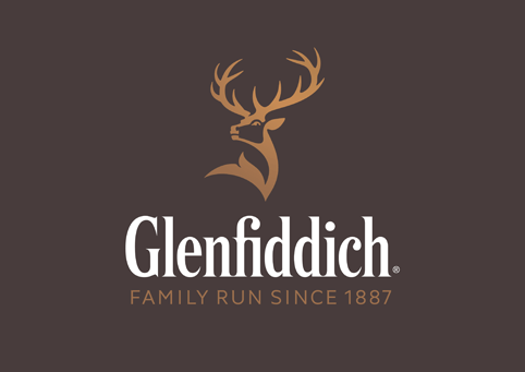
 Purple Creative has overhauled the Glenfiddich Single Malt Scotch Whisky brand creating a new identity, colour system and brand expressions.
The consultancy – which has worked with Glenfiddich for eight years prior to this rebrand – has evolved the stag in a bid to “evolve, strengthen and premiumise” the icon, which Glenfiddich sees as its strongest brand equity.
Although the brand is 125 years old the stag did not appear on bottles until 1968 and was not updated until 2007 when it became more streamlined.
![]() Purple Creative director and founder Gary Westlake says: “Based on his antler points, the current stag is 8 years old, a young male within a herd.
Purple Creative director and founder Gary Westlake says: “Based on his antler points, the current stag is 8 years old, a young male within a herd.
“We wanted to turn him back into a royal stag – a majestic 12 pointer, which denotes the alpha male, masculinity, power, confidence and maturity.”
The face has been redrawn “to make him more anatomically correct” and “we also wanted to elevate the icon’s status – to ensure it wasn’t recessive within the overall brand logo,” adds Westlake.
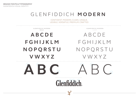
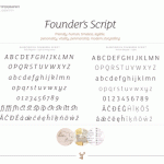
Two new bespoke Glenfiddich typefaces have been created, which will roll out across multiple touchpoints.
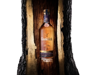 Westlake says: “We wanted to create a story-telling, bespoke font, which gives depth and authenticity.”
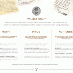
The Purple Creative team looked at Glenfiddich founder William Grant’s hand written correspondence in the company archives and found a writing style that reflected the copybook style of the Victorian period.
The handwriting was analysed using graphological techniques to inspire the development of new typefaces.
The results showed him to be “inventive, innovative, future-orientated, visionary, intelligent, proud, a good communicator and decisive,” says Westlake.
Glenfiddich Modern will be used for headlines and is a Sans Serif, which Westlake says is “confident, clean, unique, premium and crafted”. It has been inspired by the logotype.
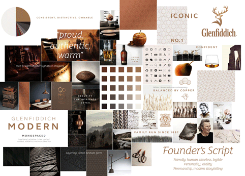 Founder’s Script will be used for body copy and is inspired by Grant’s handwriting “capturing his characteristics and personality traits,” says Westlake whose team also created a range of ligatures to add a handwritten script feel.
Glenfiddich had raised concerns that as its ranges have broadened over the years and each variant has taken on an ownable colour, the colour palette was “at risk of becoming fragmented and eroded.”
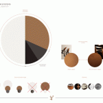
Purple’s solution was to introduce a copper colour palette, which it calls Pagoda Copper, a system inspired by the second-hand copper stills that William Grant bought in 1886, when he founded The Glenfiddich Distillery.
 “We were also inspired by the constant care of their on-site coppersmiths, and the copper stag on the distillery’s pagoda roof,” says Westlake.
The secondary colours are New Make White and Fiddich Stone, inspired by the slate and granite used on William Grant’s original warehouses.
Photographic imagery used in campaigns will also be imbued with the copper palette.
The tone of voice taken on by the brand is one of “depth and authenticity,” which echoes the spirit of Grant according to Westlake, who says the graphology results have also informed this opinion.
Photographic imagery used in campaigns will also be imbued with the copper palette.
The tone of voice taken on by the brand is one of “depth and authenticity,” which echoes the spirit of Grant according to Westlake, who says the graphology results have also informed this opinion.

You must be logged in to post a comment Login