The ice lolly is aimed at kids and the young at heart, who are looking for a healthier treat that is still super-tasty.
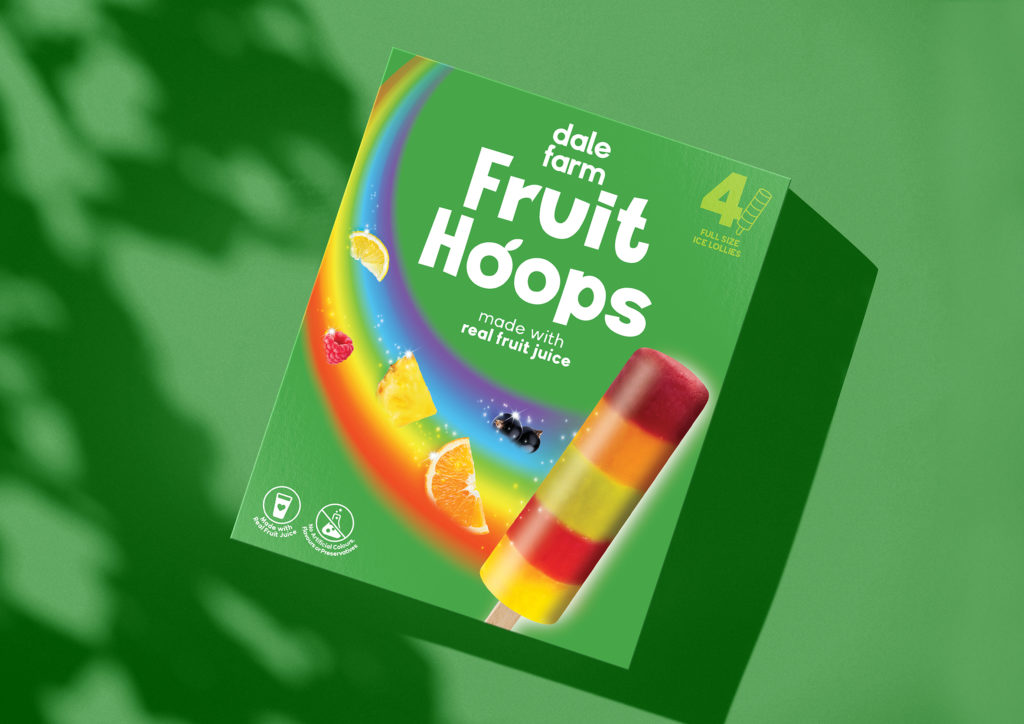
This new brand creation would then be followed by an out of home and digital advertising campaign to launch the brand in Northern Ireland, also designed by Simon Pendry Creative.
The naming needed to be simple, fun, memorable and of course reflect what is distinctive about this ice lolly. ‘Fruit Hoops’ was the winner, two rhyming words that roll off the tongue and that fully describe the products USP.
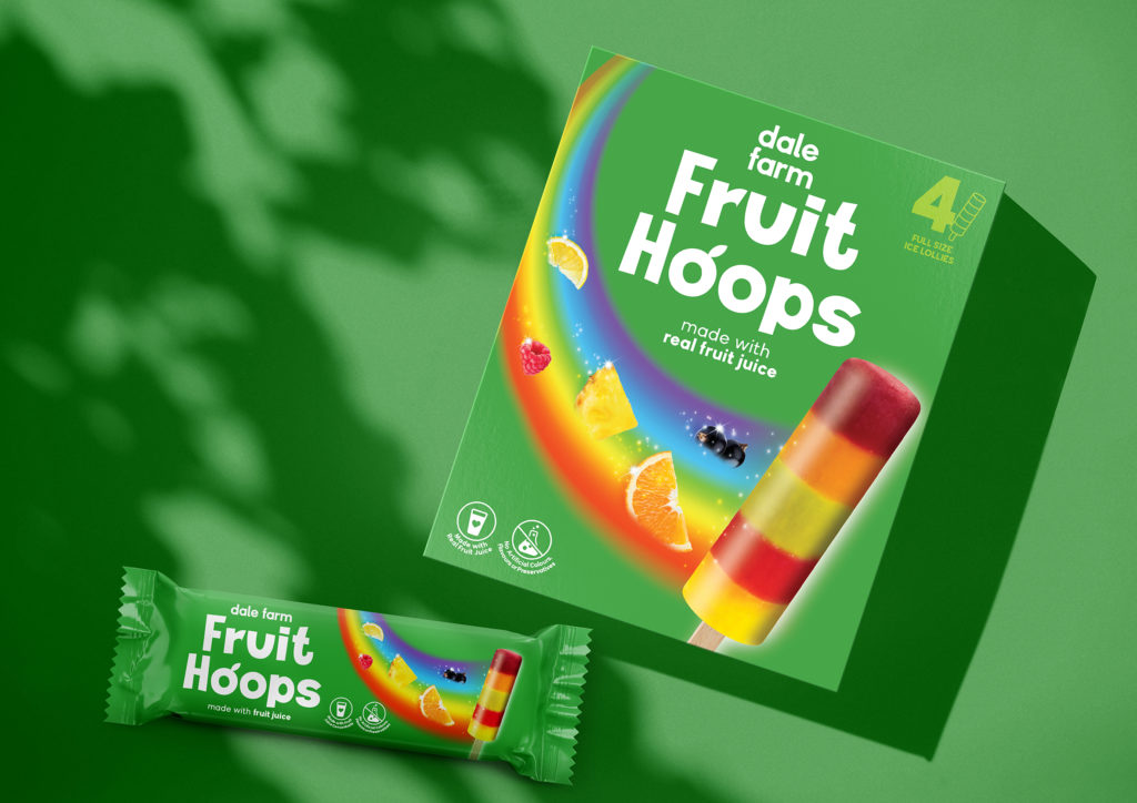
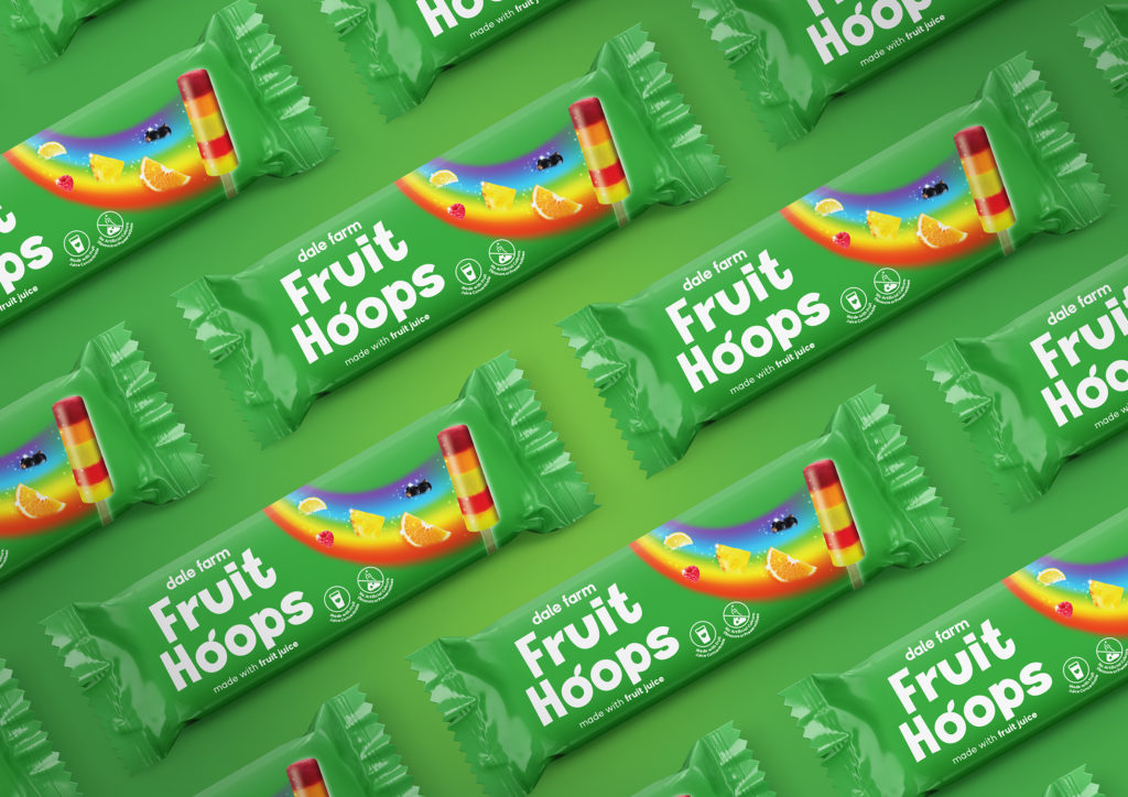
Visually we wanted to celebrate the stripes that give this ice lolly its unique look, but also the natural ingredients that are now a key motivation for consumers in this category. The ice lolly fixture is extremely crowded and busy visually, so our brand design needed to pack a punch to cut through the clutter.
The hand drawn typography, fresh green background, photographic fruit depiction and rainbow motif all suggest a healthier and more natural ice lolly treat that is still delicious and fun.
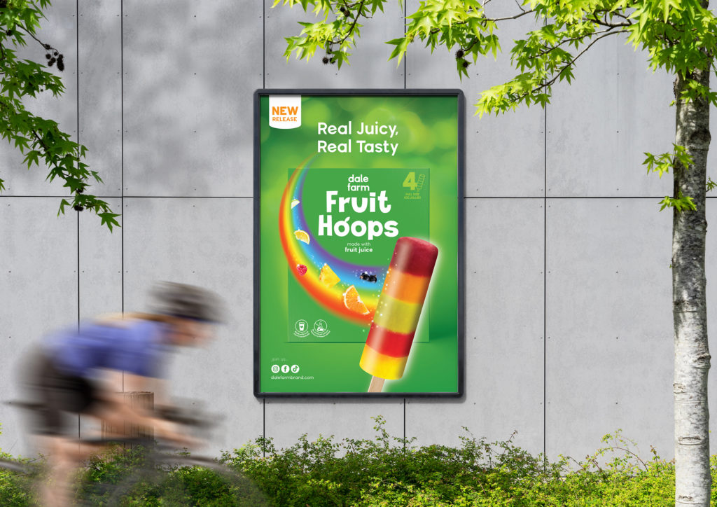
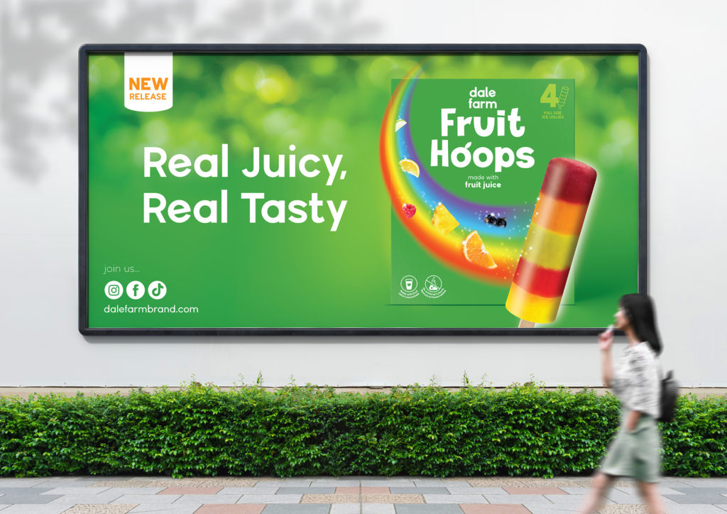
The advertising campaign places the new packaging front and centre to aid recognition, on a mottled natural green background leading with the message ‘Real Juicy, Real Tasty’ highlighting what motivates the consumer to give them a try. The campaign encompassed both print and digital media.
Creative Director Simon Pendry said “Creating brands from a blank piece of paper is always a fantastic challenge and great fun. I think we have a fantastic result, which has proved to be very effective in the market place which is the real test… tasty!””
Source: Simon Pendry Creative

You must be logged in to post a comment Login