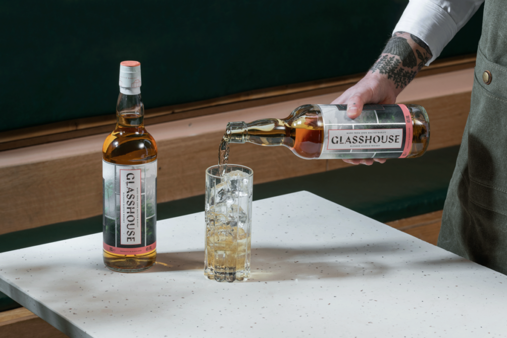
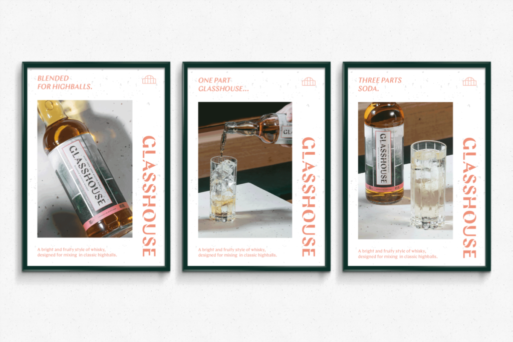
Reverse-engineering the classic highball cocktail, the bartending trio behind Langstane Liquor Company created Glasshouse, a blended Scotch destined for highballs. With such a strong niche in the market, Glasshouse needed a refreshing brand design. The team turned to Thirst to bring a light, fruity feel to the dark, complex and often inaccessible world of whisky.
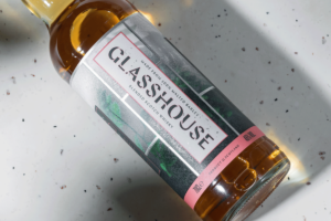
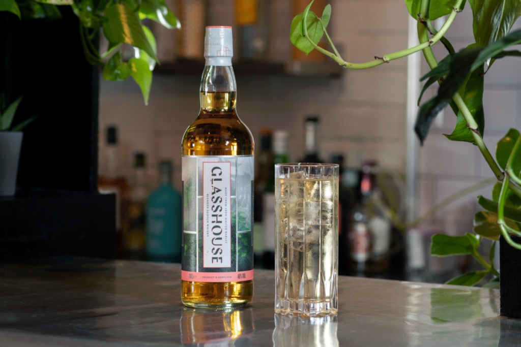
Inspired by the glasshouses of its namesake, Thirst created a glass panel design using a one to three ratio – a nod to the perfect highball serve: one part Glasshouse, three parts soda. The greenery lying behind the panels is obscured by crisp condensation, inviting consumers to take a closer look at the alluring world inside the bottle. Muted colours and botanical cues evoke a sense of tranquility, while a pop of coral brings a contemporary edge.
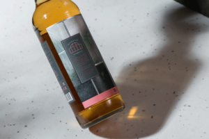
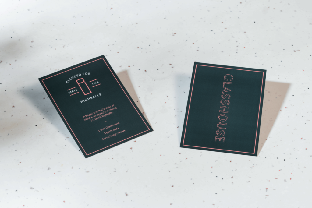
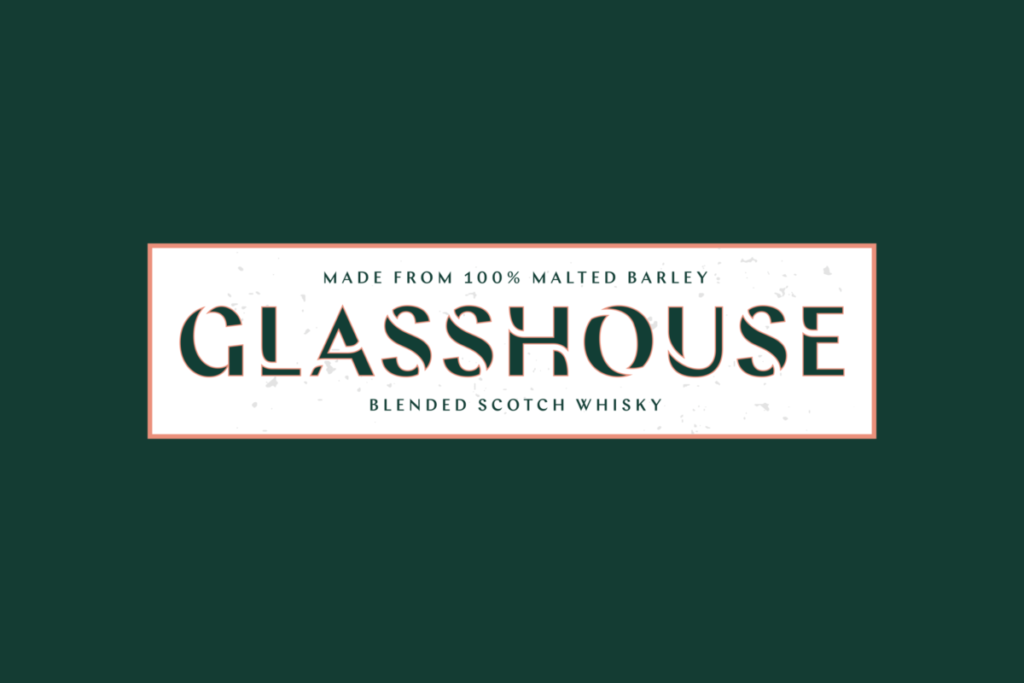
A vertical lockup gives the brand name full visibility on a busy back bar, but also shows Glasshouse’s subversive offering. The typeface is customised to mimic vines running through each letter, while an embossed finish and subtle use of foil mean the bottle effortlessly catches the light, reflecting (quite literally) the bright, crisp flavours inside. It’s a sleek design that translates off-pack with ease, helping Glasshouse make a splash that goes beyond the bottle.
Source: Thirst

You must be logged in to post a comment Login