
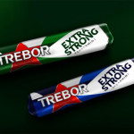
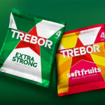
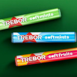
 Mint brand Trebor has refreshed its packaging design and logo as it looks to achieve a greater standout on shelf.
Working with Bulletproof, Trebor wanted to retain it’s identity but introduce a more colourful, eye-catching look.
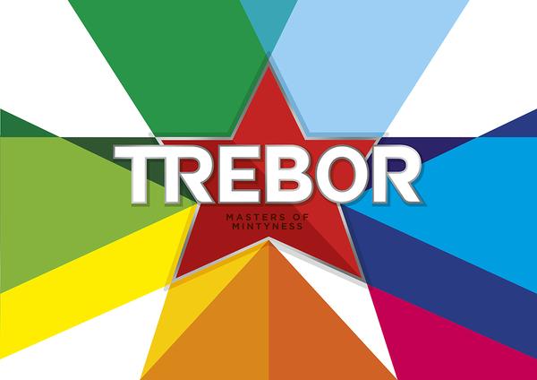
The brand’s red star mark has now become the heart of the new identity, using tonal colours on each pack to create the illusion of movement and to reflect the intense mint flavours of the product.
Colour also plays a central role in the new design as well as a silver border to provide luxury cues. To maintain its heritage the red Trebor star remains intact and the colours associated with the flavours – peppermint green and spearmint blue – also remained untouched.
Elena Mallo, senior brand manager for Trebor, said: “We wanted to rejuvenate our look to bring our products and brand spirit to life. The striking, impactful new packaging will have great standout on shelf and will encourage shoppers to pick up a pack of Trebor by highlighting our identity as a boldly British brand”.
Mondelez-owned Trebor owns a 39 per cent share of the mint market and £56m value sales.
You must be logged in to post a comment Login