
Every town in The Netherlands has one. A Chinese takeaway restaurant. Often family-owned business that is perceived as dusty restaurant, with an endless menu of hundreds of dishes.
Perhaps that is the reason why their chances of survival decrease by almost 75% year-on-year. The new generation in the family has fresh ambitions, while the popularity of sushi and wok take-aways gain the market share.
Known to never throw in the towel, owners Lide and Aihua Chung of the Chinese Box Club worked with Zware Jongens to shake-up the market. The briefing was to reinvent the Chinese takeaway, a job that certainly needs a good punch.
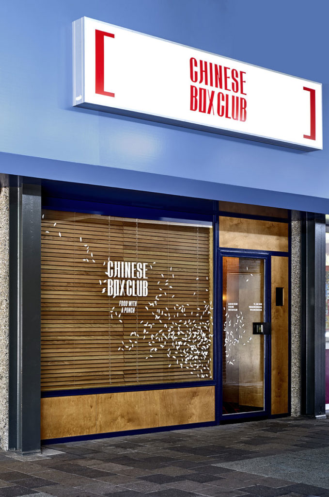
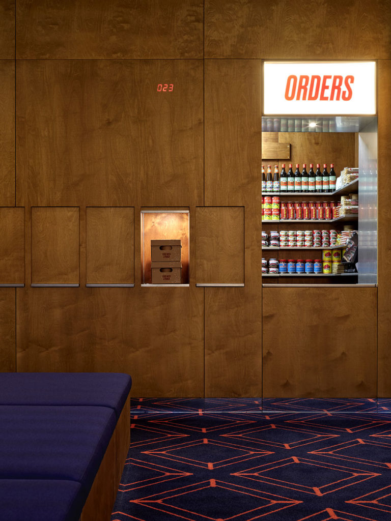
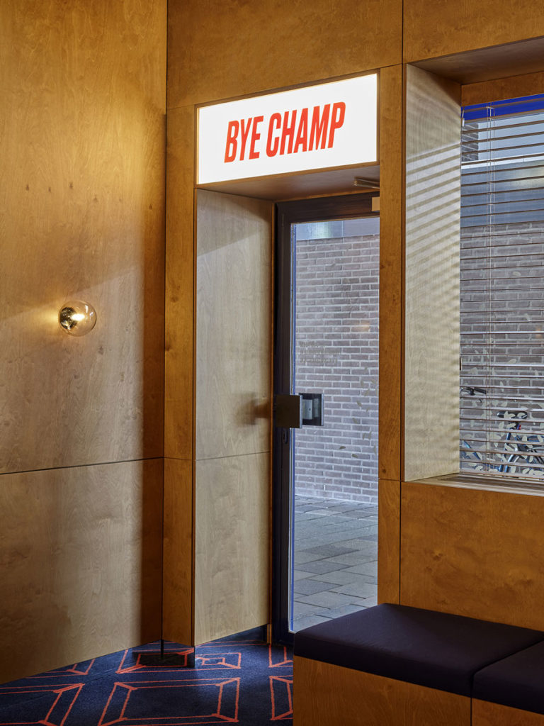
“The site location is extremely compact with an area of less than 30 m2. This is a deliberate choice. The aim was to create a unique atmosphere in the limited space. This is clearly inspired by traditional Chinese restaurants, as we all know them, where authentic elements were interpreted and implemented in a new way. The space has stained birch wood paneling with vintage spherical wall lighting. Both the personalised carpet and the repetitive lighting are endlessly extended by the mirrored skirting boards. Guests can order from the host in person or order digitally at home or in-store,” says Filip Janssen from Zware Jongens.
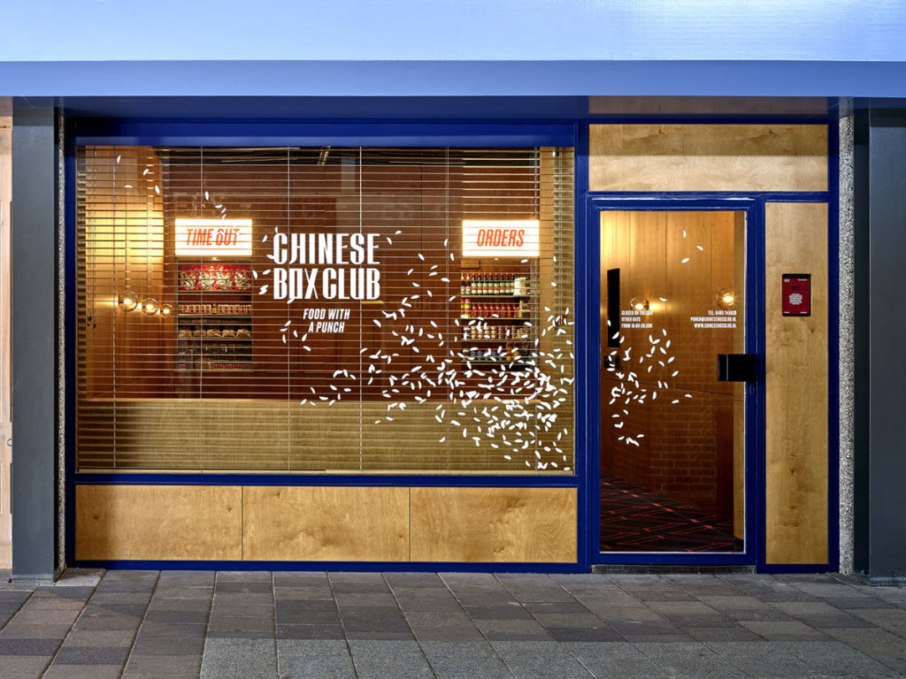
“To make the waiting moment punchier, sufficient seating space has been created, including a break-corner where guests can enjoy tea or other freebies while waiting for their box. Another important feature is the classic kitchen hatch, which has been brought to the foreground, so that the customer receives their order directly from the kitchen. The hatch could be brought even more to the foreground in the future concepts allowing to serve food via the street-side.”
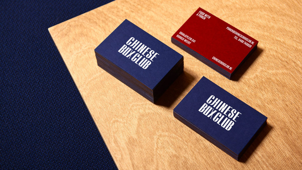
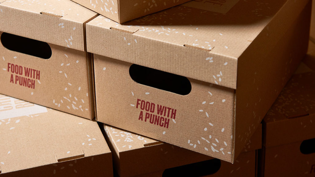
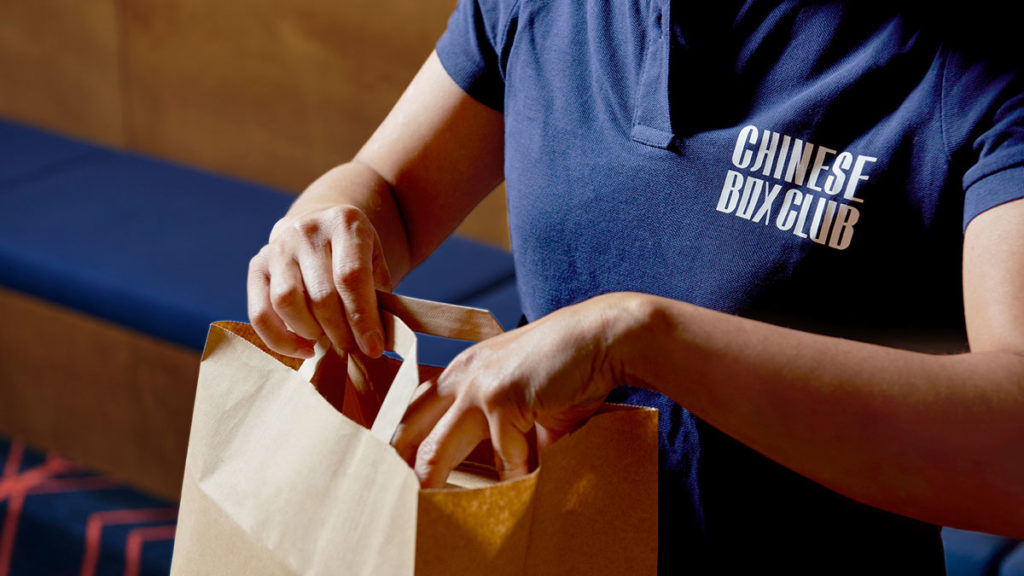
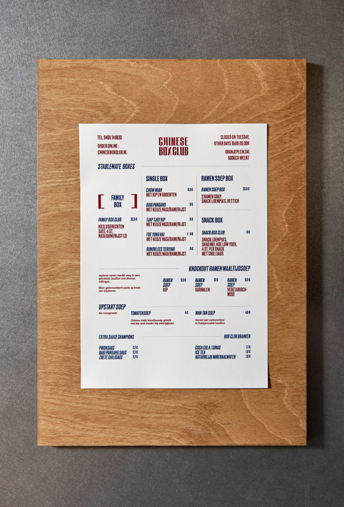
In addition to injecting fun and function into the total experience, a basic template has been set-up that can be replicated. In other words, a modular system that is scalable. From naming to menu composition, to packaging, to the entire experience and associated branding.
“We are excited about this location and trust that others will follow in the future,” said Lide Chung of Chinese Box Club.
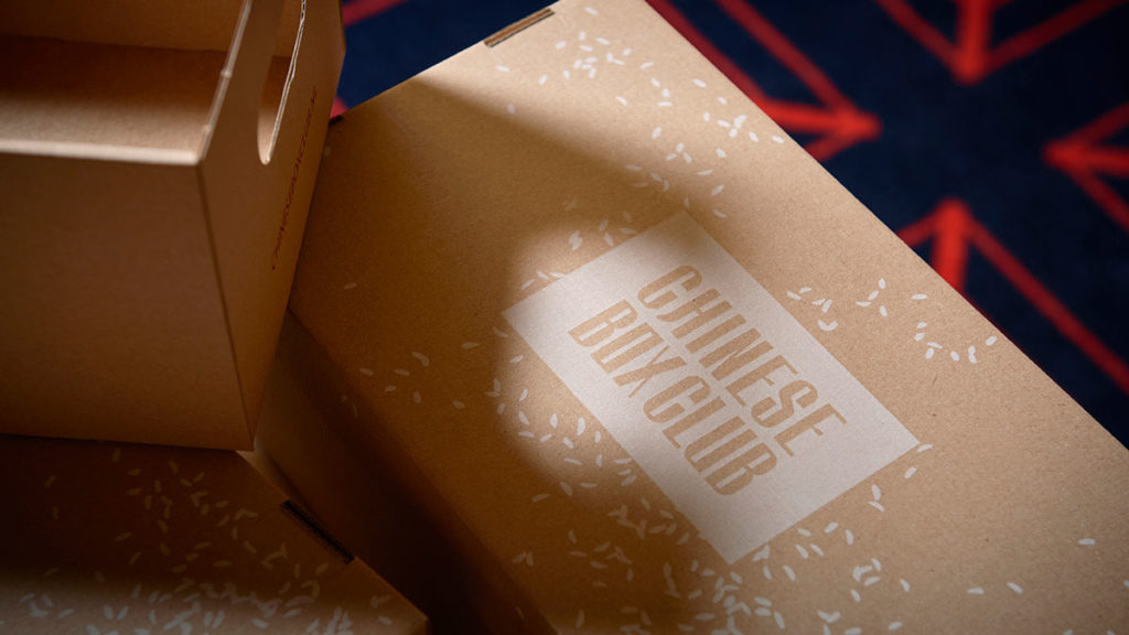
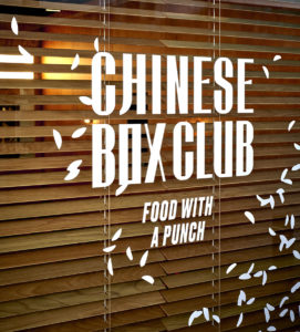
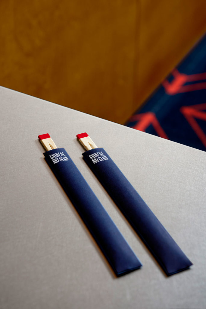
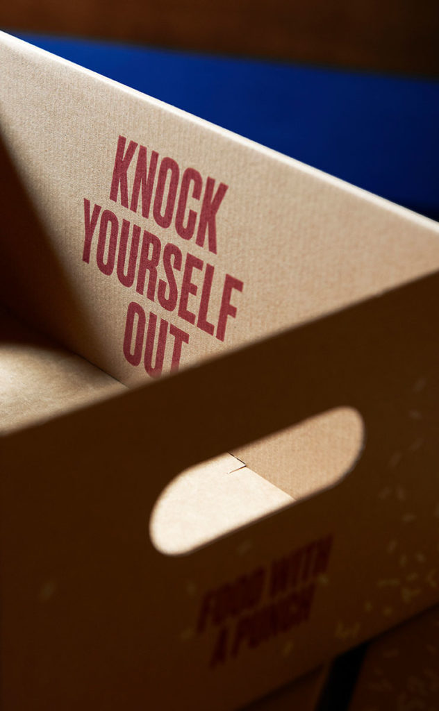
Jisook Park of Zware Jongens explains: “We opted for a completely different approach from the offset. That was also the briefing. That is why the naming; referring to the box in which you receive your order; and the branding is also powerful and recognisable. The logo is a blend of authentic Chinese lettering & modern typography. In terms of the further visual language, the rice pattern in motion refers to explosive elements from boxing culture and it aligns to the core brand idea of ‘food with a punch’. Other subtle references & twists to the box club concept are amongst others the warm-toned red & blue colour palette, the recognisable brackets containing numbers & highlights, as well as the opposite left-right alignment.”
With this take-away concept, the client aims at a broad audience.
Source: Zware Jongens
You must be logged in to post a comment Login