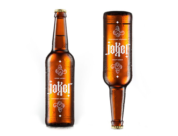
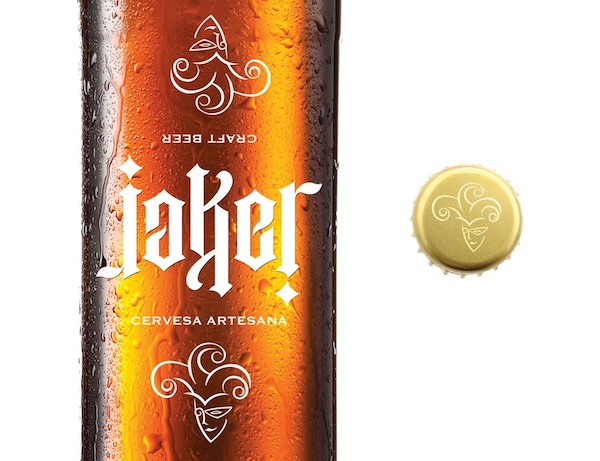
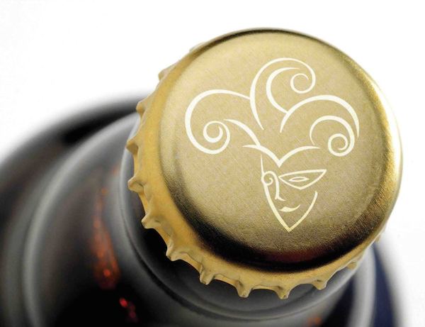
 Mexican studio Factor Tres has created a simple but clever bottle design for Jaker Beer—playing on the brand name’s similarity with the word “joker”, the resulting packaging is inspired by playing cards.
 The star of this design is its brilliant logotype, which is an ambigram—spelling out “Jaker” in a stylized type, this logo would read the same way whether it is being viewed right side up or upside down.
This fun design won its creators a Silver Award from Pentawards in 2013.


You must be logged in to post a comment Login