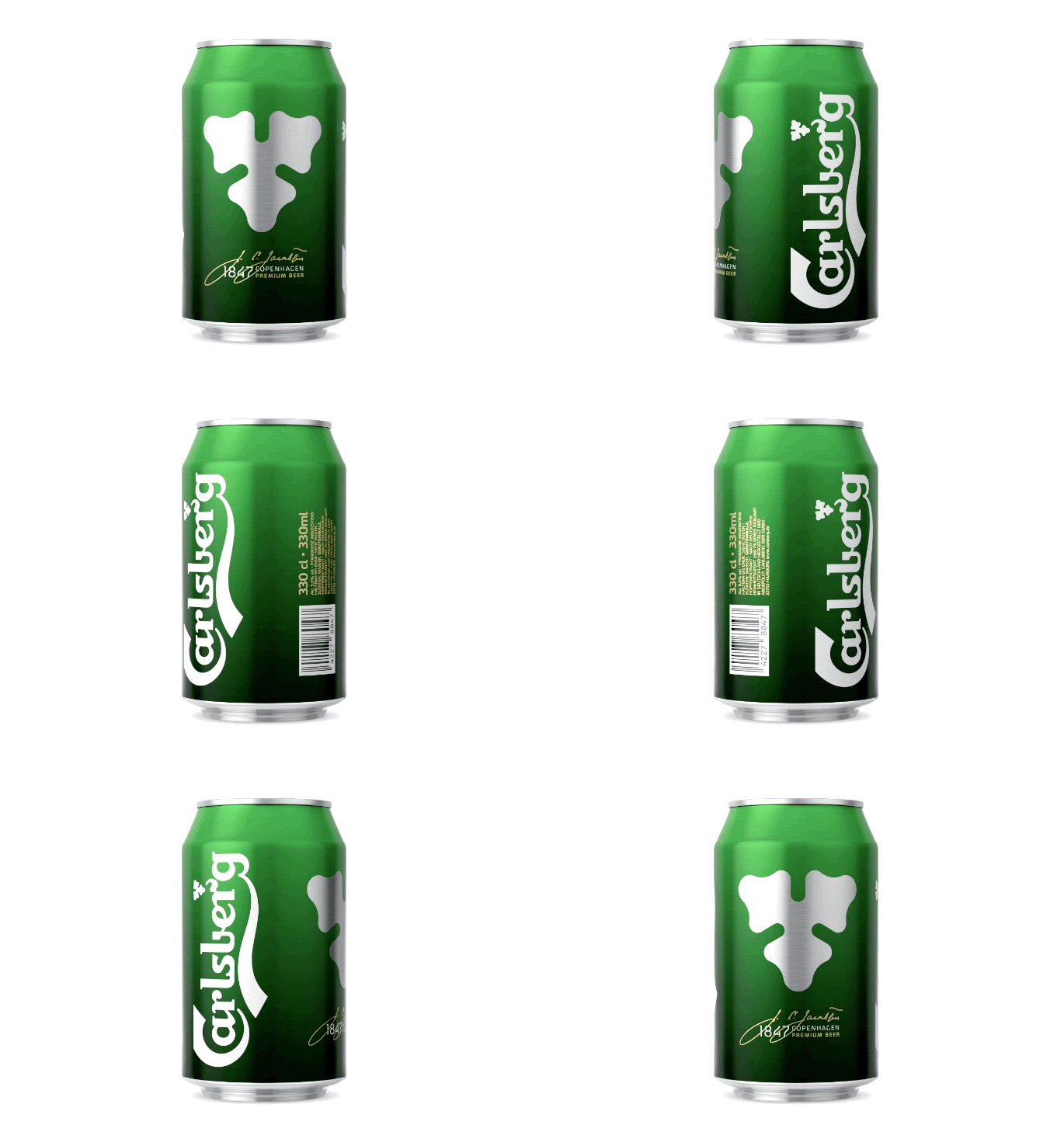
 With more and more brands on the shelves and increased competition from new regional breweries, German consumers found it increasingly hard to separate the wheat from the chaff. Or, maybe more accurately, the hop from the chaff.
 Presented with this challenge, Kontrapunkt and Carlsberg Germany looked to give the can a new refreshed facing by distilling the purity and quality of the product in a minimalistic and refined expression.
The design evolution balanced out the descriptive elements and emphasised the hop leaf as a principal icon in a new temporary design.
The design is a manifestation of the brewery’s ambition to continuously improve the Carlsberg experience. With a custom hop leaf pull tap, matte colours and distinct clean look, the can represents
the beer’s uniqueness and communicates the brand’s pioneering craft beer heritage.
Feeling thirsty? The Carlsberg can is already on the shelves in Germany with other markets looking to roll it out as well.
Source: Kontrapunkt


You must be logged in to post a comment Login