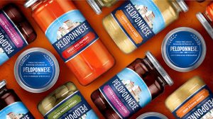
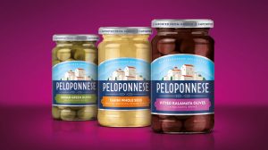
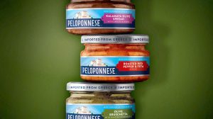
 Speciality Mediterranean food brand, Peloponnese is set to relaunch its entire portfolio of products with refreshed packaging graphics and a new visual identity aimed to establish the brand as leader in its category and appeal to a new generation of consumers looking for culinary adventure. The New York office of international brand and packaging design agency Bulletproof was appointed to the project without a pitch in January 2016 by brand owner Source Atlantique.
A purveyor of Greek and Mediterranean foods, including olives, spreads, grape leaves, roasted sweet peppers, and sesame tahini, Peloponnese was launched by Greek gourmand Sotiris Kitrilakis in 1983 and has since established a reputation for producing some of the finest, most authentic Mediterranean cuisine in the world.
 With an ambition to become brand leader in its category, Peloponnese needed to refresh its packaging, which was looking outdated and not truly reflective of the passion and skill that goes into the production of this artisanal culinary range. Bulletproof was briefed to create a contemporary design that would give the brand strong shelf standout and entice new consumers to the range, while ensuring clear range navigation for shoppers.
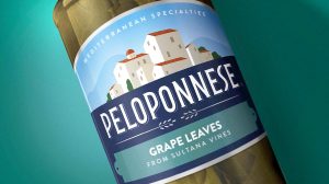
Working from a design platform of ‘Heartfelt Foods’, Bulletproof created a new brand identity and packaging design that strengthened the core equities of the brand, showing the village of Peloponnese, redrawn in a more contemporary style, evoking the idea of the small batch kitchens where the specialities are carefully yet passionately created.
 The new design architecture unifies the range, making it easier for shoppers to navigate the portfolio, with each variant descriptor clearly contained within its own brightly coloured plaque nestled below the Peloponnese logo, set against a bold blue background. The colour-ways were chosen to give the brand maximum standout at shelf, with the contrasting use of bright blue and dark blue on pack to create an impactful brand block.
Bulletproof comments: “The Peloponnese brand and its broad range of Mediterranean specialities has long been a staple of the culinary adventurer’s pantry. However, the outside of their packs has never lived up to the quality of the product at the heart of the brand. To bring this classic forward, we reimagined the distinctive brand asset of the hillside Peloponnese village, by simplifying and amplifying its inviting charm. The sun washed stone walls, the terracotta roofs and the faint silhouette of the rustic hillside all hint at the allure and history of the region.”
 Bulletproof continues: “The new design aesthetic speaks in a more colloquial and authentic tone-of-voice. A simple, hand-crafted logo and bright Mediterranean colours offer a uniquely warm smile at the shelf… inviting everyone to share in the warmth of the Peloponnese table.”
Charlotte Abella, Vice President of Marketing at Source Atlantique said: “It was a wonderful experience working with Bulletproof on the re-design of our Peloponnese brand of Mediterranean specialities. The team were extremely creative, professional and collaborative. I couldn’t be more pleased with the end result and am very excited to start the re-launch of the Peloponnese brand with the new design!”
Source: Bulletproof

You must be logged in to post a comment Login