FAB News are looking at back at some of the outstanding projects that were awarded at the recently concluded FAB Awards. We highlight Pearlfisher‘ success at The Awards Show as Design Agency of The Year at The 22nd FAB Awards.
Their NOgroni project won 4 x Gold FAB Awards and a joint FABulous ( Best in Show ) for Packaging Design at The 22nd FAB Awards. Æcorn Drinks walked away with Multiple Silver FAB Awards. Pearlfisher’ London Studio won Silver for Rubies in the Rubble Brand Redesign.
NOgroni by Seedlip
After the successive launches of Seedlip and Æcorn Aperitifs non-alcoholic spirits and aperitifs, respectively, the Seedlip team wanted to continue to deliver fresh and naturally-focused alternatives to the non-alcoholic category. Cue, NOgroni. It’s a twist on the venerable cocktail classic, served in ready-to-drink bottles.
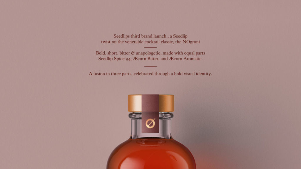
Pearlfisher’s challenge was to design a standout third brand into the Seedlip portfolio and to support on-trade partnerships with communication materials.
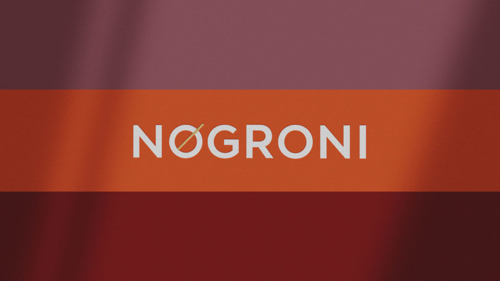
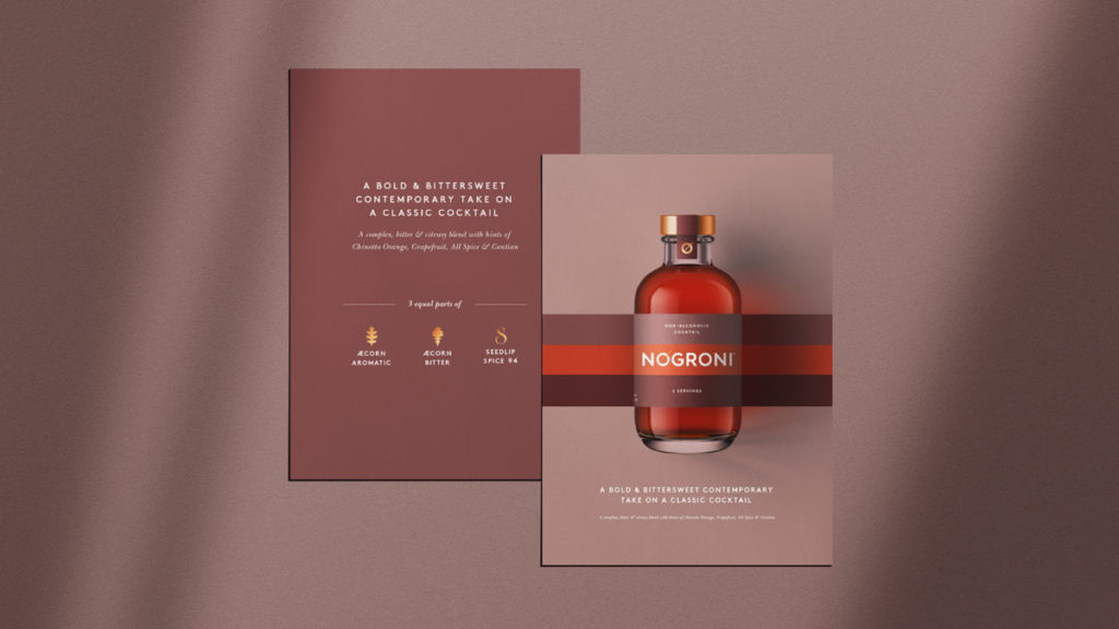
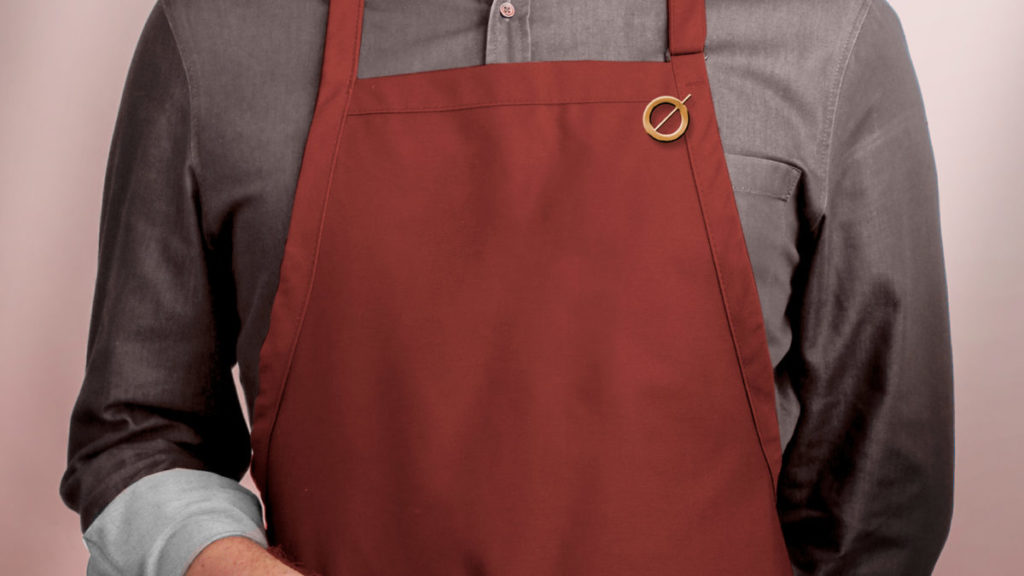
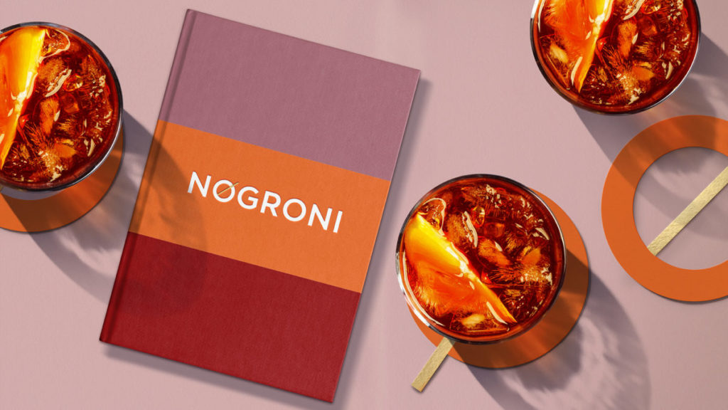
NOgroni is bold, short, bitter and unapologetic. It’s made using equal parts Seedlip Spice 94, Æcorn Bitter and Æcorn Aromatic. This fusion of three parts is celebrated through an equally bold visual identity. Maintaining the rule of thirds, Pearlfisher utilized the recognizable brand elements from each of the three ingredients – the nature-inspired color palette, font style and symbols – to communicate NOgroni’s brand in simple terms.
NOgroni is unapologetic about its non-alcoholic take on a classic cocktail and leads the charge in the category.
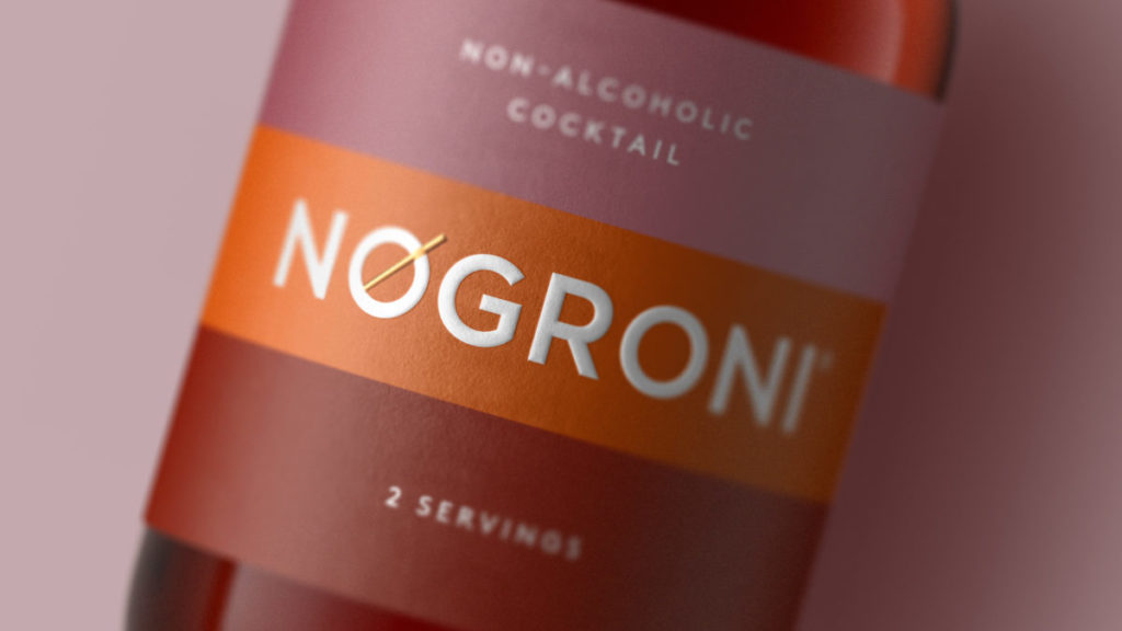
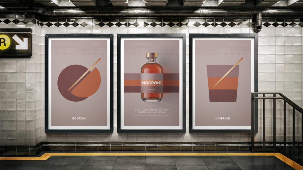
The package design brings a bold, straight-forward graphic language to the brand. Pearlfisher’s strategy was to design in a way that complements the mobility of the NOgroni drinking occasion and the bold flavor of the cocktail itself.
Seeing as it’s made using ingredients from sister brands Seedlip and Æcorn Aperitifs, Pearlfisher repurposed label materials, foils, and even the structure used on Seedlip as a way to tie the brand back to where it all began. The three layered colors also nod to the branding of each of the ingredients in equal stripes across the bottle label.
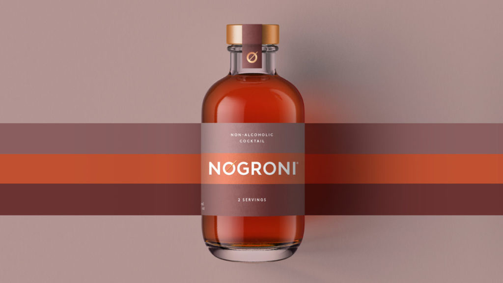
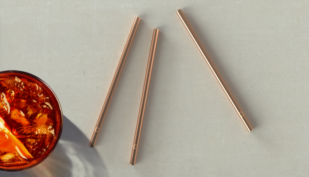
On top of the bottle’s copper cap, the ‘O’ of NOgroni makes two appearances – printed on the front of the seal and it’s also created with the shape and color of the cap from a bird’s eye view.
NOgroni’s design extends the Seedlip portfolio while making a place of its own within ready-to-drink and at-home drinking occasions.
Æcorn Drinks
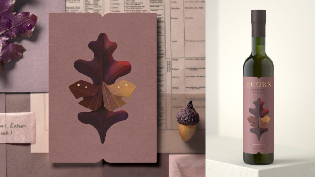
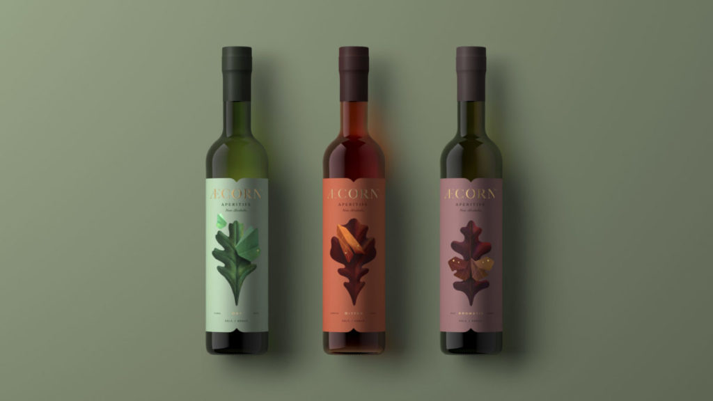
Æcorn Drinks offers the world’s first range of non-alcoholic aperitifs, inspired by 17th century English herbal remedies. Like its sister brand Seedlip, Æcorn provides today’s beverage industry with yet another answer to the question, “what to drink when you’re not drinking?” – expanding the drinking occasion with a range of truly unique, non-alcoholic British aperitifs. Reinventing the European tradition of aperitifs, Æcorn’s three non-alcoholic varietals pair perfectly with a meal to awaken and whet the appetite.
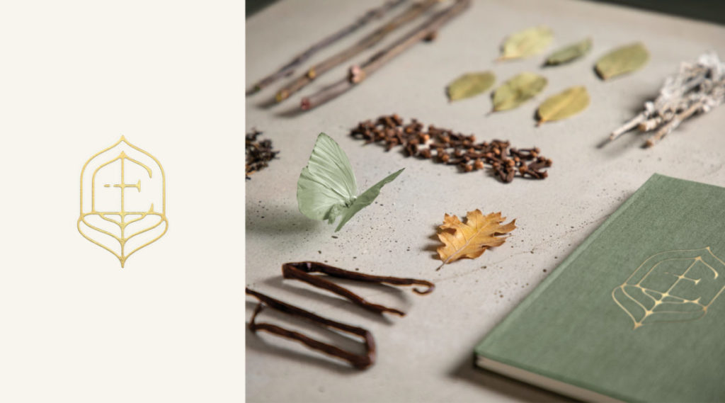
Part of making Æcorn relevant today is considering the consumer and how best to introduce non-alcoholic offerings without compromising brand integrity. For Seedlip, this came to fruition in the brand identity and packaging design that combines the distilling process and core ingredients in illustrative ways. As its own, distinct venture, Æcorn posed new opportunities for Pearlfisher’s strategic design process to create the brand, a logo, a monogram and the product packaging.
Æcorn continues the expressive art of nature through its botanical ingredients and brand design. To properly set the brand’s foundation, Pearlfisher performed extensive research on both the aperitif space as well as lepidopterology (the study of moths and butterflies), serving as an ecosystem for Æcorn to develop within.
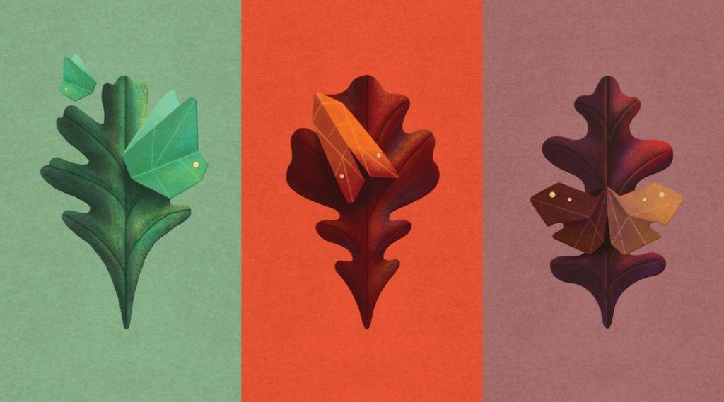
Each varietal is illustrated with changing butterflies / moths and oak leaves – crafted with dimension, iridescence and an imperfect geometry. The labels are further printed over pearlescent paper to illuminate its opaline, butterfly-like characteristics.
From its identity, packaging and brand world, Æcorn drives appetite and interest in a unique style for a unique brand, living alongside its counterpart Seedlip, to create a distinct ecosystem of brand experiences.
Jonathan Ford, Founding Partner & Group Creative Director at Pearlfisher
“Winning at this year’s FAB Awards is truly a significant moment for Pearlfisher and serves as incredible recognition by our industry peers. We’re extremely proud of each of our wins culminating in the 2020 Design Agency of the Year. It’s prompted us to pause to think about and enjoy the ways that creativity can enrich our personal and our collective development during extraordinary times like these. On behalf of Pearlfisher’s global teams, thank you! Our congratulations go out to each of this year’s FAB Award winners.”
Source: FAB News

You must be logged in to post a comment Login