
- Rebrand delivers modern shelf presence while honouring brewing legacy
- Connects with drinkers drawn to today’s craft beer culture
Hopleaf Pale Ale, one of Malta’s most cherished beer brands, has unveiled a bold new visual identity by brand design agency bluemarlin, marking a confident return to relevance for the historic brew.
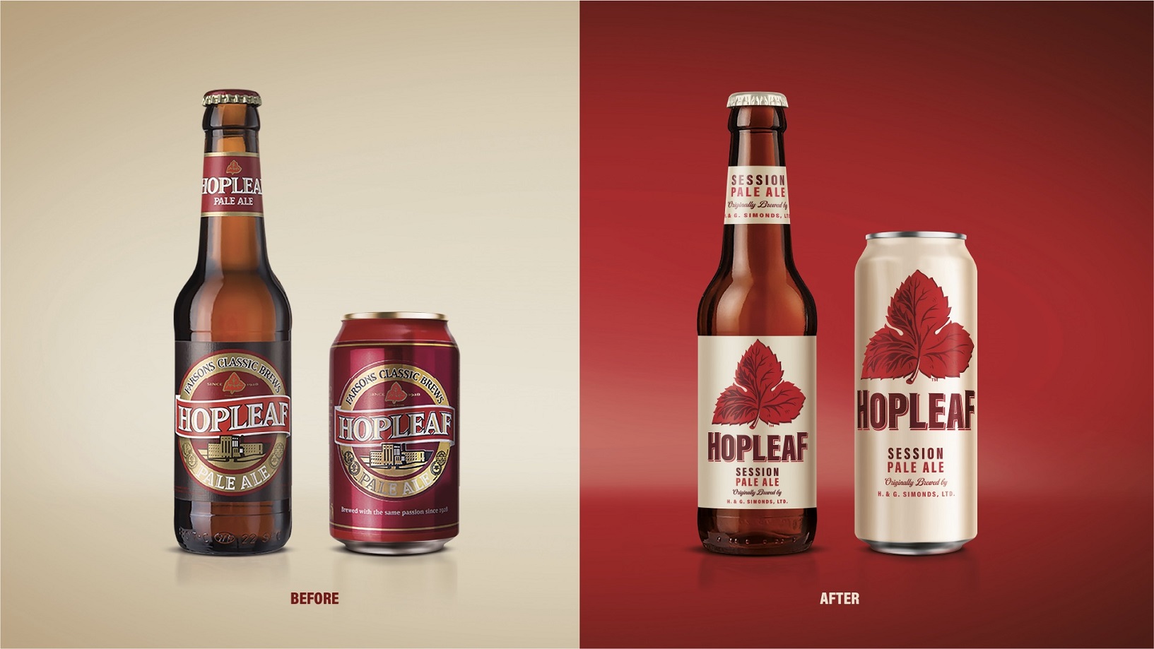
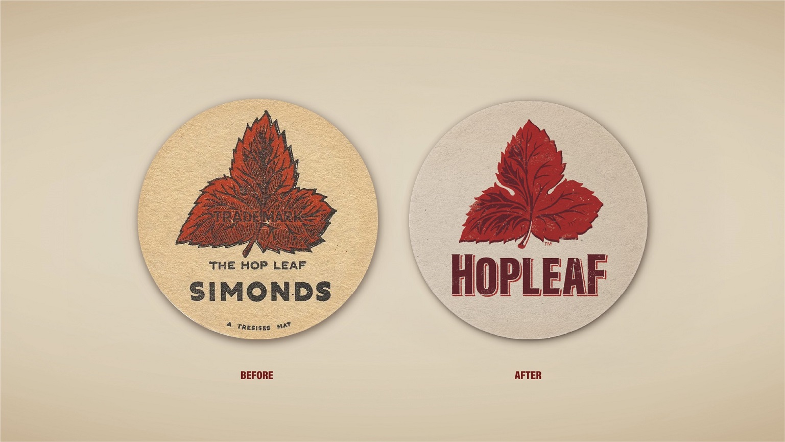
First introduced to Malta in 1928, Hopleaf’s iconic red leaf had gradually lost its presence amid increasingly generic beer design. bluemarlin set out to restore its status by re-positioning Hopleaf as a soul-filled classic reborn – honouring its heritage while appealing to a new generation of drinkers.
Authentically, boldly told
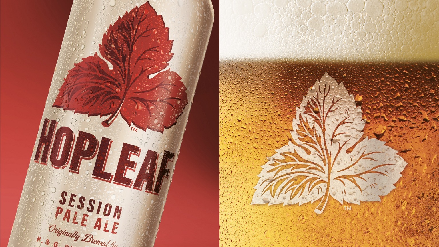
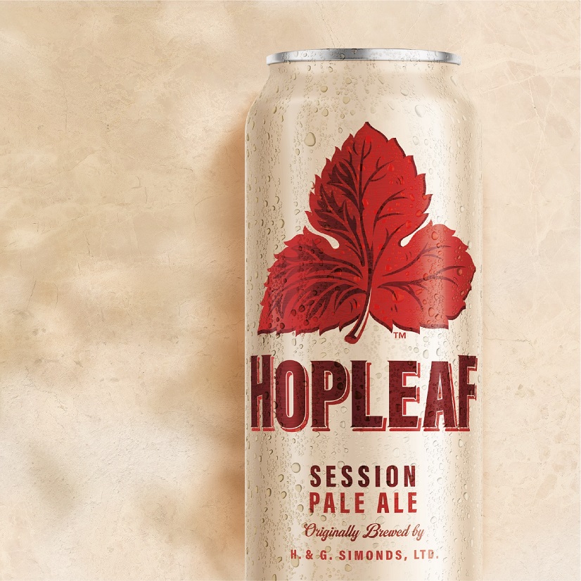
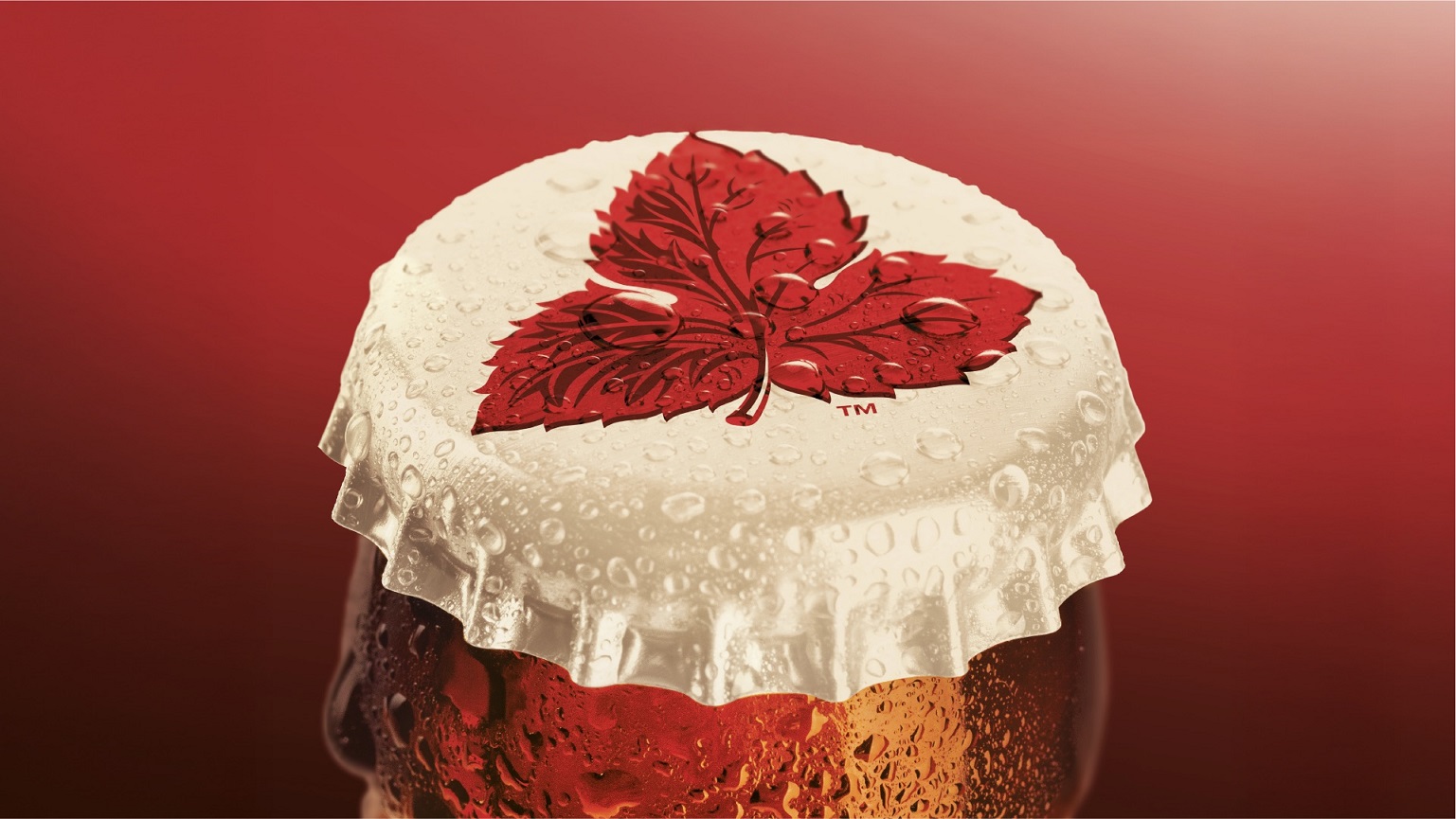
At the heart of the redesign is the liberated red leaf icon, now confidently positioned as the hero of the brand. Redrawn by hand, the leaf features cleaner venation, a stronger silhouette and a bold two-tone depth, reinforcing the brand’s craftsmanship and authenticity. Set against a warm cream background inspired by Maltese limestone, the new design signals provenance and a fresh, sessionable taste.
The refined wordmark is personable, balancing strength and approachability, while subtle heritage cues – including the words ‘Originally brewed by H. & G. Simonds, Ltd’ – pay homage to the brand’s provenance without cluttering the design.
(Originally a proud emblem of brewing heritage in Reading, England, Hopleaf found its true home in Malta after it officially launched on the island in the 1920s, when brewer Simonds Farsons Cisk adopted the brand.)
A confident palette of deep maroon, leaf reds and quiet neutrals replaces the ostentatious golds, delivering modern authority and standout on shelf.
“The previous design was tired and lacked relevance,” said Samantha Dumont, Executive Creative Director at bluemarlin. “We knew we had to go back to the brand’s roots and focus on Hopleaf’s unique and iconic red leaf as the primary brand asset.
“After visiting Malta, it was apparent this wonderful icon is still very present physically – and also in people’s hearts and minds. We didn’t want to create a retro or heritage pack, so we instead worked sensitively, re-fashioning these much-loved assets for a new audience.”
bluemarlin’s creative and strategic partnership with Hopleaf parent group Simmonds Farson Cisk started back in in 2017 and extends across all their beer and soft drinks brands.
A classic for today
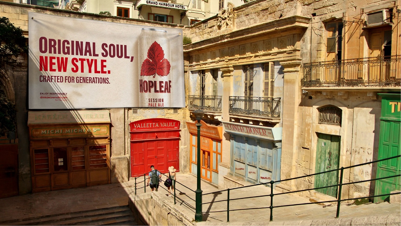
Alongside the visual refresh, Hopleaf has been subtly rebalanced for contemporary tastes. The beer is now smoother, rounder and more sessionable, with a slightly lower ABV. The brand has also moved from 33cl to 50cl cans, available in four-packs, with draft options planned for next year.
“By honouring Hopleaf’s heritage and celebrating its journey, we’ve reignited the brand love it once inspired and opened up new opportunities for growth,” said Charlie Spiers, Account Director at bluemarlin.
Karl Bondin, Head Marketing at Simonds Farsons Cisk, said: “Hopleaf’s revival ensures it continues to resonate with loyal fans while attracting younger drinkers and tourists. This is an exciting time for real ale and Hopleaf is back where it belongs.”
Source: bluemarlin
You must be logged in to post a comment Login