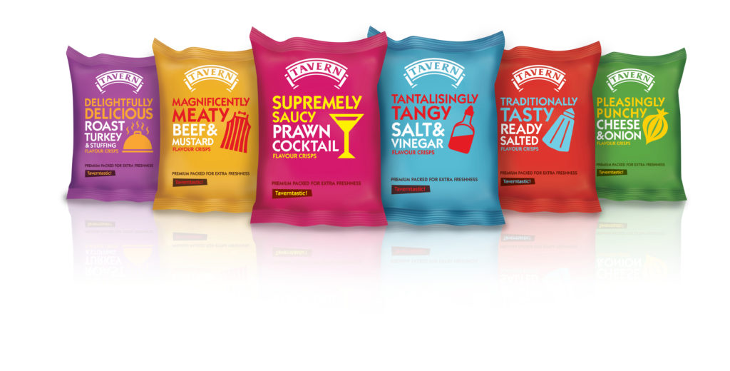
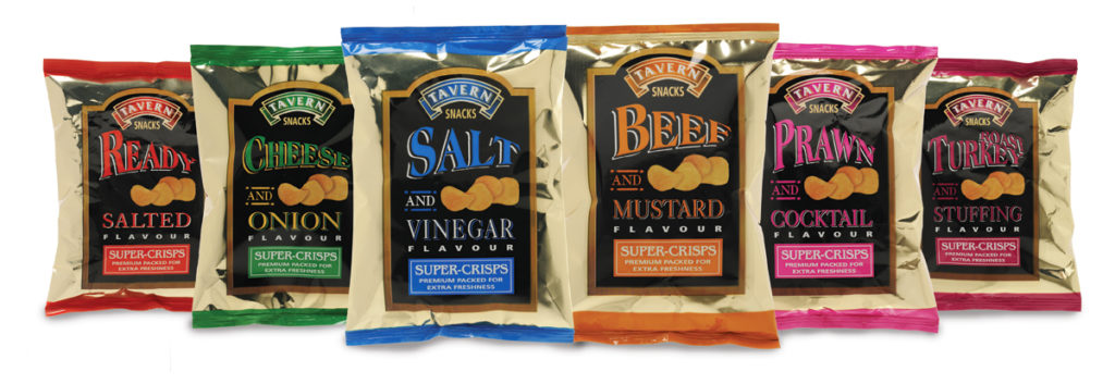
Greenwich Design has redesigned the packaging for Tavern Snack’s crisps, giving a more focused, adventurous, modern style to the range. The new-look packaging is aligned with Tavern’s nut range, which Greenwich redesigned last year, along with Tavern’s brand identity, introducing a totally revamped look and feel for the brand as part of a wider brand refresh strategy to enhance Tavern’s reputation.
 Tavern Snacks supplies snacks, crisps and nuts to pubs, restaurants and clubs in London and the South-East, and although the brand has a much higher profile within the crisps category than nuts, the crisp category is much more dynamic and competitive, and more about brand than product, so Tavern really wanted to pack a punch and portray a ‘younger’ feel for these products.
In order to do so, Greenwich Design wanted to add a level of fun and ‘Britishness’ to Tavern’s crisp range. They have developed a set of new titles, adding a quirky dimension to the personality and giving the range a level of eccentricity.
The packaging for the range of six products – Delightfully Delicious Roast Turkey, Magnificently Meaty Beef and Mustard, Supremely Saucy Prawn Cocktail, Tantalisingly Tangy Salt and Vinegar, Traditionally Tasty Ready Salted, and Pleasingly Punchy Cheese and Onion – has been pared back for a more confident, less cluttered look, with each pack using relevant colour cues and bold naming, typography and graphics which reflect the flavour.
The re-design of the crisp range follows an original brief given to Greenwich Design to design packaging for a new Chilli Peanut product. However, the agency demonstrated to Tavern Snacks that the inconsistent look and feel of the existing product range was damaging brand presence and limiting its appeal, especially amongst the younger, more sophisticated segments of its target audience. As a result, Tavern Snacks tasked Greenwich Design to consolidate the brand and pack range identity in order to build a more powerful brand impact at point of sale, appeal to a wider audience and create a more measurable difference to sales. The agency also creating complementary PoS and advertising activity and is now working on the Pork Scratching range which will be launched later this year. Lead designer on the project at Greenwich Design has been Kate Clancey.

Tavern Snacks is a family run business that has been supplying the licensed trade with snack products for over thirty years, and can trace its roots back to clay pipe manufacturing in the late 19th century, delivering to East and South-East London pubs by horse and cart. Tavern Snacks now supplies its own range of products as well as a number of well known snack brands to almost 3,500 establishments in London and South East England.
Barry Stubbs, Managing Director at Tavern Snacks, comments: “From a seemingly small brief, Greenwich Design really grabbed the bull by the horns and has provided us with a platform to completely refresh the Tavern brand. The repackaging project has introduced new energy and excitement to our business.”
Simon Wright, MD at Greenwich Design, adds: “Our relationship with Tavern has an organic feeling, we have worked really well together and we are now a central pillar in their brand thinking which really helps us to deliver the outcomes they desire. For an organisation where sales will always be king, it is great to be able to slowly rejuvenate a brand that could have easily disappeared in recent economic circumstances.
“To have been able to help a brand maintain its sales level through hard times has been a target achieved.”
The new-look crisp range with be available at the end of June.

You must be logged in to post a comment Login