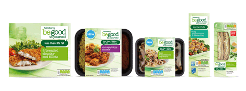
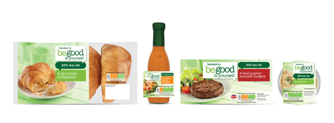
 Sainsbury’s is rolling out a new look for its Be Good to Yourself healthy eating range, with designs by FAB Design.
FAB has worked with Sainsbury’s for 16 years, and was tasked to develop a new look for the range across nearly 200 lines.
 The rollout follows a redesign of the Sainsbury’s Basics range, by BrandMe, which launched last year.
FAB says the new Be Good to Yourself designs use ‘a conversational branding and information system’ and ‘light, al fresco dining-style photography’.
A new colour-coding system has been introduced to help customers navigate the range.
FAB says it developed the designs in a ‘customer-centric’ way. It used a research phase at the start of the project to understand perceptions of the previous designs and a further research stage at later stages to validate the new concepts.
The new-look range is currently rolling out in Sainsbury’s stores.


You must be logged in to post a comment Login