
As Notting Hill Carnival prepares to fill London’s streets with colour, culture and celebration, we’re raising a glass to a project shaped by that same spirit of Caribbean conviviality: our redesign of Ponche Kuba. Created in 1942 and crafted at Mount Gay Distilleries in Barbados, Ponche Kuba is a distinctive rum cream liqueur with a rich heritage and a loyal following. Mount Gay approached Thirst with an ambitious challenge: modernise the brand for a new generation, strengthen its relevance among the Caribbean diaspora and introduce it to more global taste explorers without losing the recognition and heritage that made it an icon.
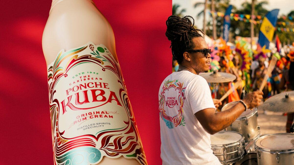
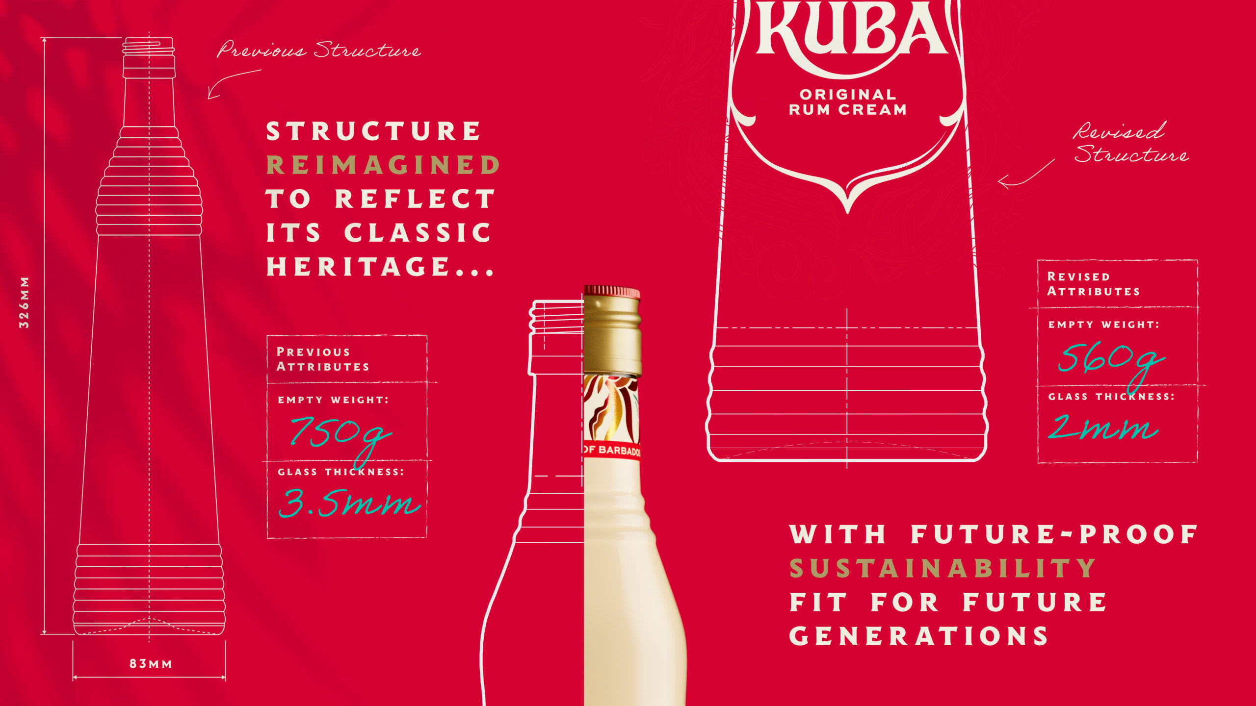
At the same time, the redesign needed to deliver something more tangible. The existing bottle needed to become substantially lighter, helping Mount Gay meet its sustainability objectives and reduce the environmental impact of the packaging. The work began with a full review of the bottle, label and wider visual identity. The opportunity was to create greater standout while building a more contemporary, inviting and premium expression of Ponche Kuba.
“Evolving an icon demands both ambition and restraint. Ponche Kuba already carries considerable recognition and affection, so our responsibility was to protect what people value while helping the brand move forward. Supporting Mount Gay Distilleries in making the bottle materially lighter gave that evolution an even greater purpose. It demonstrates that meaningful progress, creatively and environmentally, doesn’t have to come at the expense of heritage.”
— Matt Burns, Founder & Executive Creative Director, Thirst
The creative idea, A Catalyst of Convivial Celebration, was inspired by the warmth, energy and elegance of Caribbean gatherings. We brought it to life through an expressive liberation of shape, colour and typography – building a brand world that feels vibrant, generous and rooted in Caribbean culture. The refreshed label retains Ponche Kuba’s signature red while introducing flowing botanical illustrations, rhythmic forms and a brighter, more contemporary palette. Together, these elements give the brand greater presence and invite a new audience into its world, while remaining grounded in the product’s origins.
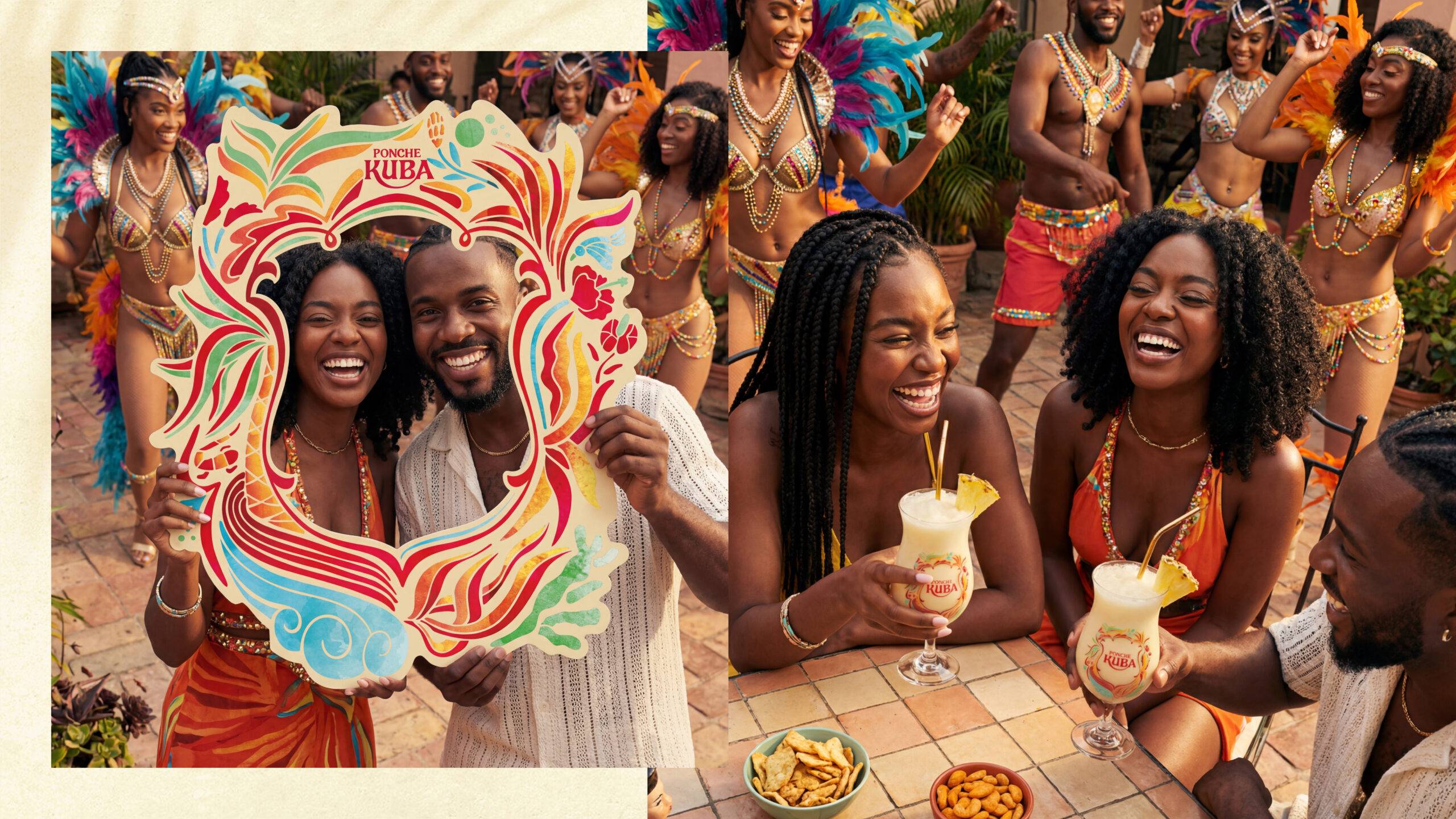
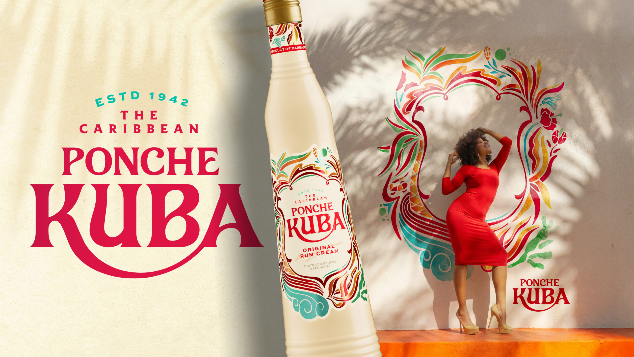
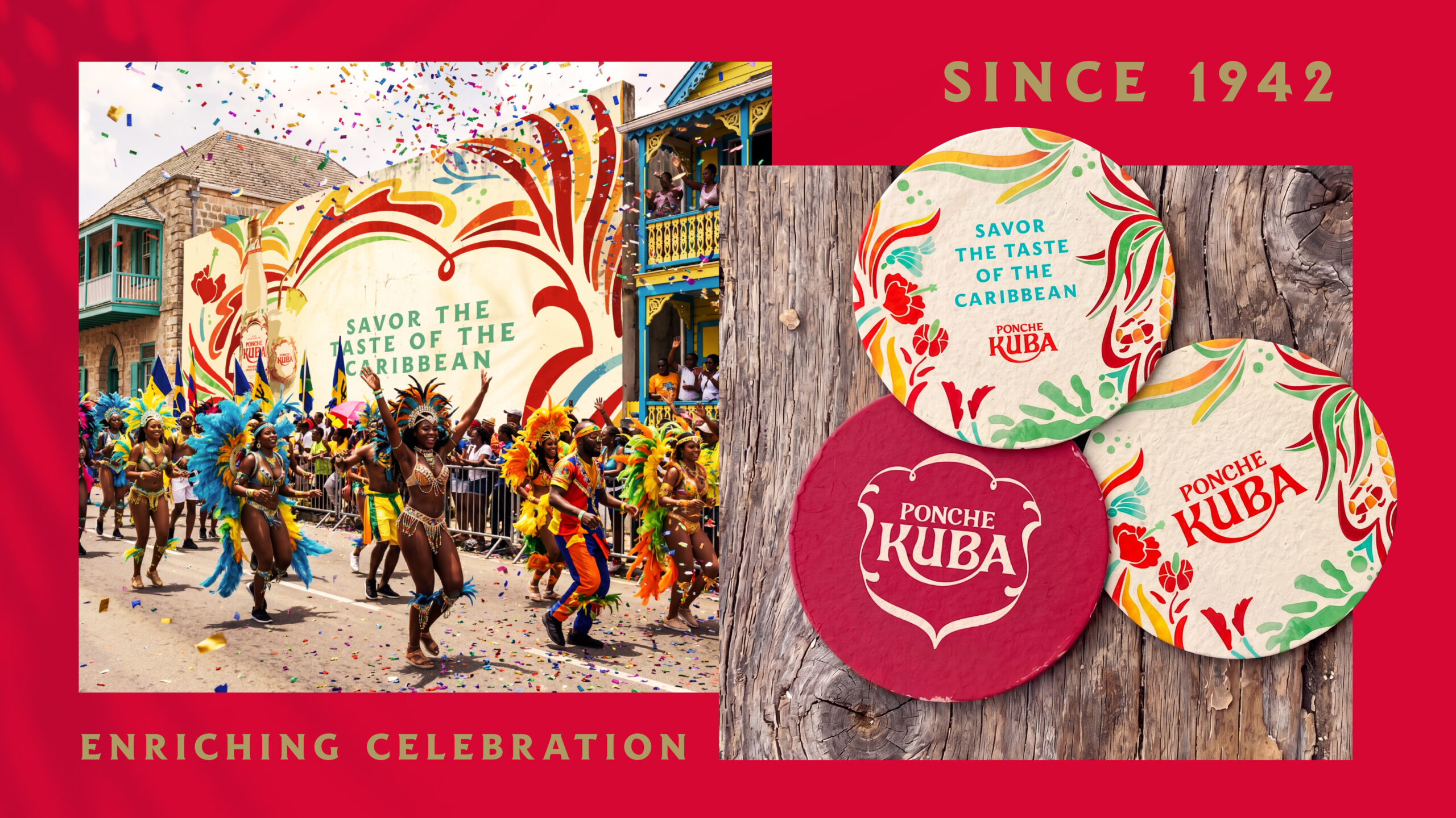
The identity was extended across the full brand experience, from the bottle and packaging to a visual brand identity, marketing toolkit and launch film. Central to the brief was the development of a lighter, more efficient bottle that could retain Ponche Kuba’s elegant, recognisable silhouette. The final 700ml bottle weighs 550g – an 80g reduction from the previous production bottle. That change has reduced CO₂ emissions per case by 24.4%, from 13.6kg to 10.3kg CO₂e. It is a measurable result that demonstrates how design can create impact far beyond appearance: reducing material use and emissions while strengthening the brand commercially and creatively.
While the identity has evolved, the liquid inside remains unchanged: the same original recipe, still crafted in Barbados. Ponche Kuba now steps forward with a lighter footprint and a more confident presence – honouring more than eight decades of heritage while opening the door to new markets, new audiences and new moments of celebration.
Source: Thirst
You must be logged in to post a comment Login