
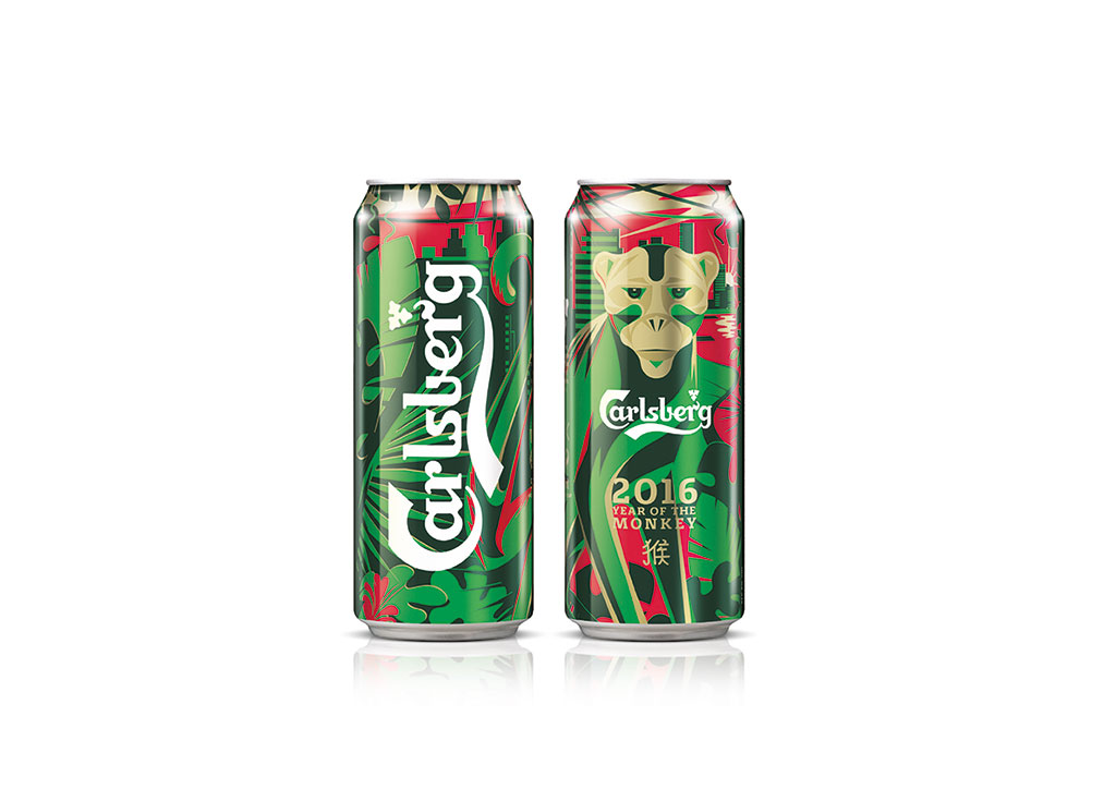
 Carlsberg is one of the world’s most iconic brands. Spanning a history of some 168 years, it reaches a global audience of millions of people everyday. Carlsberg (the flagship brand in Carlsberg Group’s portfolio of beers) is sold in over 150 markets – making it a truly international brand.
Recognizing the need to simplify the brand’s visual presence across its portfolio of beers, Carlsberg briefed Taxi Studio to reappraise their visual identity and packaging for global markets.
Taxi worked alongside Carlsberg’s Senior Brand Management and Internal Design Team over an 18 month period to arrive at the optimal solution. Taxi’s strategic approach and design rationale for the global rebrand of (probably) the world’s most iconic beer brand is summarised below:
1. SYMBOLISE
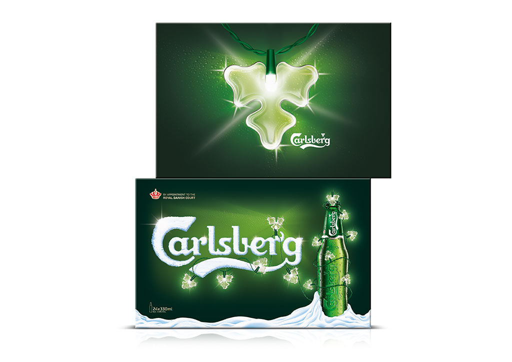
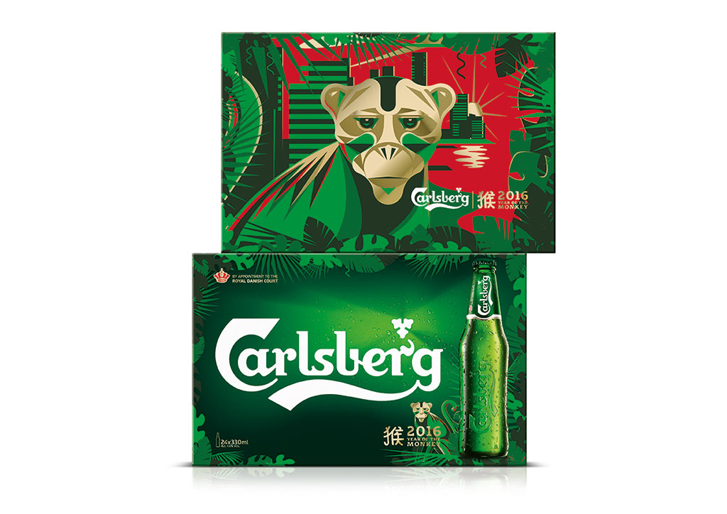
 The Dawn of the Hop Leaf! The new look new Visual Identity amplifies one Carlsberg’s latent brand equities – the Hop Leaf. It’s been a part of the brand identity and labels for over 100 years – a unique icon in the world of beer.
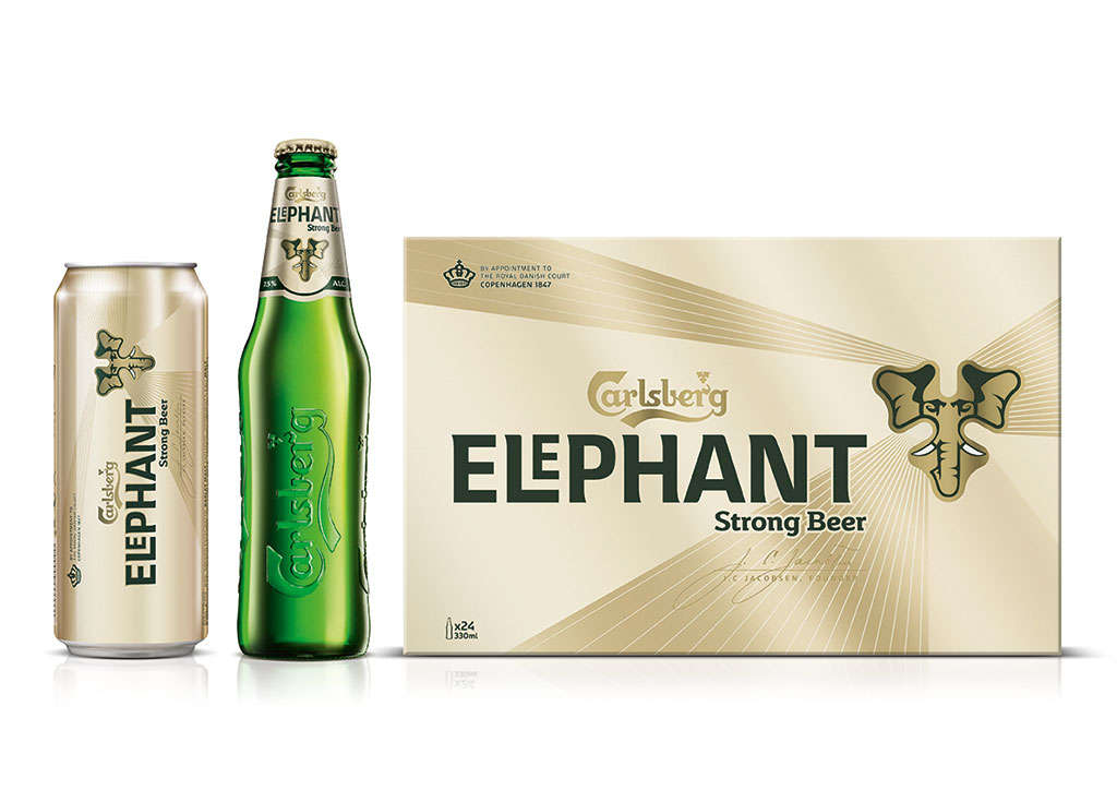
The role of Carlsberg’s Hop Leaf has been elevated across all line and flavour extensions, sub-brands, POS and on/off trade activations.
The Carlsberg ‘Shard Light’ system has been created to dramatically emphasise the Hop Leaf on packaging and communication materials while simultaneously delivering on refreshment.
2. SIMPLIFY
 Less is much more… all Carlsberg consumer touch points have been de-cluttered and refined to simplify product and range navigation. Subtle design detailing has been introduced to emphasise Carlsberg’s credible heritage, reasserting its role as one of the world’s first ‘beers of true quality’ and enhancing the brand’s premium positioning.
To complement all of this, and to introduce another layer of ownable premium craft, Taxi Studio’s Spencer Buck and Kontrapunkt’s Bo Linnemann collaborated with Carlsberg’s Design Team to create a proprietary typeface and ‘Probably’ logo for Carlsberg that borrows design cues from the iconic Carlsberg logo.
3. RATIONALISE
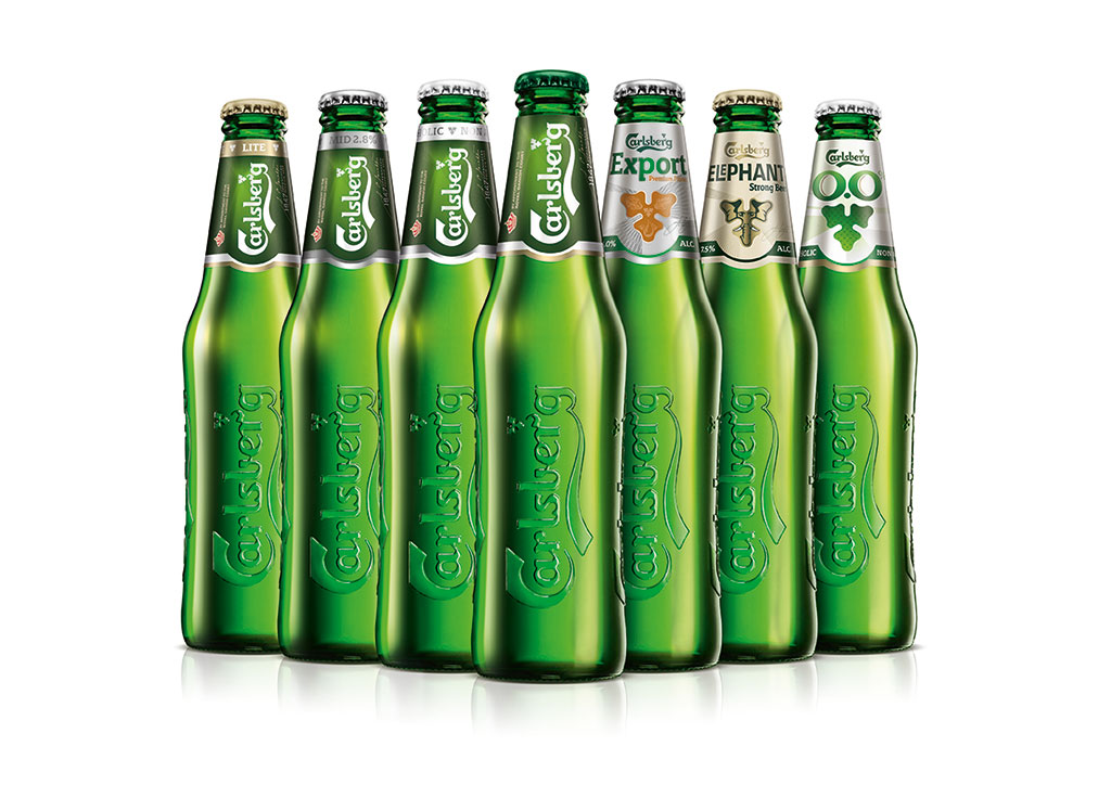
 The combination of Symbolise & Simplify results in a fridge of individual beers, each with a strong genetic link to one another. This family feel creates a more iconic and easier-to-shop product range.
Each sub-brand still communicates its own individual personality – some key design elements have been retained from previous designs to ensure that people are still able to identify their favourite beer(s) in the fixture.
Each sub-brand design drives equity back into the Hop Leaf (and therefore into Carlsberg) which we hope will begin to trigger the idea of “Probably the Best Beer in the World” in the minds of Carlsberg’s consumers.
 Taxi Studio Founder & Creative Partner, Spencer Buck said: “We’re delighted with the outcome, it’s been a challenging and fun journey over the past 18 months or so, and many miles clocked up flitting between Bristol and Denmark. This new direction is a sensitive evolution on the core Carlsberg brand, it wasn’t ‘broken’ strictly speaking… however in order for the brand to be more distinctive on shelf, and consistent on a global basis, there was a definite need to simplify and premiumise.”
Director of Strategy & Innovation for Carlsberg Brand, Didrik Fjeldstad said: “Consistent and Distinctive Visual branding is a key strategic lever for Carlsberg and we actively work on strengthening our visual presence in whatever we put in front of our consumers. Specially starting on the shelf. This is an ongoing focus for us where we are dependent on ongoing strategic and creative contribution from key agency partners such as Taxi Studio.”
You must be logged in to post a comment Login