
 Aesop Agency, the brand storytellers, has created fresh, premium packaging for Joe Delucci’s – the Italian gelato brand.
Using clear tubs that promote the product to ‘hero’ status whilst enabling it to be an integral part of the design – the new pared back packaging has a number of design cues that communicate the look and feel of an authentic Italian gelateria.
Available in three flavour variants – Coconut, Berries & Cream and Pistachio – the unique character of each flavour is communicated through bespoke copy, individual typefaces and imagery. The brand name – depicted as a label ‘stuck’ into the gelato – is a consistent architectural device that helps present the three individual flavours as one coherent brand.
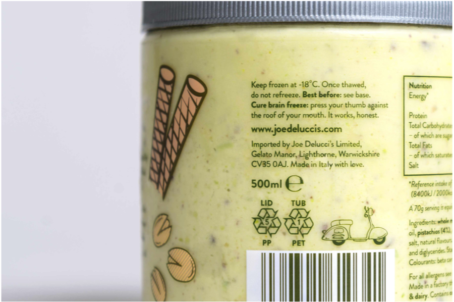 Aesop also helped Joe Delucci’s define their story and tone of voice. Playful on-pack copy rubs shoulders with cute, cheeky discoverables (check out the ‘hidden’ scooter image and the ‘cure for brain freeze’ copy) that help to define and communicate the unique personality of Joe Delucci’s gelato.
Danii Kedik, Lead Designer says: “The clear plastic tubs are quite unique in the category, most brands opting for paper tubs. We wanted to create a brand that was premium, yet playful – ensuring that the personality of the brand comes through and the product speaks for itself.”
The new Joe Delucci’s packaging is now on shelf in Tesco’s.
You must be logged in to post a comment Login