
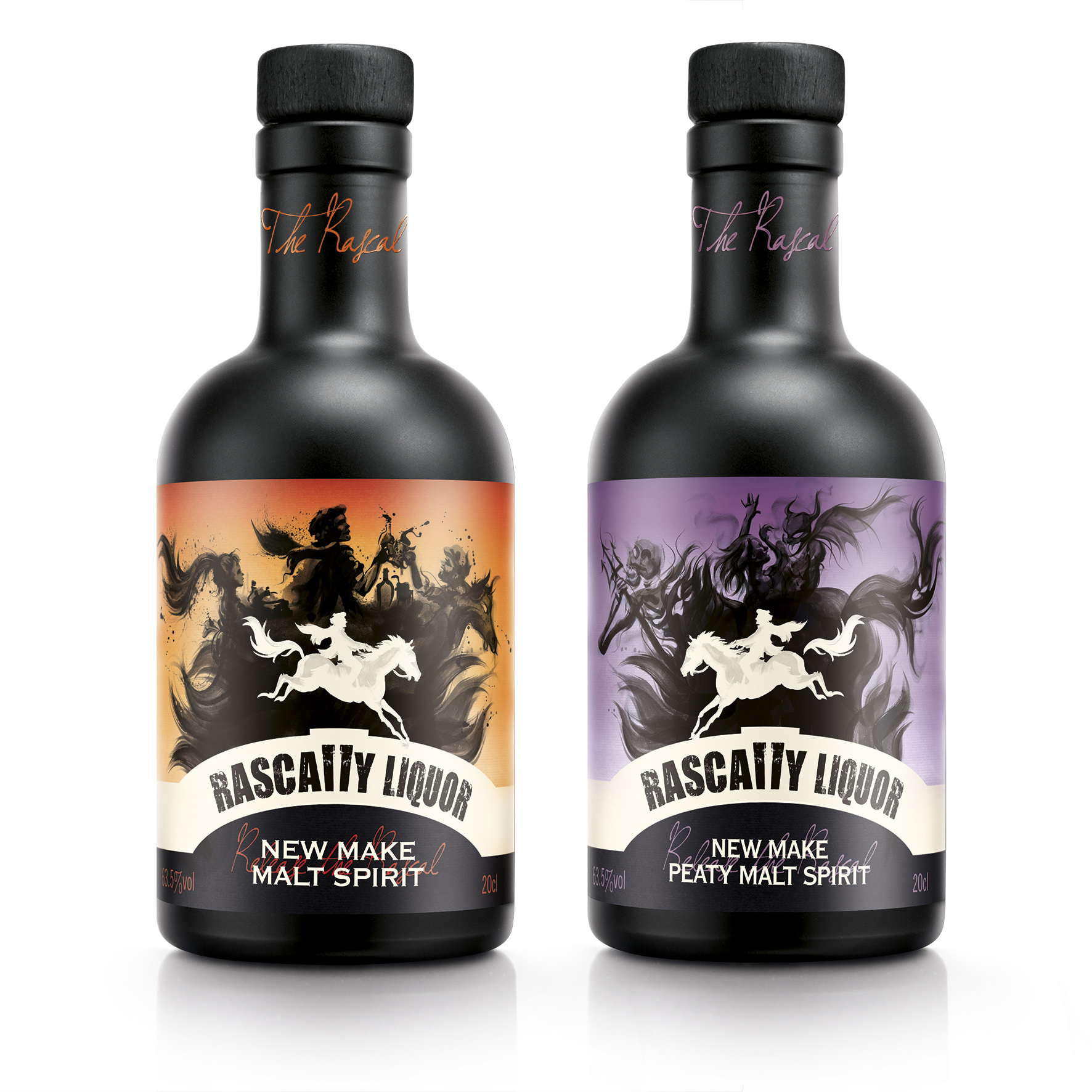
 Annandale Distillery is launching two new make spirit variants called Rascally Liquor with designs by Springetts Brand Design Consultants.
Annandale, which originally opened in 1836 but closed in 1919 and fell into disrepair, has just been restored and relaunched.
There will be two expressions of Annandale Single Malt Scotch Whisky (SMSW) – peated/smoky and un-peated/non-smoky. They will be branded and marketed on the basis of flavour character, which in turn will be based on the characters of Robert Bruce (Man O’ Sword) and Robert Burns (Man O’ Words) respectively – both renowned Scotsmen who have strong links with the Distillery.
Springetts were asked to create a brand and develop designs for the two expressions of NMS (Rascally Liquor) from Annandale Distillery – a smoky expression (that will eventually become Man O’ Sword) and a fruity expression (that will eventually become Man O’ Words).
They needed to make Rascally Liquor NMS a desirable product in its own right, rather than an inferior, rough precursor to Single Malt Scotch Whisky. It had to appeal to a broad group of potential consumers.
 The two expressions of Annandale Single Malt Scotch Whisky will be based on the characters of two renowned Scotsmen who have strong links with Annandale, so it made sense that the two expressions of NMS should relate in some way to the whiskies without encroaching upon them.
The NMS product itself is immature and rather unsophisticated It’s character is outgoing, adventurous – pushes the boundaries. It’s a bit of a rogue.
The concept of “releasing the rascal within” was developed. The consumer letting out the rascal within themselves and the bottle when they taste the product.
It was decided to name the product Rascally Liquor. As well as clearly reflecting the nature of the product, this phrase also alludes to a comment made by Robert Burns about Lowland Scotch whisky: “The whisky of this country is a most rascally liquor; and by consequence only drank by the most rascally part of the inhabitants.”
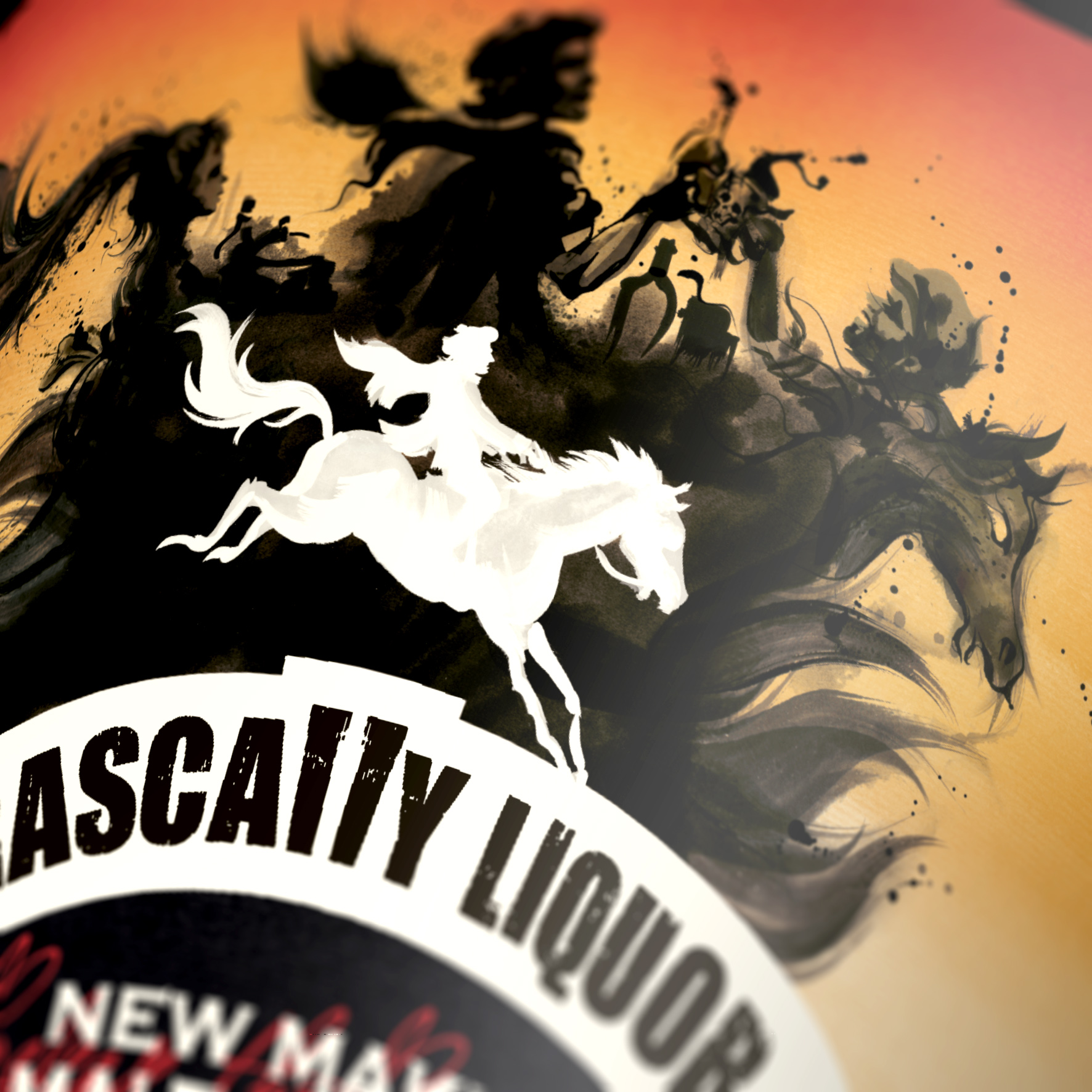
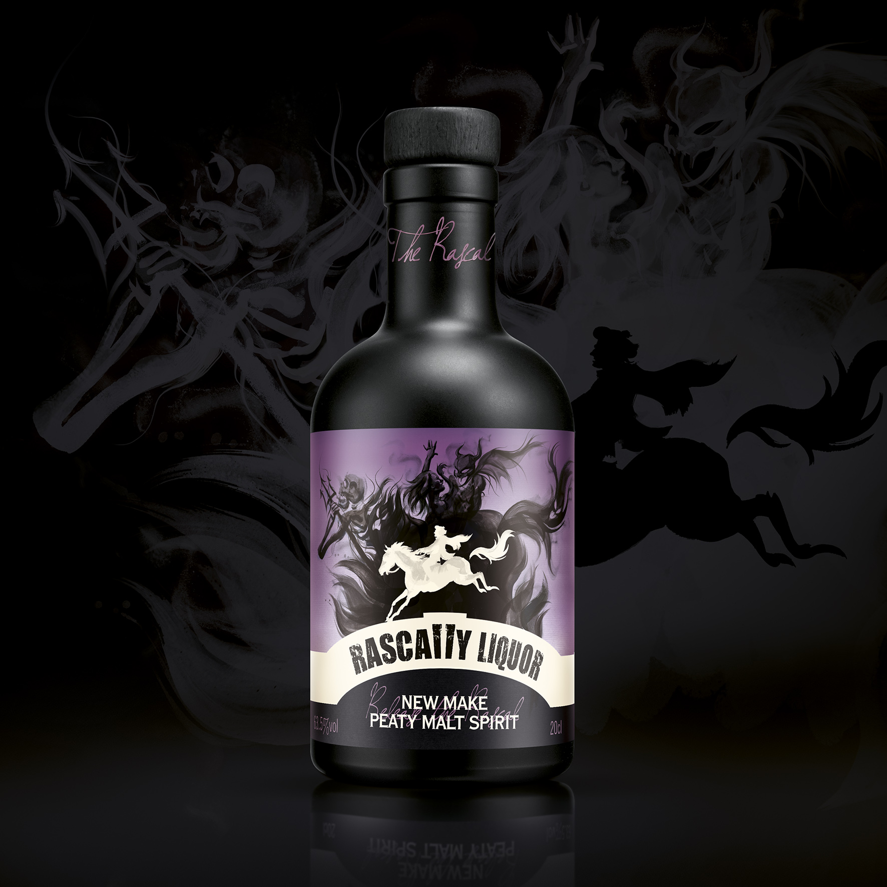
The character of Tam o’ Shanter (from a poem by Robert Burns) embodies much of the rascally nature of the product and is the inspiration behind the pack imagery.
 In the poem Tam o’ Shanter goes to the pub and makes merry with his friends. Whilst riding home later that night, with a storm looming, he spots a pretty girl in a cutty sark (short shirt) dancing. He spies on her only to discover she is dancing with the devil and his hellish followers. They see Tam and chase him, if they catch him before he crosses running water he’ll go to hell. The girl just manages to snatch his horse’s tail before they leap to safety.
The first half of the poem reflects the warmer character of the un-peated NMS. The second, darker half of the poem echoes the smokier, peaty expression of NMS
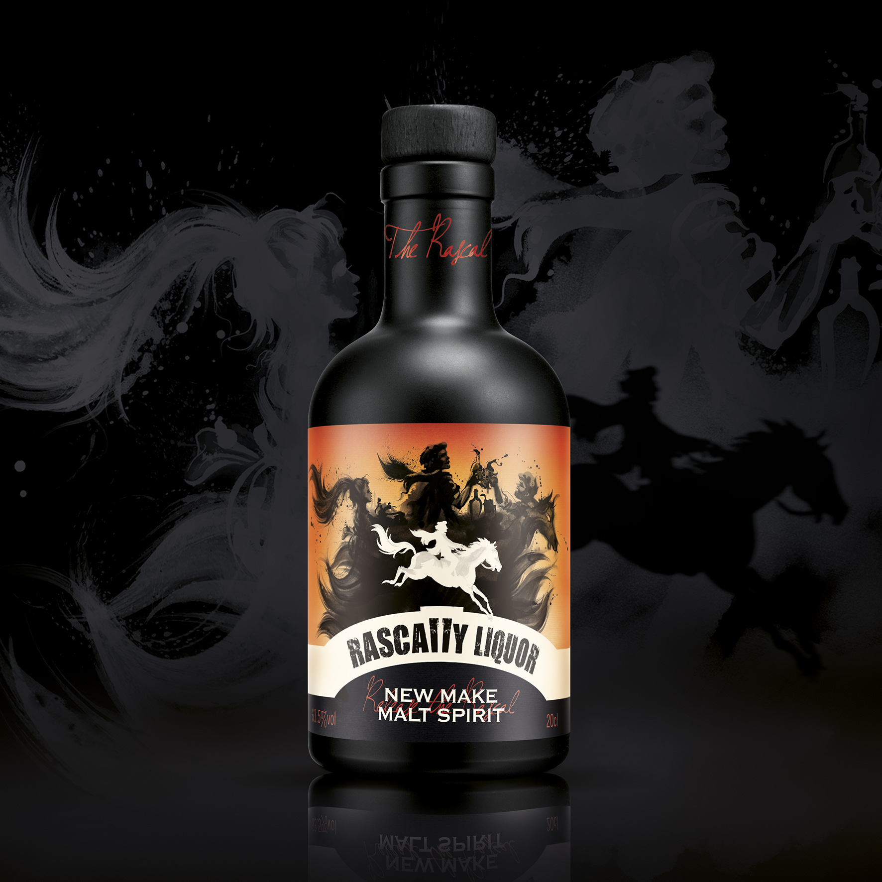
The design uses the bridge, which Tam and his horse have to cross to create the branding for Rascally Liquor. The double L of the brand name creates the keystone of the bridge. The shape of Tam riding his horse creates a distinctive icon for the brand, which can be adapted slightly to convey the different character of the products.
The concept of releasing the rascal within is brought to life by the iconic silhouette of Tam riding Maggie and casting a shadow. The shadow not only reflects the shape of the rider and horse but also the different aspects of Tam o’ Shanter and the different character of the two types of raw spirit – the rascal inside.
 On the non-peated malt spirit Tam rides towards town. The shadow forms a silhouette of Tam and friends getting “unco happy”. On the peated malt spirit Tam has been caught spying the “winsome wench” in her “cutty sark” dancing with the devil. Tam is racing away from Nanny, Satan and his followers. Maggie is about to lose her tail and the shadow cast shows the “hellish legion” in pursuit.
The shadow on the non-peated malt spirit is inky and the shadow on the peated malt spirit is smoky, further reflecting the different characters of the products. The background colours also help to convey this.
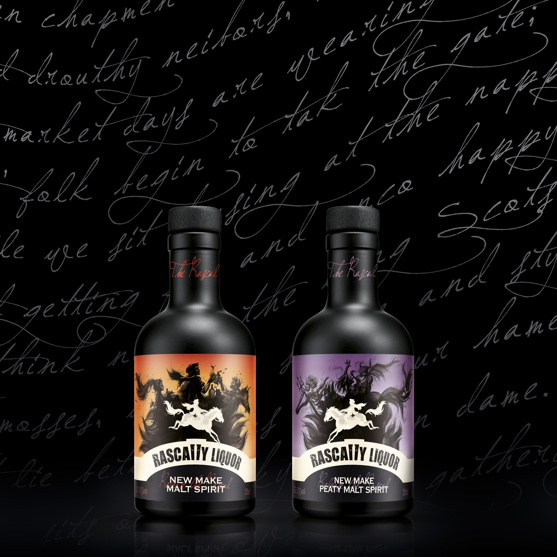
The phrase “Release the Rascal Within” wraps around the clear seal on the neck of the bottle.
The labels are applied to a carefully sourced stock glass bottle, which has been made unique by being sprayed matt black to give a ceramic appearance. This and the cork help give the impression of a youthful rascally spirit with a roguish character rather than a sedate whisky.
You must be logged in to post a comment Login