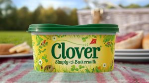
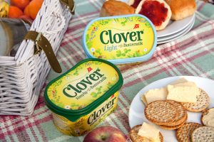
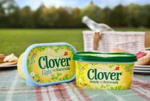
 Clover has launched its new brand identity and pack design, created by global brand consultancy BrandOpus.
With intense price competition and reduced consumption contributing to a perfect storm of falling sales across the spreads category, one of the strongest performers, Clover has been focusing on continuing to build brand engagement, by delivering a more compelling brand story designed to create even greater stand out on shelf.
 Clover’s appeal has always been grounded in its unique buttery taste which helps set it apart from the competition within the spreads category. Made with buttermilk and being the only major spread with absolutely no artificial ingredients, Clover is designed to appeal to the growing number of consumers for whom naturalness and superior taste are a priority.
BrandOpus was briefed to reflect a celebration of naturalness and togetherness in the redesign. The depiction of the Clover meadow evokes the simplicity of nature and our enjoyment of being outdoors whilst establishing the lively meadow as the origin of where dairy comes from.
 “We are extremely excited to see the new Clover identity and pack design hit the shelves” said Kate Jones, Design Director, BrandOpus. “The redesign evokes the brand’s strong connection with nature by bringing to life a meadow full of quirks, character and a few inhabitants!”
“Our ambition with the new packaging was to disrupt at shelf in order to get Clover noticed more and drive penetration by allowing more consumers to choose our brand. e. BrandOpus understood our brief from the outset and have delivered a design solution that manages to reflect all that we feel is unique and appealing about our brand.” says Neil Stewart, Marketing Manager, Dairy Crest.
Source: BrandOpus

You must be logged in to post a comment Login