
An award winning independent maker of fine chocolate – Chococo has been setting the standards in ethical trade and sustainability since 2002. Inspired by the square chocolate compartments within the original boxes their once trail blazing packaging (designed by the dearly departed Karen Welman) set high standards and disrupted the category. However, over the years the identity started to lack brand cohesiveness with the subsequent introduction of additional product ranges and was no longer living up to its identity potential both on and off pack.
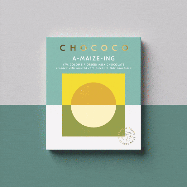
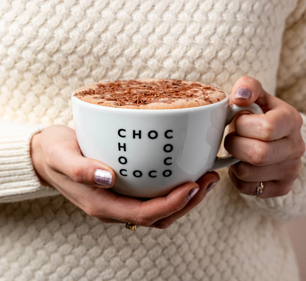
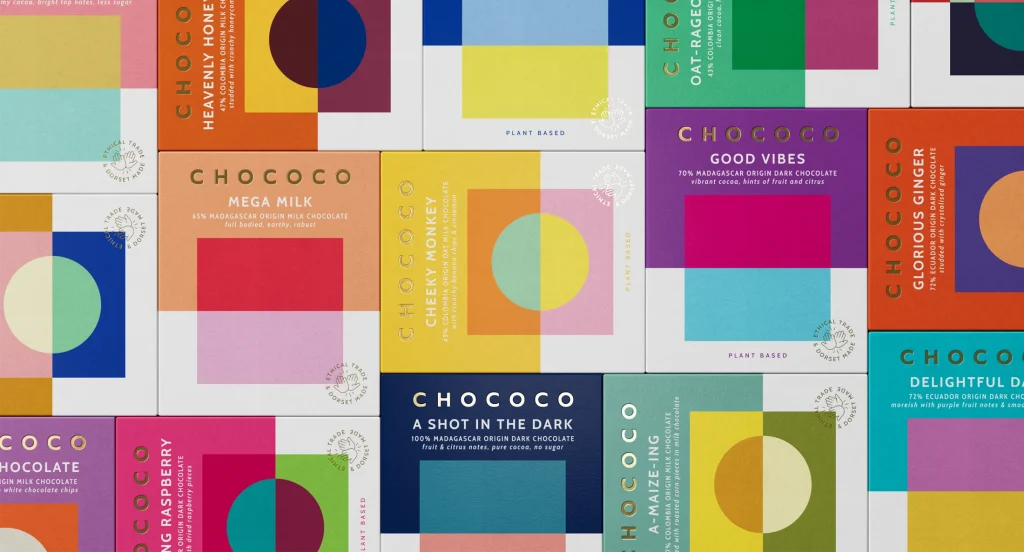
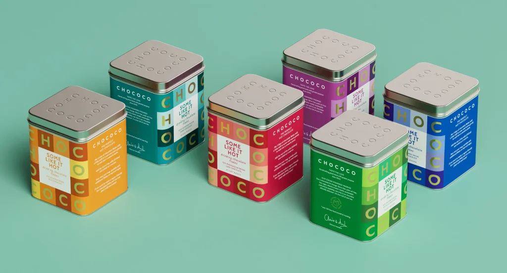
Hip to be square – We embraced and strengthened the legacy of Chococo’s coloured squares by creating a unique logotype which integrates neatly into the core chocolate boxes — the square grid formation underpins the geometric style of all subsequent ranges and becomes a distinct starting point for a design system which brings cohesion and colour to Chococo’s ever expanding range.
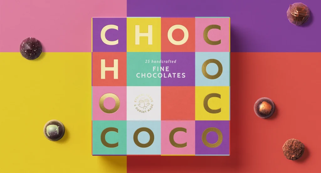
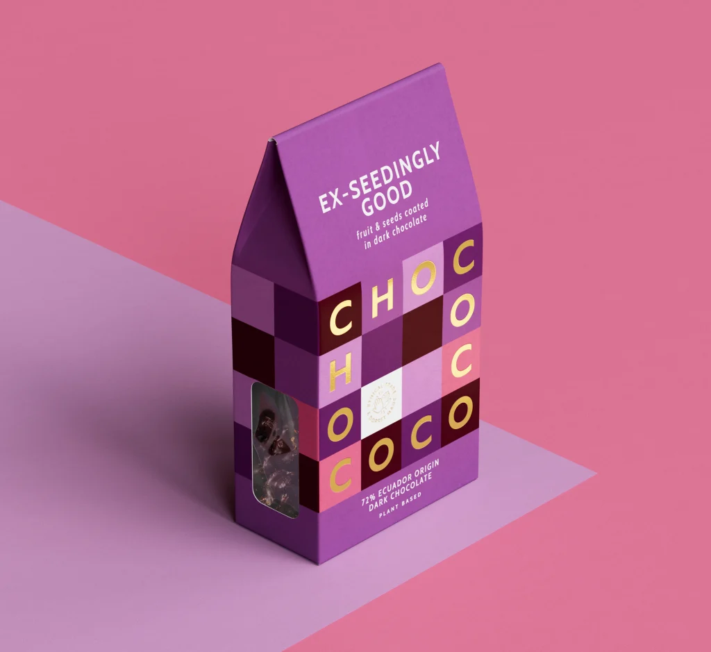
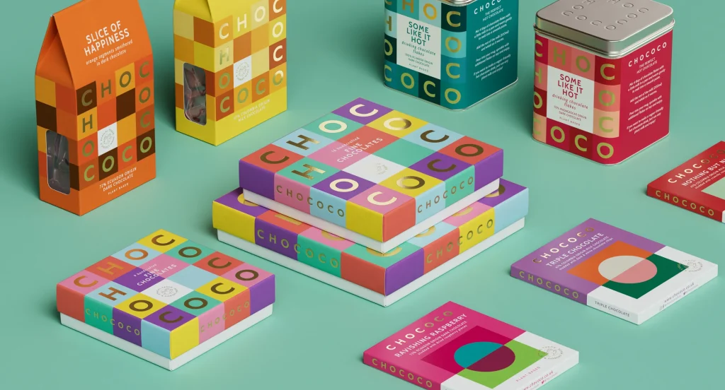
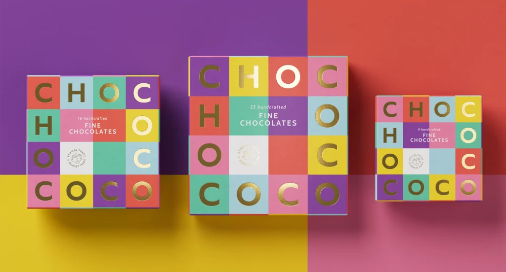
The result is distinctly Chococo; playful, vibrant and full of soul — reflecting their passion for both product and producer.
“It has been a joy to work with the Buddy team on our brand identity refresh. They really listened, interrogated and explored ways of modernising our look whilst also at the same time, building on the core brand elements first created in 2002. The idea of turning our logo into a square was inspired and something that I can’t quite believe we hadn’t spotted before! We all love it and our packaging has been receiving rave reviews from customers and the press alike.” Claire Burnet, Co-founder, Chococo
Source: Buddy Creative
You must be logged in to post a comment Login